New Steve Jackson sig.
![]() by Axel on Mon Aug 21, 2006 2:49 pm
by Axel on Mon Aug 21, 2006 2:49 pm

![]() by KIG1 on Mon Aug 21, 2006 3:12 pm
by KIG1 on Mon Aug 21, 2006 3:12 pm
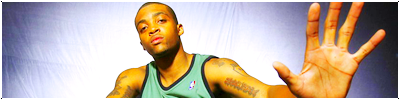
Ryan. wrote:Add some text, brushes, and a border, and it will be good.
Axel wrote:Personally I perfer minimalization, so I think it looks great as is... perhaps adding an effect to the player might make it look a little better... I'd desaturate the player (i dk his name) a little bit with the sponge tool, then apply a blue tint color balance.. then go from there by adjusting the levels of that pic to make it fit in better with the background... just a suggestion
I like the lighting effects though.

![]() by Srbija on Fri Aug 25, 2006 7:43 pm
by Srbija on Fri Aug 25, 2006 7:43 pm


![]() by cklitsie on Sun Oct 01, 2006 5:49 pm
by cklitsie on Sun Oct 01, 2006 5:49 pm

Users browsing this forum: No registered users and 5 guests