Sun Aug 13, 2006 5:23 pm

New Steve Jackson sig.
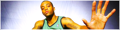
Wed Aug 16, 2006 6:42 pm

A new Melo sig, Im goin too simple..
Wed Aug 16, 2006 7:37 pm
Melo looks stoned.
Mon Aug 21, 2006 12:44 pm
I tweaked with some of the lighting and also on Allan Ray..
Mon Aug 21, 2006 12:53 pm
Nice!  Only suggestion I have really is to change your background to a light green color to match his jersey.
Mon Aug 21, 2006 1:29 pm

I took into consideration what you said into this sig.. Sort of the same as the Ray one.
Mon Aug 21, 2006 2:23 pm
Add some text, brushes, and a border, and it will be good.
Mon Aug 21, 2006 2:49 pm
Personally I perfer minimalization, so I think it looks great as is... perhaps adding an effect to the player might make it look a little better... I'd desaturate the player (i dk his name) a little bit with the sponge tool, then apply a blue tint color balance.. then go from there by adjusting the levels of that pic to make it fit in better with the background... just a suggestion
I like the lighting effects though.
I like the lighting effects though.
Mon Aug 21, 2006 3:12 pm
Ryan. wrote:Add some text, brushes, and a border, and it will be good.
Do you not see the border??
Axel wrote:Personally I perfer minimalization, so I think it looks great as is... perhaps adding an effect to the player might make it look a little better... I'd desaturate the player (i dk his name) a little bit with the sponge tool, then apply a blue tint color balance.. then go from there by adjusting the levels of that pic to make it fit in better with the background... just a suggestion
I like the lighting effects though.
Never really thought about doing that, but I was just trying something new.
Fri Aug 25, 2006 1:26 pm

A new Adrian Peterson sig, first one with brushing in a while so im a little rusty
Fri Aug 25, 2006 7:09 pm
it looks cool but i think they all look the same, nice though
Fri Aug 25, 2006 7:43 pm
Maybe the player could be blended in with the background abit better, but looks alright.
Could you tell me how you added the two borders on it. I've been wanting to know how to do that for ages.
Could you tell me how you added the two borders on it. I've been wanting to know how to do that for ages.
Sun Sep 03, 2006 5:56 am

Couldn't do much with the empty space again.
Sun Oct 01, 2006 2:43 pm


Two new college football sigs.
Sun Oct 01, 2006 3:22 pm

- Brandon Meriweather -
Sun Oct 01, 2006 5:49 pm
Your sigs aren't necessarily bad, but they all look the same. Very light brushed background, a logo on it, the player on it (sometimes an effect on the player, that's good) and the same type of classic looking font. And pretty much the same border.
I suggest you try something different, because even though it might not work out on the first couple sigs, you will learn from trying different styles and experimenting in PS.
I suggest you try something different, because even though it might not work out on the first couple sigs, you will learn from trying different styles and experimenting in PS.
Sun Oct 01, 2006 5:54 pm
those allen ray and dee brown sigs are better than your last ones.
Mon Oct 02, 2006 3:39 am
Thanks guys, I appreciate your help.
Mon Oct 09, 2006 3:13 pm


Mon Oct 09, 2006 7:07 pm
I really like the second one, but I don't like the text too much. Still looks nice though.
Mon Oct 09, 2006 8:24 pm

New Byron Leftwich sig.
Tue Oct 10, 2006 1:37 am
i like it
Tue Oct 10, 2006 1:41 am
Not bad at all.
Wed Oct 18, 2006 2:15 pm

I focused this sig around the lighting.
Last edited by KIG1 on Sun Oct 22, 2006 8:36 am, edited 1 time in total.
Sun Oct 22, 2006 1:53 am
Broken link, all i see is a red x.