

KIG's Photoshop Showcase----- Jarrett and Griffin
98 posts
• Page 4 of 4 • 1, 2, 3, 4


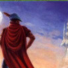
![]() by Ruff Ryder on Sun Nov 05, 2006 11:30 am
by Ruff Ryder on Sun Nov 05, 2006 11:30 am
It's just too empty like most of your sigs. Not enough depth in the background.

'Retired'
"You can’t drive a knife into a man’s back nine inches, pull it out six inches, and call it progress."-Malcolm X
-

Ruff Ryder - Posts: 5996
- Joined: Wed Jun 25, 2003 7:17 am
- Location: VA RLY
![]() by Ruff Ryder on Sun Nov 05, 2006 3:44 pm
by Ruff Ryder on Sun Nov 05, 2006 3:44 pm
Mess around with the lighting a little bit, maybe blend pictures into the background.
'Retired'
"You can’t drive a knife into a man’s back nine inches, pull it out six inches, and call it progress."-Malcolm X
-
Ruff Ryder - Posts: 5996
- Joined: Wed Jun 25, 2003 7:17 am
- Location: VA RLY


![]() by cyanide on Sat Nov 25, 2006 9:37 am
by cyanide on Sat Nov 25, 2006 9:37 am
Nice, clean, sophisticated. I don't know if the white border is really necessary. One comment I want to make: Although the type style is a good choice, it needs better kerning.
Nice work.
Nice work.
if you were killed tomorrow, i WOULDNT GO 2 UR FUNERAL CUZ ID B N JAIL 4 KILLIN THE MOTHA FUCKER THAT KILLED U!
......|..___________________, ,
....../ `---______----|]
...../==o;;;;;;;;______.:/
.....), ---.(_(__) /
....// (..) ), ----"
...//___//
..//___//
.//___//
WE TRUE HOMIES
WE RIDE TOGETHER
WE DIE TOGETHER
......|..___________________, ,
....../ `---______----|]
...../==o;;;;;;;;______.:/
.....), ---.(_(__) /
....// (..) ), ----"
...//___//
..//___//
.//___//
WE TRUE HOMIES
WE RIDE TOGETHER
WE DIE TOGETHER
-

cyanide - Dat steatopygous
- Posts: 9197
- Joined: Sat Oct 11, 2003 6:09 am
- Location: US's toque


98 posts
• Page 4 of 4 • 1, 2, 3, 4
Who is online
Users browsing this forum: No registered users and 12 guests