
And I really can't be bothered carrying on about my work at length anymore, particularly since it's been years since I've done some of these, so it's pretty much just images. Anything that doesn't say otherwise was done in Photoshop.
The Shot:

Bulls-Celtics, Game One:
The preview software only does the thinner US Blu-Ray boxes, whereas the spine on Australian Blu-Ray boxes is the same as on a DVD, which is why the spine seems to head over onto the front and back of the cover.

1996 NBA Finals, Game Two:
The other five games are all the same thing, just with different images on the front. I haven't actually gotten around to game five or six yet, when I do I'll post the entire spineset.

Knicks' week of hopelessness:
I know the back looks like crap, I just haven't fixed it yet. Might end up with a completely different arrangement for the entire cover, even.

Backlash 2007:
Version one, with my own colour scheme.

Backlash 2007:
Version two, with the official colour scheme.

Judgment Day 2007:

NBL 07-08:

Royal Rumble 2007:

WrestleMania 23:

All Star Weekend 2007:


WWE Saturday Night Main Event (Photoshop):
Visually this is one of the most simple cover designs I have created so far. As far as the work gone into it, however, it was one of the more complicated ones. It took me a while to get the design on the front cover working, and while the idea of the NBC logo containing superstar images was always my plan for the cover, the color overlay was a spur of the moment idea. This is another cover like my Backlash and GAB ones, in which I had a very good idea for the front, and nothing for the back. I just started playing around with different settings on the NBC logo before coming up with what actually landed on the cover. 8/10.
http://img239.imageshack.us/img239/6366/snme06wo8.jpg
WWE Great American Bash (Photoshop):
I had some really good ideas for the front of this cover, and practically nothing for the back. I always planned on using the official WWE poster on the front, but I fiddled around with the colours, adding a blue overlay to the poster, as well as adding the punjabi prison and photos of rey, taker, booker and khali in the space that was the arena in the initial poster. I ended up with a fairly decent back cover considering I was making it up as I went along, but it let the cover down as I suspected it would. 7.5.
http://img81.imageshack.us/img81/5549/gabo6vk7.jpg
WWE Vengeance (Photoshop):
I really had no ideas for this one at all, apart from using the vengeance font for the match listings. which isnt really an idea, since everyone does it. i ended up doing something based on a cross between the tv theme and the poster, which looks absolute shit. 6/10.
http://img148.imageshack.us/img148/9261 ... e06lt5.jpg
TNA Slammiversary (Photoshop):
No, this isn't an indication that I plan to make TNA monthly covers as well. I simply have both of these to put onto DVD, so I need covers. I struggled a bit with this one, with no real idea of a theme or w/e, so I just ripped the colors from the logo and attempted to whack something together. The match listings on the back are orange text with a gold outer glow, they're a little hard to see in the preview, but they show up fine on the finished product. I really like the look of the front of this cover, I fiddled a bit with opacity and an overlayed background layer. I like it. 7.5/10
http://img77.imageshack.us/img77/3197/s ... ary5cr.jpg
RAW--DX Return (Photoshop):
I return to making RAW weekly covers here only because I plan to get this episode on DVD. I went for the look of a cover that had been completely defaced, graffitti'd, etc. I think it came off nicely. I like the tape I've put on the corners of the images, looks good. 7.5/10
http://img138.imageshack.us/img138/584/dx2ru.jpg
WWE Judgment Day (GIMP):
Continued messing around with some layer effects on this one, with the mysterio-jbl image on the back of th box. I like the way this turned out. I think the cover suffers a bit in that the front and back are different colors (due to the mysterio image), but overall i like this one. certainly the best job ive done with the match listings so far. 7.5/10
http://www.freewebtown.com/koberulzgfx/images/jd.jpg
TNA Sacrifice (Photoshop):
I tried a different method of doing the match listings here, with the wrestlers' images next to the listing of their match. This didn't turn out at all well, as both the images and the type ended up far to small, so as to fit them all in. I like the front, however. Not too simple, not too complicated either. I just put christian in front of the background and set him to overlay. simple, but it looks good. The back lets this one down though. 7/10.
http://img145.imageshack.us/img145/2305 ... ice5xo.jpg
Kobe Bryant Sig (Photoshop):
Well, this is a much more complicated project than anything else i've undertaken. I used several different brushed backgrounds, a couple of cloud layers, and played around a bit with layer settings (overlay, soft light, etc), and i'm liking the result. 8/10
http://img106.imageshack.us/img106/4519/kobe18nq.jpg
All-Star covers (Friday: GIMP, Saturday: GIMP, Sunday: GIMP & Photoshop):
Started these ages ago, only just finished today (it's been an on-off project). as you can see they're all based on a similar template. i made a few of the cuts myself here (yao, shaq, iguodala, paul and bogut). The josh smith cut is from the 2005 all star weekend, i used photoshop's replace color tool to change the ball here, and i like how it turned out. 7/10 each.
http://img88.imageshack.us/img88/3541/asfriday3es.jpg
http://img164.imageshack.us/img164/985/assat6eh.jpg
http://img88.imageshack.us/img88/9610/assun2po.jpg
ECW Bloodsport (Photoshop):
Well, I made this while still feeling out photoshop, so its not of the best quality, and i haven't done as much with it as i would have if i was still using gimp. i basically just populated the front with wrestlers and the back with weapons. simple and quick. 7/10.
http://img135.imageshack.us/img135/3446/ecwbs9nz.jpg
LA Lakers vs Phoenix, Game 3 (GIMP):
Basically the same as my NBL covers, except with a busier background, a grunge brushing with both teams' colors. The main issue with this was the kobe psd, as he was facing the same way as marion. this would have left someone facing out of the cover, so i flipped kobe horizontally. thing being, now the lakers logo on the front of his jersey was around the wrong way. so i cut it out, added some perspective to it, and filled in the gaps with the brush and the pick color tool. that worked brilliantly, and unless you're looking for it, you cant see it. 8/10
http://img116.imageshack.us/img116/2548/lagm48zi.jpg
SmackDown vs RAW 2006 (GIMP):
I really don't like the back on this, it's far too plain. I did have a brushed metal effect on it, but it didnt print well. For the front, I went with the original design, and it turned out quite well, IMO. It was really just an update to get Mysterio on the front in place of Batista. As i said, i like the front, but the back lets this one down. 6/10
http://img97.imageshack.us/img97/989/sdvr066et.jpg
Backlash (GIMP):
First cover in a long while, and it went through several stages of planning. i never really had a plan for the back, and just played around with it, so all things considered that turned out well. for the front, i went through several draft ideas. the three superstar logos blended together in the background was always going to be there, but i planned several ways of getting cena, edge and hhh on the front, eventually just going with the regular and rather boring triangular grouping. the business of the back created by the logos counterbalances this though, and prevents the cover from becoming too boring. i also tried a few ways of getting the backlash logo on there. i originally just had the logo, but decided it was too boring (and everyone does it that way), and went for the bump-map in the wwe belt. 8.5/10

Custom DVD cover for Perth Wildcats vs Cairns Taipans (GIMP):
This cover is crap, mainly because there's no decent NBL images to use on DVD covers. However, given the limited resources available, and going for a simple look, i think it turned out well, especially since it was my first ever cover. I had to cut the player PSDs myself, so the cuts are very choppy and far from perfect. 7/10
http://img77.imageshack.us/img77/2412/c ... rth3ut.jpg
My first sig (GIMP):
I wanted to whack something together quickly for here, cause id just acquired GIMP. I didn't apply too much thought to it, and its really just a bunch of PSDs whacked together on a gold background with som white text that happens to be halfway-lame-funny only because homer couldnt speak english. 5/10
http://img222.imageshack.us/img222/7093/sig1wo.jpg
Denver Nuggets at Miami Heat (GIMP):
I used a template here, but it came in jpg form, so i had a hard time getting the players in the circles on the back right. Still, it's a template. This goes unrated, cause, well, its a template.
http://img69.imageshack.us/img69/5870/heatdenver2sp.jpg
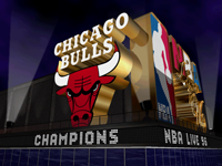
I was playing NBA Courtside 02 on my GCN, and got to game seven of the finals. whacked a tape in, so here's a cover for the result (GIMP):
Well, this one is just something i did out of pure boredom. But I quite like the result. Again, I cut the players out, so the cuts are sub-par, and I was still finding my way around gimp. it took me several hours to figure out how to blend the images out at the back. For the background i had a gold gradient, for the championship trophy, and a red-white-blue semi-transparant one, for the NBA, an effect i personally quite like, and would not hesitate to use again.I also experimented with removing all black pixels from the images on the front, and all white ones from the trophy, again an effect i quite like. as you can see from the fact that its still an image and not a link, this cover is one of my personal favorites. 8.5/10

Custom cover for WrestleMania 22 (GIMP):
WIP (see below for full)
http://img57.imageshack.us/img57/9787/mania229qa.jpg
Custom cover for Brisbane Bullets vs Perth Wildcats, NBL playoffs (GIMP):
NBL cover, i used a template here, which i made myself from my first NBL cover. Again i had to make my own player psds which were less than average, but its a good solid cover. 7/10
http://img140.imageshack.us/img140/3234 ... nal1vv.jpg
Custom cover for No Way Out 2006 (GIMP):
Waaaay too simple for a wrestling cover. However, simple is not always a bad thing. this cover, though, is too simple for my liking. I put eddie guerrero on the front as he was a major player in the story at the time, in the type of position which seems as if he is looking over the orton-mysterio matchup. again with the gold background, it kind of grew on me early in my gimp use, but im over it now. this cover needs some work to busy it up a little. maybe i'll get to it sometime. 4/10
http://img87.imageshack.us/img87/2585/nowayout0wy.jpg
Kobe sig V2 (GIMP):
This time i actually tried to make a decent sig.I made the gold in the back semi transparant, and put an image of staples center in the background, so it didnt look so plain. i also bump-mapped the text with the gold so it wasnt just plain white text. a lot better than the previous effort. 7.5/10

Saturday Night Main Event Cover (GIMP):
This one is probably my favorite cover to date. The blending and placement of the images on the front really works well. again, though, i had some problems with the match listings and fitting them all in. 9/10

Undertaker Sig (GIMP):
The effects on the text came out really well in this one, as did his eyes. I covered everything with semi-transparant blue fill, then cut and pasted his eyes back over the top, giving them that extra-bright quality which really makes them stand out, an effect i wanted to achieve from the outset, and did. one of the rare times its happened. 8.5/10

Tombstone: History of the undertaker cover (GIMP):
Again, the same text. i dont really like the blending/fading effect on the heads at the top, i think it needs a softer transition out, but at the time i didnt have the skills to achieve that. now that i do, we could be seeing this cover updated in the near future. 8/10
http://img93.imageshack.us/img93/725/tombstone0sn.jpg
RAW for March 20th (GIMP):
http://img73.imageshack.us/img73/3697/mar201gi.jpg
SmackDown, March 24 (GIMP):
http://img93.imageshack.us/img93/2703/24mar4gb.jpg
RAW, March 27 (GIMP):
http://img90.imageshack.us/img90/6977/mar279na.jpg
SmackDown, March 30 (GIMP):
http://img84.imageshack.us/img84/7650/30mar1on.jpg
Final version of the WrestleMania cover (GIMP):
Went for the official wm21 look here, and i think this cover turned out nicely. The front does at times look a little overcrowded, but most of the time it looks ok. i had trouble with the match listings here, fitting so many of them on one cover. I also had to use a daylight chicago skyline image, and used a semi-transparant blue fill to darken it, and this effect came off very well. I experimented a couple of things with the images on the back, and had a few problems with sizing, which i resolved. 8.5/10

RAW, April 3 (GIMP):
http://img87.imageshack.us/img87/6398/apr032cn.jpg
WWE Day of Reckoning 2 (the carlito and benoit-orton cuts on the back are mine) (GIMP):
my cutting here has really improved from the nbl covers i had going before. what the original concept for the back cover was was an in-game image of the ring, with a whole pile of in-game psds put in, one for each feature to be advertised on the back of the box. it didnt quite work out that way, but if you look carefully at the titantron visible in the top-right, you'll see that carlito, benoit and orton were not originally there, so i did get some element of that design. i also really like the front cover design on this one, along with the brushed-metal effect on the info boxes on the back. 9/10
http://img111.imageshack.us/img111/8843/dor28au.jpg
Kobe Bryant season recap DVD (GIMP):
My attempt at brushing a background. and it came off brilliantly. in fact, ive yet to regain a background this good, and ive tried many times. you cvant really see on an image preview that small, but the back images are all nicely blended together, my first attempt at using masks. i quite like the back cover design, and ive used it for my all-star game covers which are in progress. 8/10

Undertaker Wallpaper (GIMP):
A lot better than the kobe one, since i actually spent some time on it. it uses basically the same concept as the taker dvd cover, except this time with much better blending. 8/10

Kobe Wallpaper (GIMP):
Another rush job, i just wanted to get something together quickly. 2/10

Version 2 of my WrestleMania cover (GIMP):
Going for a metallic look this time, i considered adding that effect to the images on the back, but it looked retarded. the rest of it comes off quite well and is pretty much exactly how i wanted it to turn out. 8/10
http://img235.imageshack.us/img235/6888/mania2223vh.jpg
Something different, a sig for round three of the sig league (GIMP):
Was bored, took the idea from the sig league. used the lame and old heir/air jordan thing, in a rather plain font. i added a spotlight-type effect, and darkened the rest of the images, to create the effect of kobe being overshadowed by jordan. 7/10
http://img87.imageshack.us/img87/8506/newold0dn.jpg
If anyone taped any of these and wants to burn it, feel free to PM me for a version you can put on a DVD box.


