
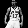
Lakers Home & Away
The collars are pretty different, I'd seen it in the Lonzo Ball screenshot but wasn't sure if they'd keep that in the actual design. I'm glad they didn't fudge with it too much.
Official link.
Nike and the NBA Reveal First uniforms
33 posts
• Page 2 of 2 • 1, 2
Re: Nike and the NBA Reveal First uniforms
![]() by Jackal on Sat Aug 12, 2017 3:53 am
by Jackal on Sat Aug 12, 2017 3:53 am
-

Jackal - Posts: 14877
- Joined: Fri Mar 21, 2003 2:59 am
Re: Nike and the NBA Reveal First uniforms
![]() by [Q] on Sat Aug 12, 2017 4:11 am
by [Q] on Sat Aug 12, 2017 4:11 am
Did you notice they called the white association and gold jersey Icon? By Nike's terms white is home and gold is away, but since the home team picks, I could see them continuing tradition of gold home, white on sundays for Chick ☝☝

-
[Q] - NBA Live 18 Advocate
- Posts: 14396
- Joined: Tue Oct 01, 2002 8:20 am
- Location: Westside, the best side
Re: Nike and the NBA Reveal First uniforms
![]() by Jackal on Sat Aug 12, 2017 4:52 am
by Jackal on Sat Aug 12, 2017 4:52 am
Screw Nike. Their terminology isn't for me.
Completely agree with you, yellow = home, purple = away & white = sunday's. I'd be fine with them doing the sleeveless black Hollywood nights jerseys too, the sleeved ones just didn't look right to me.
I do believe they are also going to have a fifth "classic" jersey. Wonder which they'll opt for. I really liked those baby blue MPLS jerseys but my gut tells me they'll go with the darker shade blue version.
-
Jackal - Posts: 14877
- Joined: Fri Mar 21, 2003 2:59 am
Re: Nike and the NBA Reveal First uniforms
![]() by [Q] on Sat Aug 12, 2017 5:13 am
by [Q] on Sat Aug 12, 2017 5:13 am

This is what the almighty Conrad thinks
Honestly I'd be okay with it. I do like the baby blues a little more but they've already been done before and I'd prefer new ones I haven't seen yet. I hate when teams with long histories keep bringing back the same throwbacks instead of picking new ones
-
[Q] - NBA Live 18 Advocate
- Posts: 14396
- Joined: Tue Oct 01, 2002 8:20 am
- Location: Westside, the best side
Re: Nike and the NBA Reveal First uniforms
![]() by Andrew on Sat Aug 12, 2017 10:33 am
by Andrew on Sat Aug 12, 2017 10:33 am
I like the new Clippers jerseys. I'd say it's an improvement over the previous design.
Contact: Email | X | Bluesky
Modding Topics: NBA 2K10 | NBA Live 08 | NBA Live 07 | NBA Live 06 | NBA 2K6 | NBA Live 2005 | NBA Live 2004 | NBA Live 96
Story Topics: NBA Live 16 | NBA 2K14 | NBA 2K13 | NBA Live 06 (Part 2) | NBA Live 06 (HOF) | NBA Live 2004 (HOF)
NLSC: Podcast | The Friday Five | Monday Tip-Off | Wayback Wednesday | Facebook | X | YouTube | Instagram | Bluesky
Donations/Support: Patreon | PayPal
-
Andrew - Retro Basketball Gamer

- Posts: 115460
- Joined: Thu Aug 22, 2002 8:51 pm
- Location: Australia
Re: Nike and the NBA Reveal First uniforms
![]() by Lean on Sun Aug 13, 2017 12:45 pm
by Lean on Sun Aug 13, 2017 12:45 pm
So glad that the Clippers opted to use "CLIPPERS" for the wordmarks instead of those hideous jerseys from last year.
I see what you did there.
[Q] wrote:Also on Chris creamers site they showed the wolves jersey which doesn't look as bad as it did in that game screenshot. I kinda dog the look as its a bit different, similar to the wizards jersey
I see what you did there.

-

Lean - The Artist Formerly Known as Crappystuff
- Posts: 7775
- Joined: Mon Nov 13, 2006 8:49 pm
- Location: Pilipinas
Re: Nike and the NBA Reveal First uniforms
![]() by Andrew on Sun Aug 13, 2017 7:47 pm
by Andrew on Sun Aug 13, 2017 7:47 pm
Agreed. I felt the same way about the Spurs alternate that uses the alternate logo in place of a wordmark. It makes for a decent concept jersey or fan apparel, but I'm not a fan of the idea for an actual jersey. It's funny because I do actually like the Rockets old "pyjama" pinstripe jerseys which did have the team logo on the front, but since the logo included the Rockets wordmark, I'd say it works better than the aforementioned designs.
Contact: Email | X | Bluesky
Modding Topics: NBA 2K10 | NBA Live 08 | NBA Live 07 | NBA Live 06 | NBA 2K6 | NBA Live 2005 | NBA Live 2004 | NBA Live 96
Story Topics: NBA Live 16 | NBA 2K14 | NBA 2K13 | NBA Live 06 (Part 2) | NBA Live 06 (HOF) | NBA Live 2004 (HOF)
NLSC: Podcast | The Friday Five | Monday Tip-Off | Wayback Wednesday | Facebook | X | YouTube | Instagram | Bluesky
Donations/Support: Patreon | PayPal
-
Andrew - Retro Basketball Gamer
- Posts: 115460
- Joined: Thu Aug 22, 2002 8:51 pm
- Location: Australia
Re: Nike and the NBA Reveal First uniforms
![]() by [Q] on Sun Aug 13, 2017 11:55 pm
by [Q] on Sun Aug 13, 2017 11:55 pm
Lean wrote:So glad that the Clippers opted to use "CLIPPERS" for the wordmarks instead of those hideous jerseys from last year.[Q] wrote:Also on Chris creamers site they showed the wolves jersey which doesn't look as bad as it did in that game screenshot. I kinda dog the look as its a bit different, similar to the wizards jersey
I see what you did there.
Whoops. That was a typo. I meant dig
-
[Q] - NBA Live 18 Advocate
- Posts: 14396
- Joined: Tue Oct 01, 2002 8:20 am
- Location: Westside, the best side
33 posts
• Page 2 of 2 • 1, 2
Who is online
Users browsing this forum: No registered users and 14 guests