
I had read about the Hawks getting new Jerseys and didn't really think it was needed but what they pulled out of their ass is to me worse than the Clippers rebrand jerseys.
https://cmgajcatlantahawks.files.wordpr ... iforms.pdf
Jesus. Neon green with black and red?
New Hawks jerseys
20 posts
• Page 1 of 1
New Hawks jerseys
![]() by Jackal on Wed Jun 24, 2015 10:36 pm
by Jackal on Wed Jun 24, 2015 10:36 pm
-

Jackal - Posts: 14877
- Joined: Fri Mar 21, 2003 2:59 am
Re: New Hawks jerseys
![]() by Andrew on Wed Jun 24, 2015 10:59 pm
by Andrew on Wed Jun 24, 2015 10:59 pm
From SportsLogos.net:

Well...they're different, I'll give them that. For all the hate that the jerseys of the mid to late 90s get, I think they were far better than some of the designs we're seeing right now. From designs that are bit too outdated (Bucks) to interesting but weird designs (these Hawks jerseys) to the downright uninspired and terrible (Clippers), I think this might be one of the worst eras for uniforms. The 76ers' new designs are probably the best of the recent bunch, and while I do like them, parts of the design are a bit too old school in an outdated kind of way in my opinion.
As for the Hawks jerseys, though...the green is probably the worst thing about them, it looks odd and out of place. The triangle texture is a bit different and that's kind of cool, and I like how they're trying to incorporate some of the colours from older designs (which is why the green is there, I imagine), but...kinda weird.
Contact: Email | X | Bluesky
Modding Topics: NBA 2K10 | NBA Live 08 | NBA Live 07 | NBA Live 06 | NBA 2K6 | NBA Live 2005 | NBA Live 2004 | NBA Live 96
Story Topics: NBA Live 16 | NBA 2K14 | NBA 2K13 | NBA Live 06 (Part 2) | NBA Live 06 (HOF) | NBA Live 2004 (HOF)
NLSC: Podcast | The Friday Five | Monday Tip-Off | Wayback Wednesday | Facebook | X | YouTube | Instagram | Bluesky
Donations/Support: Patreon | PayPal
-
Andrew - Retro Basketball Gamer

- Posts: 115196
- Joined: Thu Aug 22, 2002 8:51 pm
- Location: Australia
Re: New Hawks jerseys
![]() by stereoxide on Wed Jun 24, 2015 11:44 pm
by stereoxide on Wed Jun 24, 2015 11:44 pm
It might be good if they had the right color combinations. The triangular pattern makes it look an NCAA jersey but I hope it will grow on me.
-

stereoxide - Posts: 730
- Joined: Sat Jun 06, 2009 4:37 pm
- Location: Philippines
Re: New Hawks jerseys
![]() by Moz on Wed Jun 24, 2015 11:55 pm
by Moz on Wed Jun 24, 2015 11:55 pm
In before anyone says it... ILLUMINATI!!!
Are those embossed (the black kit seems to look like it is) or is it just like those T-Mac era Magic jerseys? The black and red kits looks alright while the white one seems needing some trims to make it less bland...
Are those embossed (the black kit seems to look like it is) or is it just like those T-Mac era Magic jerseys? The black and red kits looks alright while the white one seems needing some trims to make it less bland...

Nationwide is on your side...
-
Moz - What a load of bollocks...
- Posts: 1332
- Joined: Wed Mar 07, 2007 8:00 pm
- Location: Superunknown
Re: New Hawks jerseys
![]() by Andrew on Thu Jun 25, 2015 12:08 am
by Andrew on Thu Jun 25, 2015 12:08 am
Agreed. Aside from the green, the black and red jerseys are fine, but the home white feels too plain.
Contact: Email | X | Bluesky
Modding Topics: NBA 2K10 | NBA Live 08 | NBA Live 07 | NBA Live 06 | NBA 2K6 | NBA Live 2005 | NBA Live 2004 | NBA Live 96
Story Topics: NBA Live 16 | NBA 2K14 | NBA 2K13 | NBA Live 06 (Part 2) | NBA Live 06 (HOF) | NBA Live 2004 (HOF)
NLSC: Podcast | The Friday Five | Monday Tip-Off | Wayback Wednesday | Facebook | X | YouTube | Instagram | Bluesky
Donations/Support: Patreon | PayPal
-
Andrew - Retro Basketball Gamer
- Posts: 115196
- Joined: Thu Aug 22, 2002 8:51 pm
- Location: Australia

Re: New Hawks jerseys
![]() by Moz on Thu Jun 25, 2015 12:19 am
by Moz on Thu Jun 25, 2015 12:19 am
I reckon, after taking a closer look, it isn't green but pale yellow... It makes more sense, for their current scheme, if those are yellow (though as you said they've used green back then)...
Nationwide is on your side...
-
Moz - What a load of bollocks...
- Posts: 1332
- Joined: Wed Mar 07, 2007 8:00 pm
- Location: Superunknown
Re: New Hawks jerseys
![]() by Andrew on Thu Jun 25, 2015 12:21 am
by Andrew on Thu Jun 25, 2015 12:21 am
Right again; a slightly different yellow to the one they were using in the late 90s/early 2000s, unless my monitor needs adjusting. Something about it doesn't seem quite right, at any rate.
Contact: Email | X | Bluesky
Modding Topics: NBA 2K10 | NBA Live 08 | NBA Live 07 | NBA Live 06 | NBA 2K6 | NBA Live 2005 | NBA Live 2004 | NBA Live 96
Story Topics: NBA Live 16 | NBA 2K14 | NBA 2K13 | NBA Live 06 (Part 2) | NBA Live 06 (HOF) | NBA Live 2004 (HOF)
NLSC: Podcast | The Friday Five | Monday Tip-Off | Wayback Wednesday | Facebook | X | YouTube | Instagram | Bluesky
Donations/Support: Patreon | PayPal
-
Andrew - Retro Basketball Gamer
- Posts: 115196
- Joined: Thu Aug 22, 2002 8:51 pm
- Location: Australia
Re: New Hawks jerseys
![]() by Kevin on Thu Jun 25, 2015 12:24 am
by Kevin on Thu Jun 25, 2015 12:24 am
Welp, at least it doesn't look as bad as the Clippers'. That yellow/green tint is bugging me off. Either that or the picture is really low res
Rest In Peace Kobe
-
Kevin - Fuck the Celtics
- Posts: 8038
- Joined: Sat Nov 16, 2013 9:47 pm
- Location: Staples
Re: New Hawks jerseys
![]() by Solaris Phase Two on Thu Jun 25, 2015 1:34 am
by Solaris Phase Two on Thu Jun 25, 2015 1:34 am
They look awesome to me. I hope someone mods these into 2k15

-

Solaris Phase Two - Posts: 522
- Joined: Wed Jul 13, 2011 8:10 am
Re: New Hawks jerseys
![]() by Andrew on Thu Jun 25, 2015 1:34 am
by Andrew on Thu Jun 25, 2015 1:34 am
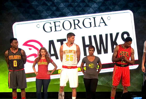
Better look at the yellow, and it doesn't look quite as bad in that shot. Still don't love them, but with a better look at the colours, they're not as bad as I thought at first glance.
Contact: Email | X | Bluesky
Modding Topics: NBA 2K10 | NBA Live 08 | NBA Live 07 | NBA Live 06 | NBA 2K6 | NBA Live 2005 | NBA Live 2004 | NBA Live 96
Story Topics: NBA Live 16 | NBA 2K14 | NBA 2K13 | NBA Live 06 (Part 2) | NBA Live 06 (HOF) | NBA Live 2004 (HOF)
NLSC: Podcast | The Friday Five | Monday Tip-Off | Wayback Wednesday | Facebook | X | YouTube | Instagram | Bluesky
Donations/Support: Patreon | PayPal
-
Andrew - Retro Basketball Gamer
- Posts: 115196
- Joined: Thu Aug 22, 2002 8:51 pm
- Location: Australia
Re: New Hawks jerseys
![]() by stereoxide on Thu Jun 25, 2015 1:39 am
by stereoxide on Thu Jun 25, 2015 1:39 am
The red and especially the white jersey reminds me of McDonald's or am I just hungry?
-
stereoxide - Posts: 730
- Joined: Sat Jun 06, 2009 4:37 pm
- Location: Philippines
Re: New Hawks jerseys
![]() by Solaris Phase Two on Thu Jun 25, 2015 1:41 am
by Solaris Phase Two on Thu Jun 25, 2015 1:41 am
Andrew wrote:[ Image ]
Better look at the yellow, and it doesn't look quite as bad in that shot. Still don't love them, but with a better look at the colours, they're not as bad as I thought at first glance.
Its officially called Volt Green. But i like how it looks yellow. The fans actually wanted yellow.
-
Solaris Phase Two - Posts: 522
- Joined: Wed Jul 13, 2011 8:10 am
Re: New Hawks jerseys
![]() by Kevin on Thu Jun 25, 2015 1:46 am
by Kevin on Thu Jun 25, 2015 1:46 am
It looks good with the home jersey but the away one is just weird.
Rest In Peace Kobe
-
Kevin - Fuck the Celtics
- Posts: 8038
- Joined: Sat Nov 16, 2013 9:47 pm
- Location: Staples
Re: New Hawks jerseys
![]() by Murat on Thu Jun 25, 2015 1:50 am
by Murat on Thu Jun 25, 2015 1:50 am
Looks better than these blue and red uniforms. The black one is astonishing.

- Murat
- The modder formerly known as Badger

- Posts: 6488
- Joined: Sun Feb 14, 2010 6:07 am
- Location: US/East Coast
Re: New Hawks jerseys
![]() by JaoSming on Thu Jun 25, 2015 2:31 am
by JaoSming on Thu Jun 25, 2015 2:31 am
meh, something different at least.......
....maybe too different
....maybe too different
- JaoSming
- 2KTV Producer

- Posts: 29904
- Joined: Tue Sep 13, 2005 12:45 am
- Location: 2K
Re: New Hawks jerseys
![]() by Andrew on Thu Jun 25, 2015 10:24 am
by Andrew on Thu Jun 25, 2015 10:24 am
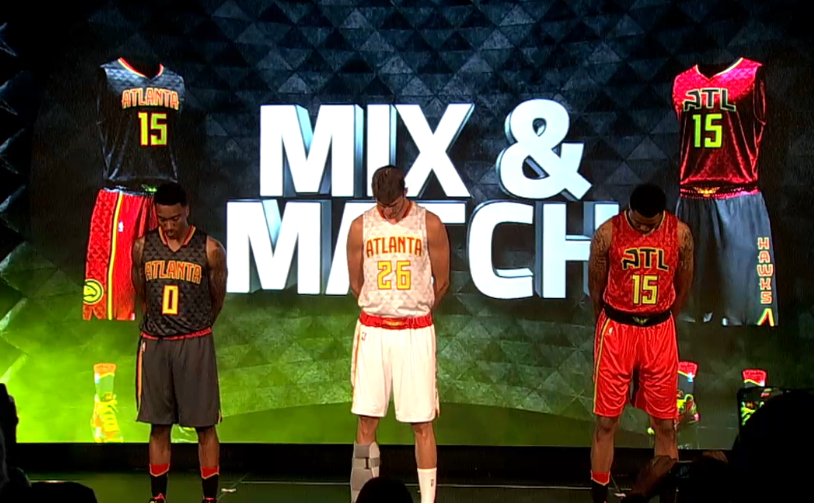
Yeah, I don't care for the mixing and matching. I hope they don't actually do that. I mean, it's a minor complaint in the grand scheme of things, but it's just a weird look.
Contact: Email | X | Bluesky
Modding Topics: NBA 2K10 | NBA Live 08 | NBA Live 07 | NBA Live 06 | NBA 2K6 | NBA Live 2005 | NBA Live 2004 | NBA Live 96
Story Topics: NBA Live 16 | NBA 2K14 | NBA 2K13 | NBA Live 06 (Part 2) | NBA Live 06 (HOF) | NBA Live 2004 (HOF)
NLSC: Podcast | The Friday Five | Monday Tip-Off | Wayback Wednesday | Facebook | X | YouTube | Instagram | Bluesky
Donations/Support: Patreon | PayPal
-
Andrew - Retro Basketball Gamer
- Posts: 115196
- Joined: Thu Aug 22, 2002 8:51 pm
- Location: Australia
Re: New Hawks jerseys
![]() by [Q] on Thu Jun 25, 2015 11:29 am
by [Q] on Thu Jun 25, 2015 11:29 am
I actually like these, especially the triangles. I'm glad they finally did away with the navy blue.
The red top and black shorts doesn't look too bad but I don't like it the other way around.
The red top and black shorts doesn't look too bad but I don't like it the other way around.

-

[Q] - NBA Live 18 Advocate

- Posts: 14396
- Joined: Tue Oct 01, 2002 8:20 am
- Location: Westside, the best side
Re: New Hawks jerseys
![]() by Bruce on Thu Jun 25, 2015 2:25 pm
by Bruce on Thu Jun 25, 2015 2:25 pm
stereoxide wrote:It might be good if they had the right color combinations. The triangular pattern makes it look an NCAA jersey but I hope it will grow on me.
I wish this forum had likes or +1s. LOL
YEAH BOY!
-

Bruce - Posts: 799
- Joined: Fri Oct 28, 2005 7:21 pm
Re: New Hawks jerseys
![]() by mp3 on Fri Jun 26, 2015 5:08 am
by mp3 on Fri Jun 26, 2015 5:08 am
Bruce wrote:stereoxide wrote:It might be good if they had the right color combinations. The triangular pattern makes it look an NCAA jersey but I hope it will grow on me.
I wish this forum had likes or +1s. LOL
I "like" and "and1" this post.
Not a fan of some of theses jerseys teams are putting out this summer.
Youtube - mp3 Basketball Gaming
-

mp3 - Posts: 5356
- Joined: Mon Feb 24, 2003 12:45 am
20 posts
• Page 1 of 1
Who is online
Users browsing this forum: No registered users and 10 guests