
I've worked on a personal identity recently, and have been since working on a portfolio website to display my work...I've finished and launched it, so please visit it here:
Red Goat Creations
Please let me know if there are any problems with graphics, grammar, or execution. I would really like to here any thoughts you might have on what I've made. thanks...
www.conradburry.com (updates made)
17 posts
• Page 1 of 1
www.conradburry.com (updates made)
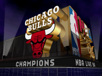
![]() by c0nr4d on Sun Jul 05, 2009 3:54 pm
by c0nr4d on Sun Jul 05, 2009 3:54 pm
Last edited by c0nr4d on Wed Jul 08, 2009 3:40 am, edited 1 time in total.
-

c0nr4d - The One and Only

- Posts: 3211
- Joined: Thu Apr 29, 2004 8:31 am
- Location: East TN
Re: www.conradburry.com (red goat creations)
![]() by Modifly on Sun Jul 05, 2009 4:09 pm
by Modifly on Sun Jul 05, 2009 4:09 pm
They're really nice c0nr4d.  I've had a quick look through most of the stuff there and I really like them.

-

Modifly - On a hiatus..
- Posts: 4077
- Joined: Sun Jan 27, 2008 2:04 pm
- Location: Thailand
Re: www.conradburry.com (red goat creations)
![]() by J@3 on Sun Jul 05, 2009 5:35 pm
by J@3 on Sun Jul 05, 2009 5:35 pm
This doesn't really belong here but I guess no one would see it if it were in the PS section. Carry on.
-

J@3 - Posts: 19815
- Joined: Thu Mar 11, 2004 3:25 pm
- Location: MLB
Re: www.conradburry.com (red goat creations)
![]() by Null17 on Sun Jul 05, 2009 6:14 pm
by Null17 on Sun Jul 05, 2009 6:14 pm
Actually stumbled upon it googling for your NBA Europe project. That was before it was completed though. You going freelance?
Have to redo my site as well. My site is more of just my personal project since I work under an agency.
Have to redo my site as well. My site is more of just my personal project since I work under an agency.
- Null17
- Posts: 4543
- Joined: Thu Jan 29, 2004 6:55 pm
- Location: Philippines
Re: www.conradburry.com (red goat creations)
![]() by Lean on Sun Jul 05, 2009 8:59 pm
by Lean on Sun Jul 05, 2009 8:59 pm
You have been an inspiration to improve my work Conrad. I will bring you down someday. 
Kidding aside, your site is clean. I admire the simplicity in it.
Kidding aside, your site is clean. I admire the simplicity in it.

-

Lean - The Artist Formerly Known as Crappystuff
- Posts: 7775
- Joined: Mon Nov 13, 2006 8:49 pm
- Location: Pilipinas
Re: www.conradburry.com (red goat creations)
![]() by cyanide on Mon Jul 06, 2009 1:37 am
by cyanide on Mon Jul 06, 2009 1:37 am
Some awesome logo work! Very nice. Hopefully you're able to specialize into the corporate identity field, if you're not already.
I also appreciate the use of simplicity on your website. I do have some suggestions and usability improvements though, that you may want to consider (I have a BDes in VCD and do this for a living, so I'm qualified to do this )
)
- have you tried making the stroke of the C horizontally thicker on your personal logo?
- on the homepage, you have 3 image links, but only one is labelled (NBA Europa/launch); I suggest labeling each
- avoid under construction pages. If it's not completed, don't have it up.
- in the contact page, make it clear what's clickable and what's not (i.e. add color or underline to visible links, because they look like text right now). Also, users will attempt to click on the icon, so consider making that into a link as well.
- You may benefit having the side icons in a thicker stroke.
- There's too much gradients. Try to use it when it is appropriate to do so, otherwise it becomes ornamentation—a mask. It gets really dark on the bottom left when you're on the contact page.
I also appreciate the use of simplicity on your website. I do have some suggestions and usability improvements though, that you may want to consider (I have a BDes in VCD and do this for a living, so I'm qualified to do this
- have you tried making the stroke of the C horizontally thicker on your personal logo?
- on the homepage, you have 3 image links, but only one is labelled (NBA Europa/launch); I suggest labeling each
- avoid under construction pages. If it's not completed, don't have it up.
- in the contact page, make it clear what's clickable and what's not (i.e. add color or underline to visible links, because they look like text right now). Also, users will attempt to click on the icon, so consider making that into a link as well.
- You may benefit having the side icons in a thicker stroke.
- There's too much gradients. Try to use it when it is appropriate to do so, otherwise it becomes ornamentation—a mask. It gets really dark on the bottom left when you're on the contact page.
if you were killed tomorrow, i WOULDNT GO 2 UR FUNERAL CUZ ID B N JAIL 4 KILLIN THE MOTHA FUCKER THAT KILLED U!
......|..___________________, ,
....../ `---______----|]
...../==o;;;;;;;;______.:/
.....), ---.(_(__) /
....// (..) ), ----"
...//___//
..//___//
.//___//
WE TRUE HOMIES
WE RIDE TOGETHER
WE DIE TOGETHER
......|..___________________, ,
....../ `---______----|]
...../==o;;;;;;;;______.:/
.....), ---.(_(__) /
....// (..) ), ----"
...//___//
..//___//
.//___//
WE TRUE HOMIES
WE RIDE TOGETHER
WE DIE TOGETHER
-

cyanide - Dat steatopygous
- Posts: 9197
- Joined: Sat Oct 11, 2003 6:09 am
- Location: US's toque
-

Its_asdf - I'm kind of a big deal.
- Posts: 5462
- Joined: Sat Mar 19, 2005 4:53 am
- Location: Under a Rock in Canada
Re: www.conradburry.com (red goat creations)
![]() by Calamaro on Mon Jul 06, 2009 2:12 pm
by Calamaro on Mon Jul 06, 2009 2:12 pm
Nice work man
I really like the Reduce campaign. Are you going to keep uploading your work?
I really like the Reduce campaign. Are you going to keep uploading your work?

- Calamaro
- Posts: 86
- Joined: Wed Feb 11, 2009 5:16 am
Re: www.conradburry.com (red goat creations)
![]() by Andrew on Mon Jul 06, 2009 2:19 pm
by Andrew on Mon Jul 06, 2009 2:19 pm
Cool stuff. I quite like your take on new designs for the Blazers, I hadn't seen that before.
Contact: Email | X | Bluesky
Modding Topics: NBA 2K10 | NBA Live 08 | NBA Live 07 | NBA Live 06 | NBA 2K6 | NBA Live 2005 | NBA Live 2004 | NBA Live 96
Story Topics: NBA Live 16 | NBA 2K14 | NBA 2K13 | NBA Live 06 (Part 2) | NBA Live 06 (HOF) | NBA Live 2004 (HOF)
NLSC: Podcast | The Friday Five | Monday Tip-Off | Wayback Wednesday | Facebook | X | YouTube | Instagram | Bluesky
Donations/Support: Patreon | PayPal
-
Andrew - Retro Basketball Gamer

- Posts: 115431
- Joined: Thu Aug 22, 2002 8:51 pm
- Location: Australia
Re: www.conradburry.com (red goat creations)
![]() by kibaxx7 on Tue Jul 07, 2009 4:46 am
by kibaxx7 on Tue Jul 07, 2009 4:46 am
Didn't see the rebrandings either, it's superb.
× Watched: Evolution (2001) ×
-

kibaxx7 - ギャラドス
- Posts: 12673
- Joined: Fri Oct 08, 2004 11:34 am
- Location: Buenos Aires, Argentina
Re: www.conradburry.com (red goat creations)
![]() by Cartar on Tue Jul 07, 2009 4:57 am
by Cartar on Tue Jul 07, 2009 4:57 am
Just one word: WOW  . Great as always.
Last edited by Cartar on Tue Jul 07, 2009 5:18 am, edited 1 time in total.
- Cartar
- Posts: 2600
- Joined: Wed May 02, 2007 10:02 pm
Re: www.conradburry.com (red goat creations)
![]() by c0nr4d on Tue Jul 07, 2009 4:59 am
by c0nr4d on Tue Jul 07, 2009 4:59 am
thanks for taking a look everyone
thanks a bunch Cy, i really appreciate the time you took to give my site a once-over. thats the kind of feedback i need to make this as successful as it can be.
I'll work on these issues soon and hopefully get more feedback from you.
cyanide wrote:- have you tried making the stroke of the C horizontally thicker on your personal logo?
- on the homepage, you have 3 image links, but only one is labelled (NBA Europa/launch); I suggest labeling each
- avoid under construction pages. If it's not completed, don't have it up.
- in the contact page, make it clear what's clickable and what's not (i.e. add color or underline to visible links, because they look like text right now). Also, users will attempt to click on the icon, so consider making that into a link as well.
- You may benefit having the side icons in a thicker stroke.
- There's too much gradients. Try to use it when it is appropriate to do so, otherwise it becomes ornamentation—a mask. It gets really dark on the bottom left when you're on the contact page.
thanks a bunch Cy, i really appreciate the time you took to give my site a once-over. thats the kind of feedback i need to make this as successful as it can be.
I'll work on these issues soon and hopefully get more feedback from you.
-
c0nr4d - The One and Only
- Posts: 3211
- Joined: Thu Apr 29, 2004 8:31 am
- Location: East TN
Re: www.conradburry.com (red goat creations)
![]() by c0nr4d on Wed Jul 08, 2009 3:40 am
by c0nr4d on Wed Jul 08, 2009 3:40 am
I've made some changes on the site from what comments I've received on it:
Updated Site
I added a text-only version of my resume (in addition to the image version), and I linked to both of these on the home page and the contact page. Also, I changed the background color of the site (and the litebox background color) to a charcoal color so as not to compete with the colors in my design work (people said the maroon was overpowering). I also edited the links on the contact page to be more apparent, and thickened the stroke on the left nav buttons to be more prominent on the page. Thanks again for your input (especially Cy)...how's this all look?
-
c0nr4d - The One and Only
- Posts: 3211
- Joined: Thu Apr 29, 2004 8:31 am
- Location: East TN
Re: www.conradburry.com (updates made)
![]() by kibaxx7 on Wed Jul 08, 2009 4:24 am
by kibaxx7 on Wed Jul 08, 2009 4:24 am
Added you in Facebook, bro
Question: You still making jerseys for Live?
Question: You still making jerseys for Live?
× Watched: Evolution (2001) ×
-
kibaxx7 - ギャラドス
- Posts: 12673
- Joined: Fri Oct 08, 2004 11:34 am
- Location: Buenos Aires, Argentina
Re: www.conradburry.com (updates made)
![]() by Martti. on Wed Jul 08, 2009 7:02 pm
by Martti. on Wed Jul 08, 2009 7:02 pm
Wow, really incredible work! The NBA Europa looks great now when completed. I followed your progress throughout the creation.
-

Martti. - #HeatLifer
- Posts: 8101
- Joined: Mon Oct 09, 2006 5:19 am
Re: www.conradburry.com (updates made)
![]() by Modifly on Wed Jul 08, 2009 8:52 pm
by Modifly on Wed Jul 08, 2009 8:52 pm
I had a look at it and compared it to what Cyanide recommended you to do earlier, looks really great to me!
Here are some of the things I came across:
- Your virtual business card is really nice, but it flips over too fast. I didn't had enough time to read the contents on it nor does I had enough time to look at the picture on the other side, and I'm quite a fast reader so you might want to take this into consideration.
- When I point the pointer to the contact thumbnail, the text that appears said "how do you get ahold of me?". I'm not quite sure about this but maybe it should be "how do you get a hold of me" ?
Hope those helps.
-
Modifly - On a hiatus..
- Posts: 4077
- Joined: Sun Jan 27, 2008 2:04 pm
- Location: Thailand
Re: www.conradburry.com (updates made)
![]() by cyanide on Thu Jul 09, 2009 5:01 am
by cyanide on Thu Jul 09, 2009 5:01 am
Modifly wrote:I'm not quite sure about this but maybe it should be "how do you get a hold of me" ?
Ahold is actually correct, though I do prefer conventional web language such as, "Contact Conrad," which is short, sweet and to the point. I think too many designers try to be linguistically creative when a large aspect of their job is to communicate the message.
Other than the suggestions I've mentioned, I'm really liking the labels and the underlined hyperlinks, as it really helps with usability. Anything else I'll give is subjective and nitpicky
if you were killed tomorrow, i WOULDNT GO 2 UR FUNERAL CUZ ID B N JAIL 4 KILLIN THE MOTHA FUCKER THAT KILLED U!
......|..___________________, ,
....../ `---______----|]
...../==o;;;;;;;;______.:/
.....), ---.(_(__) /
....// (..) ), ----"
...//___//
..//___//
.//___//
WE TRUE HOMIES
WE RIDE TOGETHER
WE DIE TOGETHER
......|..___________________, ,
....../ `---______----|]
...../==o;;;;;;;;______.:/
.....), ---.(_(__) /
....// (..) ), ----"
...//___//
..//___//
.//___//
WE TRUE HOMIES
WE RIDE TOGETHER
WE DIE TOGETHER
-
cyanide - Dat steatopygous
- Posts: 9197
- Joined: Sat Oct 11, 2003 6:09 am
- Location: US's toque
17 posts
• Page 1 of 1
Who is online
Users browsing this forum: No registered users and 9 guests