Before:

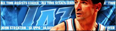
The Graphic

Now I think there is too much contrast on it too lol.
![]() by Ruff Ryder on Wed Feb 15, 2006 6:53 am
by Ruff Ryder on Wed Feb 15, 2006 6:53 am


![]() by Ruff Ryder on Wed Feb 15, 2006 9:17 am
by Ruff Ryder on Wed Feb 15, 2006 9:17 am
![]() by Colin on Wed Feb 15, 2006 4:08 pm
by Colin on Wed Feb 15, 2006 4:08 pm


![]() by zmac on Wed Feb 15, 2006 4:50 pm
by zmac on Wed Feb 15, 2006 4:50 pm


![]() by Null17 on Wed Feb 15, 2006 5:29 pm
by Null17 on Wed Feb 15, 2006 5:29 pm
![]() by PiksS on Thu Feb 16, 2006 5:46 am
by PiksS on Thu Feb 16, 2006 5:46 am


![]() by jester1189 on Fri Feb 24, 2006 2:35 am
by jester1189 on Fri Feb 24, 2006 2:35 am


![]() by Ruff Ryder on Fri Feb 24, 2006 9:29 am
by Ruff Ryder on Fri Feb 24, 2006 9:29 am
TOXIC wrote:What was the set of brushes you made for the NATE ROBINSON SIG Jester?
![]() by cyanide on Fri Feb 24, 2006 11:30 am
by cyanide on Fri Feb 24, 2006 11:30 am
The Black Death wrote:Stop asking for brushes.Make a sig without them for a change, contrary to popular belief, IT IS POSSIBLE!
![]() by The GOAT on Fri Feb 24, 2006 11:41 am
by The GOAT on Fri Feb 24, 2006 11:41 am


![]() by mark_30_112 on Sat Feb 25, 2006 9:18 am
by mark_30_112 on Sat Feb 25, 2006 9:18 am
 “I'm just honored to play for the Jazz and to play after John Stockton, to wear the same jersey he wore and be on the same floor he was on because he's one of the best players of all-time, one of the best point guards of all-time" Derron Williams - Utah Jazz
Users browsing this forum: No registered users and 5 guests