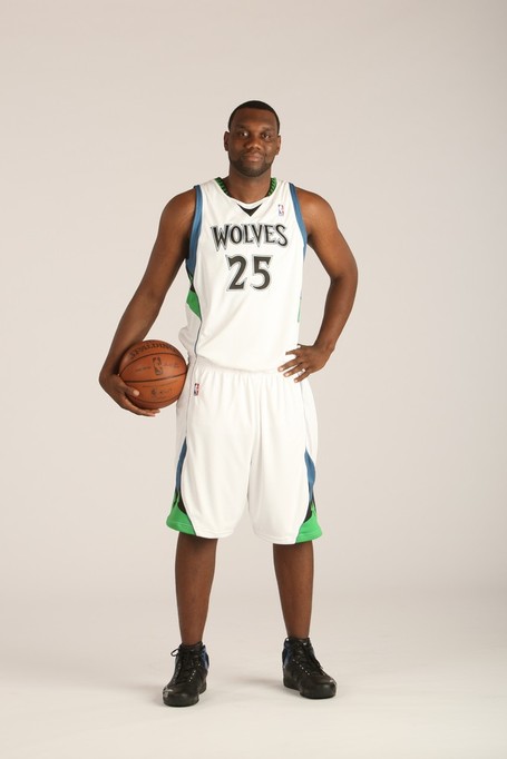
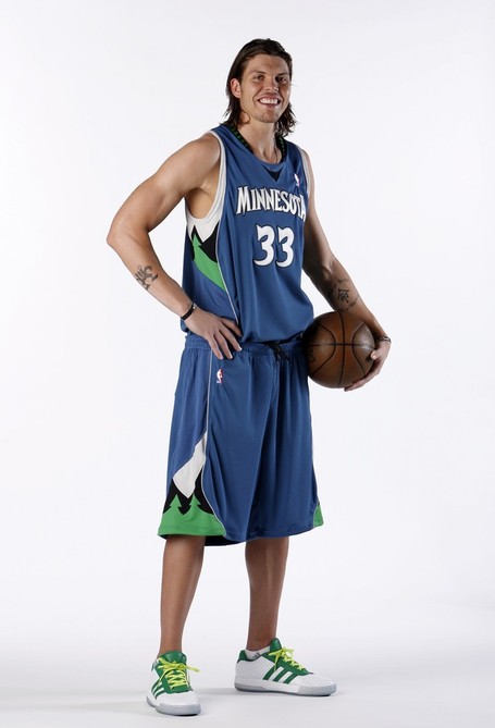
New 08-09 Logos / Jerseys [2 new jerseys!]
Crimson Penguin wrote:When do we get to see the Hornets new jerseys?
conr4d already got it..and i believe pepis21 already posted it in a jersey thread for 08..and wow..the alternate jersey of NOLA is oh so great!..wow!..the home jersey of the twolves looks better than the away..wait..there's more..the magic are introducing a new version of pinstripes..

-

Billie - Posts: 195
- Joined: Tue Jul 08, 2008 11:25 am
- Location: Spooner St.
looks like they ripped off the colors of the Denver Nuggets
http://i67.photobucket.com/albums/h296/ ... _home2.png
http://i67.photobucket.com/albums/h296/ ... _away2.png
http://i67.photobucket.com/albums/h296/ ... oh_alt.png
:
http://i67.photobucket.com/albums/h296/ ... _home2.png
http://i67.photobucket.com/albums/h296/ ... _away2.png
http://i67.photobucket.com/albums/h296/ ... oh_alt.png
:
Allen Iverson passing on family values:
A.I.: son, what you doing there?
A.I.'s son: practicing my math for my test tommorow
A.I: practice? practice? we talkin' 'bout practice. not the test - practice. we talkin' 'bout practice. not the test, not the test - practice.
A.I.: son, what you doing there?
A.I.'s son: practicing my math for my test tommorow
A.I: practice? practice? we talkin' 'bout practice. not the test - practice. we talkin' 'bout practice. not the test, not the test - practice.
-

Fcuk Orlando - Posts: 474
- Joined: Sat Oct 27, 2007 12:18 pm
those Hornets jerseys i posted are just ideas based on stuff that has been leaked...they aren't official by any standards. also, that alternate hornets jersey i made it just a concept, they can't have an alternate jersey until the 2010-11 season.
none of the stuff I have been posting is official (yet ), its all just ideas I have based on the leaked parts of jerseys we've seen that ARE official.
none of the stuff I have been posting is official (yet
-

c0nr4d - The One and Only

- Posts: 3211
- Joined: Thu Apr 29, 2004 8:31 am
- Location: East TN
dramacydal wrote:c0nr4d wrote:they can't have an alternate jersey until the 2010-11 season.
Why's that?
its a league rule that whenever a team changes logos and/or jerseys, they have to wait 2 seasons before they can add a 3rd jersey. the rule is there to fully establish the 2 jerseys as the new identity for the team.
-

c0nr4d - The One and Only

- Posts: 3211
- Joined: Thu Apr 29, 2004 8:31 am
- Location: East TN
I still like the throwback aspect of the pinstripes. It's not a huge change but I like the result.

Contact: Email | X | Bluesky
Modding Topics: NBA 2K10 | NBA Live 08 | NBA Live 07 | NBA Live 06 | NBA 2K6 | NBA Live 2005 | NBA Live 2004 | NBA Live 96
Story Topics: NBA Live 16 | NBA 2K14 | NBA 2K13 | NBA Live 06 (Part 2) | NBA Live 06 (HOF) | NBA Live 2004 (HOF)
NLSC: Podcast | The Friday Five | Monday Tip-Off | Wayback Wednesday | Facebook | X | YouTube | Instagram | Bluesky
Donations/Support: Patreon | PayPal
-
Andrew - Retro Basketball Gamer

- Posts: 115339
- Joined: Thu Aug 22, 2002 8:51 pm
- Location: Australia
-

kaiser_kobe - Posts: 491
- Joined: Mon May 05, 2008 1:16 am
- Location: Philippines
- shadowgrin
- Doesn't negotiate with terrorists. NLSC's Jefferson Davis. The Questioneer
- Posts: 23229
- Joined: Thu Dec 12, 2002 6:21 am
- Location: In your mind
good find
Doesn't look that bad as it did in the first one with Love, but it'll take some time getting used to it. My only big complain of the jersey is still the collar. At the side of the neck is still the design of the old jerseys, which is weird. If they want a new jersey design, then stick with it. That part of the old collar is just inappropriate.
Doesn't look that bad as it did in the first one with Love, but it'll take some time getting used to it. My only big complain of the jersey is still the collar. At the side of the neck is still the design of the old jerseys, which is weird. If they want a new jersey design, then stick with it. That part of the old collar is just inappropriate.
-

buzzy - Take it sleazy.

- Posts: 4033
- Joined: Sun Jul 03, 2005 11:19 pm
- Location: Vienna
I kinda like it.
El Badmanator VI: AMD Ryzen 9 5900X @3.7GHz, Nvidia GTX 3090 24GB; Acer Predator XB273K 4K 27"Monitor; Samsung NVMe EVO 970 1TB / Samsung EVO Pro 500GS SSD; Gigabyte X570 Aorus Elite; T-Force RAM DDR4-4000 32GB RAM; EVGA G5 850W PSU; Corsair iCUE H100i CPU Liquid Cooler; Razer DeathAdder Chroma wireless gaming mouse; HyperX Cloud Flight S wireless headset; Logitech G560 speakers; Razer Black Widow v3 mechanical keyboard; PS5 Dualsense controller; Rosewill Cullinan V500 gaming case; Windows 10 Pro 64bit
el badman's bandcamp
el badman's bandcamp
-

el badman - Last of the Meheecans
- Posts: 4246
- Joined: Sun Sep 24, 2006 3:42 am
- Location: El Paso, TX
-

Tyler - Posts: 329
- Joined: Sat Jun 21, 2008 3:26 pm
- Location: Canada
Agreed, it looks a bit better than the first picture but it could just be that I've seen it before and am a little used to it. Still looks a bit awkward to me.

Contact: Email | X | Bluesky
Modding Topics: NBA 2K10 | NBA Live 08 | NBA Live 07 | NBA Live 06 | NBA 2K6 | NBA Live 2005 | NBA Live 2004 | NBA Live 96
Story Topics: NBA Live 16 | NBA 2K14 | NBA 2K13 | NBA Live 06 (Part 2) | NBA Live 06 (HOF) | NBA Live 2004 (HOF)
NLSC: Podcast | The Friday Five | Monday Tip-Off | Wayback Wednesday | Facebook | X | YouTube | Instagram | Bluesky
Donations/Support: Patreon | PayPal
-

Andrew - Retro Basketball Gamer

- Posts: 115339
- Joined: Thu Aug 22, 2002 8:51 pm
- Location: Australia
-

cighvin3642 - NBA/PBA Live 2003 Patcher
- Posts: 1094
- Joined: Fri Dec 02, 2005 3:31 pm
- Location: PILIPINAS
Looks better than the pic with Love, the fonts look better with those new pics. And I agree that the trees in the collar should be [cheesyjoke] "cut down" [/cheesyjoke]. They could've made it in solid color. Like black.
-

Lean - The Artist Formerly Known as Crappystuff

- Posts: 7775
- Joined: Mon Nov 13, 2006 8:49 pm
- Location: Pilipinas
Better than the first preview posted here, the one with Love, where the "Minnesota" wordmark is too small and centered. But the logo at the back looks abnormal.
Interestingly, they wear black shoes at home jerseys and white shoes for the away one. Or is't only in the pictorial?
For the hornets, i like c0nr4d's concept more..the hornets just put pinstripes at their old jersey and added a new design for the side panel.
Interestingly, they wear black shoes at home jerseys and white shoes for the away one. Or is't only in the pictorial?
For the hornets, i like c0nr4d's concept more..the hornets just put pinstripes at their old jersey and added a new design for the side panel.
Last edited by Billie on Thu Aug 21, 2008 11:46 am, edited 1 time in total.

-

Billie - Posts: 195
- Joined: Tue Jul 08, 2008 11:25 am
- Location: Spooner St.
-

Tyler - Posts: 329
- Joined: Sat Jun 21, 2008 3:26 pm
- Location: Canada
Who is online
Users browsing this forum: No registered users and 5 guests

