Fri Jun 27, 2008 6:01 pm
Not necessarily a bad logo, but its somewhat sad. It seems that every team is ditching their identity just for marketing purposes. Notice how all of the teams are shifting towards similar colors? It's because they want to make apparel that people will wear and think is cool. Take those Celtics road uniforms for instance; a complete abomination. Whatever happened to tradition and establishing a team identity? As long as they stay somewhat true to what they have then i'm happy.
Sun Jun 29, 2008 9:03 pm
They look pretty to me, though I think the alternate would have been better had they kept a touch of green in there.
Mon Jun 30, 2008 2:09 am
final official raps primary recolored (decent):

yet another nuggs recolor of the same logo (boring):

worst anniversary logo in nba history (?):

magic anniversary (coulda been better imo):

yet another nuggs recolor of the same logo (boring):
worst anniversary logo in nba history (?):
magic anniversary (coulda been better imo):
Mon Jun 30, 2008 2:17 am
that raptors logo looks much better.
the sixers aniv. logo looks kind of old fashioned to me.. the colors on it is somewhat attractive(in a bad way tho). I think they could have done better. the magic one is pretty simple, i like it.
the sixers aniv. logo looks kind of old fashioned to me.. the colors on it is somewhat attractive(in a bad way tho). I think they could have done better. the magic one is pretty simple, i like it.
Mon Jun 30, 2008 4:21 am
what's new about the nugs logo?
Mon Jun 30, 2008 4:43 am
The darker blue I guess.
The Sixers Anniversary logo is ugly. I hope they don't put in their jerseys and on their court.
The Sixers Anniversary logo is ugly. I hope they don't put in their jerseys and on their court.
Mon Jun 30, 2008 7:02 am
Hey.. Wanna know.. Are Nuggets gonna recolor their away jerseys (from sky blue to dark..) Or that logo is just based on their Alternate jersey?
Mon Jun 30, 2008 8:15 am
GazuN wrote:Hey.. Wanna know.. Are Nuggets gonna recolor their away jerseys (from sky blue to dark..) Or that logo is just based on their Alternate jersey?
u'll see soon, when i post screenshots of the 08-09 nuggs jerseys i made for NBA Live PC Project
here is the "new" Raps alternate logo btw:

Mon Jun 30, 2008 8:53 am
WTF? The 76ers logo is horrible :S
It looks like a circus sign
It looks like a circus sign
Mon Jun 30, 2008 2:23 pm
Greatest logo ever!
Who am I kidding
Who am I kidding
Mon Jun 30, 2008 8:04 pm
Without being biased I don't think the Sixers' logo looks too bad. If it wasn't for that butt-ugly totally out of place looking green in there it'd actually be pretty decent.
I like that they're going back to those red and blue themes and the old school logo. In my opinion they should have worn their new alternate jerseys more often than they did last season.
I like that they're going back to those red and blue themes and the old school logo. In my opinion they should have worn their new alternate jerseys more often than they did last season.
Tue Jul 01, 2008 12:37 pm
Agree, that "Anniversary" ribbon makes the whole logo craptacular.
Tue Jul 01, 2008 1:22 pm
dramacydal wrote: In my opinion they should have worn their new alternate jerseys more often than they did last season.
I love sixers' alternate jersey. They should wear it as the road jersey
Tue Jul 01, 2008 1:28 pm
c0nr4d wrote:final official raps primary recolored (decent):
yet another nuggs recolor of the same logo (boring):
worst anniversary logo in nba history (?):
magic anniversary (coulda been better imo):
I like that Raptors logo much better.
Not a fan of that ball though...
Tue Jul 01, 2008 2:23 pm
Did the NBA fire its best graphic designers or something? These are awful.
Wed Jul 02, 2008 4:21 am
GoHornets wrote:dramacydal wrote: In my opinion they should have worn their new alternate jerseys more often than they did last season.
I love sixers' alternate jersey. They should wear it as the road jersey
agreed...of any team in the nba the 1776ers should be wearing the most red, white, and blue.
i'll be posting some more logos soon, as i'll be getting more offical logos later 2nite
ps: and yes lamrock, ur right on the money there. awful is a great word to describe the latest "work" the nba marketing committee has done.
Wed Jul 02, 2008 9:21 am
GazuN wrote:Hey.. Wanna know.. Are Nuggets gonna recolor their away jerseys (from sky blue to dark..) Or that logo is just based on their Alternate jersey?
I found this one image where the new Nuggets jerseys are just some minor color changes. Nothing totally exciting.

Courtesy of BigFooty.com
Wed Jul 02, 2008 1:36 pm
bobcats anniversary logo:
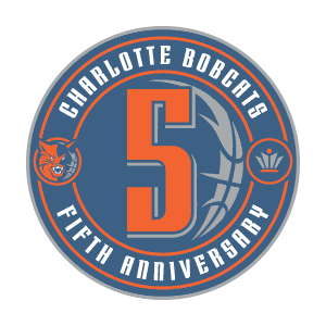
sort of weird to do a 5th anny, but whatev'...looks alright to me.
sort of weird to do a 5th anny, but whatev'...looks alright to me.
Wed Jul 02, 2008 1:56 pm
It's not a bad a logo but I agree, an anniversary celebration seems a bit premature.
Wed Jul 02, 2008 2:01 pm
The nuggets jersey is so boring... damn
And The bobcats are making this anniversary logo including the new bobcat face (on the right side)
Next: Some team is going to have their 43 anniversary logo ¬¬
And The bobcats are making this anniversary logo including the new bobcat face (on the right side)
Next: Some team is going to have their 43 anniversary logo ¬¬
Wed Jul 02, 2008 4:18 pm
c0nr4d wrote:bobcats anniversary logo:
sort of weird to do a 5th anny, but whatev'...looks alright to me.
Wed Jul 02, 2008 5:28 pm
At least it's a reasonably sensible number since five or ten year increments usually hold some significance, but celebrating five years in the league - especially when they haven't done anything particularly noteworthy yet - is overkill.
Wed Jul 02, 2008 5:32 pm
It's their sapphire anniversary or pink tourmaline. They should have a pink tourmaline special alternate jersey for that.
The anniversary thing is the league's newest bandwagon. (If I use the term right)
The anniversary thing is the league's newest bandwagon. (If I use the term right)
Wed Jul 02, 2008 5:35 pm
Sort of. It's the latest trend, and teams are jumping on the bandwagon. 
Wed Jul 02, 2008 5:39 pm
Then which team started it?