New 08-09 Logos / Jerseys [2 new jerseys!]
Sun Jun 22, 2008 2:34 am
acquired from twolves.com (new font for wordmark and edited primary wolf) & the draft hat (completely new alternate logo):

imo, the only good thing about this change for the Wolves is the simplified font and the well-executed alt logo...it seems as if they are ditching green (which is retarded imo) and they are going with a color scheme just like the Mavericks, Magic, and all other blue/black/silver teams
anyone else have some thoughts?
ps: soon, i'll be making the complete versions of these logos in vector, and i'll post those as well once i finish.
Last edited by c0nr4d on Thu Jul 31, 2008 8:45 am, edited 7 times in total.
Sun Jun 22, 2008 2:40 am
Why is ditching green retarded? I don't like the idea of having to use green just because other teams don't have it. It's important to make it look good regardless of what colours other teams use, and I think they did an excellent job.
Sun Jun 22, 2008 3:32 am
I liked their previous font loads more than this one.
Sun Jun 22, 2008 4:13 am
I don't really care, as long as it's still good.
Sun Jun 22, 2008 5:09 am
i dunno but i like these
But they should had gone pink not blue/black/silver
But they should had gone pink not blue/black/silver
Sun Jun 22, 2008 5:48 am
IDK i kinda like it. looks fresh
Sun Jun 22, 2008 6:09 am
Whats with that white blob in the primary wolf's head?
Sun Jun 22, 2008 6:25 am
well, they didn't really use that much green with these last jerseys anyways. only in the trees. the alt logo looks like the bobcats alt logo.
but the problem is that it continues the trend of blue teams.
but the problem is that it continues the trend of blue teams.
Sun Jun 22, 2008 6:27 am
Are there going to be any other teams making new logos and uniforms?
Sun Jun 22, 2008 10:34 am
DustBall wrote:Are there going to be any other teams making new logos and uniforms?
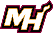
funny u should ask...here is the new Heat alternate logo i vectored today:
also, based on the stuff we have seen for the Twolves new primary, i made this:

i guess the trees would be a different color (white = snow?) if they have gone away from the green, but I am just living in the hope that they will keep the green...
im in the process of vectoring the alt logo, that'll come soon
Sun Jun 22, 2008 10:57 am
anything's better than raptors and grizzlies. u almost feel embarrased when u wear jersey with their logo.
Sun Jun 22, 2008 11:23 am
You mean Raptors' old logo? The newer one looks good I think.
And as for the Timberwolves, if they are really using that font, then the M, W and V looks weird. This font is neat, and doesn't match with this rather "irregular" alignment.
And as for the Timberwolves, if they are really using that font, then the M, W and V looks weird. This font is neat, and doesn't match with this rather "irregular" alignment.
Sun Jun 22, 2008 12:56 pm
It looks fine to me, it's a subtle enough change.
Sun Jun 22, 2008 6:50 pm
I still prefer the old wolf head, minus the white stuff on its face. Also, great job on redoing the logos in vector, c0n. 
I also like that alternate logo of the Wolves, though if they scrap the green, they'll be ridding off the old Wolves jersey colors (the one Garnett has worn through his rookie year).
I also like that alternate logo of the Wolves, though if they scrap the green, they'll be ridding off the old Wolves jersey colors (the one Garnett has worn through his rookie year).
Sun Jun 22, 2008 7:15 pm
nah guys, i saw the new wolves 2 days ago in the pic wherein its in the cap and its just hundred times better.
as for the heat is it fiction? i cant understand lawl
as for the heat is it fiction? i cant understand lawl
Mon Jun 23, 2008 2:36 am
here is the new, recolored Raps primary logo (completing the total removal of purple from the scheme):

also, for fun i put this together to show what the Twolves SHOULD do imho:
also, for fun i put this together to show what the Twolves SHOULD do imho:
Last edited by c0nr4d on Mon Jun 23, 2008 7:31 am, edited 1 time in total.
Mon Jun 23, 2008 4:24 am
That Raptors logo is official?
Your Wolves logo looks awesome, that's definitely better with the green. You should get in contact with the NBA, dude.
Your Wolves logo looks awesome, that's definitely better with the green. You should get in contact with the NBA, dude.
Mon Jun 23, 2008 4:53 am
The new Raptors logo takes some getting used to, but I like it.
Conrad, nice work with the addition of green! It works nicely that way as well.
Conrad, nice work with the addition of green! It works nicely that way as well.
Mon Jun 23, 2008 4:57 am
Your T-Wolves logo looks outstanding.
Mon Jun 23, 2008 7:31 am
thanks Cy & Indy
i found a couple errors i made in making the new Raps re-color
*fixed and updated now*
i found a couple errors i made in making the new Raps re-color
*fixed and updated now*
Mon Jun 23, 2008 7:37 am
they're just great, really good job!
Mon Jun 23, 2008 7:40 am
Saw that logo a while ago. Hurts the eyes a little, but you'll get used to it.
And that T-Wolves logo you made looks far better than the original.
Looking at the original logo makes me think Dallas Mavericks for some reason.
And that T-Wolves logo you made looks far better than the original.
Looking at the original logo makes me think Dallas Mavericks for some reason.
Mon Jun 23, 2008 11:48 am
c0nr4d wrote:here is the new, recolored Raps primary logo (completing the total removal of purple from the scheme):
also, for fun i put this together to show what the Twolves SHOULD do imho:
That wolves logo looks really cool.
It should be the real one.
Mon Jun 23, 2008 12:01 pm
Damn conrad, that Wolvs logo is rockin.
Mon Jun 23, 2008 12:16 pm
lmao~it looks like Dallas Mavericks logo to me, and i prefer the old fonts better 