Wed Jul 19, 2006 9:07 am
its not really good man. The cropping needs some work and I dont really understand what the Background is suppose to be?Like all of your other sigs the Text is not blended or has any effects on them. Same for your players. Try to put more effects on them. And try to do somehting with the logos aswell, they look so boring. Better if you justtake them out. What I would do (you dont have to do this) is take the logos and make them bigger. And put them behind the player and blend it with the background. Then put an effect on the pics. Then put the text in the middle and do something with that.
but try to read some tutorials, they will help.
but try to read some tutorials, they will help.
Thu Jul 20, 2006 9:38 am

New Steven Gerrard sig.. First sig withot brushing.
Last edited by KIG1 on Thu Jul 20, 2006 10:01 am, edited 1 time in total.
Thu Jul 20, 2006 9:56 am
Like always, wankster has no idea what the fuck hes on about.
Don't listen to him KIG, hes talking about flashy effects and shit when all it takes is basic principles to make a good sig. Gradients, lighting, colouring, depth.
That Gerrard sig is a nice manip, I wouldn't put the outer glow on the text though. Nice idea but he looks too yellow for some reason. Keep it up.
Thu Jul 20, 2006 10:02 am
Thanks Peachy, BTW that might be my last sig for a while because Im going on vacation tommorow.
Fri Jul 21, 2006 11:53 am
I have to say your best sig so far is the dirk one, keep up the good work
Thu Aug 03, 2006 4:59 pm

This sig took like 5 minutes, because I had to leave for the airport. So this was made on the 20th of July.
Thu Aug 03, 2006 7:19 pm
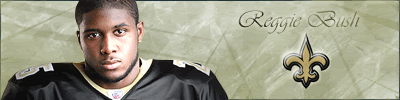
Brand new sig... Comments?
Fri Aug 04, 2006 2:15 am
reggie bush is your new best sig so far
good work
good work
Fri Aug 04, 2006 3:30 am
Thanks Sniper, good to hear some compliments 
Fri Aug 04, 2006 3:35 am
It's pretty nice man, you're still in the early learning stages, but you're trying different techniques and colors and stuff so that's good.
Fri Aug 04, 2006 5:34 am
Yeah, I saw the Quinn one on the other forums. Pretty good.
I voted for it.
I voted for it.
Fri Aug 04, 2006 5:34 am
i suggest you should get some new brushes, maybe some good grunge brushes, they can help alot
and maybe you should check out some tuts over here
http://www.gamerenders.com/forum/index. ... pic=107546
and maybe you should check out some tuts over here
http://www.gamerenders.com/forum/index. ... pic=107546
Fri Aug 04, 2006 6:15 pm
lol @ wankster giving advice/criticism
It looks great except that it's Reggie Bush. Getting better with each one. Try experimenting a little more though, and varying your sigs once you get the basics of photoshop completely mastered.
It looks great except that it's Reggie Bush. Getting better with each one. Try experimenting a little more though, and varying your sigs once you get the basics of photoshop completely mastered.
Sat Aug 05, 2006 1:47 pm

Sat Aug 05, 2006 6:05 pm
You need to make your backgrounds better because they are fairly plain.
Wed Aug 09, 2006 3:52 pm
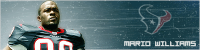
New Mario Williams sig... Commets?
Thu Aug 10, 2006 1:08 am
mario williams one is real good
now this is just somethin in my opinion, but maybe you should put less glow to the left, like just a little glow around him, but the rest is dark, instead of having almost the entire left side bright. but thats just my opinion, it maybe good just the way it is.
now this is just somethin in my opinion, but maybe you should put less glow to the left, like just a little glow around him, but the rest is dark, instead of having almost the entire left side bright. but thats just my opinion, it maybe good just the way it is.
Thu Aug 10, 2006 11:12 am
hey these two new ones are great keep up the good work
Thu Aug 10, 2006 1:36 pm
Eh, just a gradient with pic, logo, cd scratch, and text, try to add more to the background.
Thu Aug 10, 2006 1:50 pm
Mario Williams is pretty nice Good job... too bad the Texans drafted him instead of Bush. 
Fri Aug 11, 2006 8:41 pm

I tried something new with this sig by adding a picture that I lowered the opacity on. How do you guys like it?
Fri Aug 11, 2006 10:44 pm
You're improving . I just saw the Brady Quinn sig and I like it.
My advice is to make your sigs smaller (not always 450/400x100 but something like 300x100) so there isn't too many empty space. Your text needs some work too but it's normal, no one really is very good at text.
My advice is to make your sigs smaller (not always 450/400x100 but something like 300x100) so there isn't too many empty space. Your text needs some work too but it's normal, no one really is very good at text.
Sat Aug 12, 2006 1:54 pm

This is a request I made for someone, he wanted the same text as the Bryant sig.
Last edited by KIG1 on Sat Aug 12, 2006 3:10 pm, edited 1 time in total.
Sat Aug 12, 2006 2:04 pm
First of all, the Mario Williams is your best so far. Colour and contrast is great. Text + logo don't really work, but whatever. It's good.
As for the newest, I'd suggest not just throwing the logo on like that, leave some negative space. And try to keep some of the aspects of the sig a little closer together, otherwise it spreads things out to much and messes with the focal point of your sig. Also Mr. Brandon there is waaaaaay too bright.
As for the newest, I'd suggest not just throwing the logo on like that, leave some negative space. And try to keep some of the aspects of the sig a little closer together, otherwise it spreads things out to much and messes with the focal point of your sig. Also Mr. Brandon there is waaaaaay too bright.
Sat Aug 12, 2006 5:27 pm
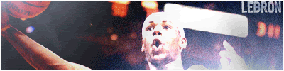
A manip of LeBron with a little bit of brushing.