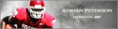
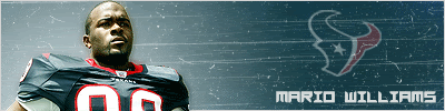
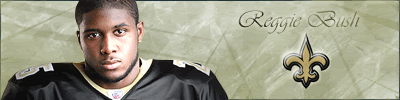
KIG's Photoshop Showcase----- Jarrett and Griffin
Mon Jul 10, 2006 9:25 pm


Mon Jul 10, 2006 9:29 pm
Not bad.
For a second I was like "Who the hell is KIG?"
For a second I was like "Who the hell is KIG?"
Mon Jul 10, 2006 9:43 pm
It ain't too bad, at least you had some graphics experience before making your first PS sig, unlike me, my first sig was horrible. 
Tue Jul 11, 2006 12:25 am
Nice but you'll have to learn how to add effects on the player..
Tue Jul 11, 2006 9:42 am
Not bad, I like it better than anything you made with the other program. It actually looks like something YOU made rather than just cropping a pic and adding some contrast.
Tue Jul 11, 2006 10:02 am
yup not bad at all
Tue Jul 11, 2006 11:15 am
not bad, finally you got photoshop, but read some tuts to elecate and get to know new buttons.
Wed Jul 12, 2006 9:50 am
Thanks guys, Ive just been experimenting with diff effects.
Wed Jul 12, 2006 4:43 pm
Version 1

Version 2

Version 2
Wed Jul 12, 2006 5:03 pm
I think you need to get some things going on in the background... an action pic faded in or something. And play around with layers on the main pic, duplicate it and set it to Overlay or something.
Wed Jul 12, 2006 5:06 pm
How do you put the border in front of the picture?
Wed Jul 12, 2006 5:08 pm
Make the border layer above the picture layer.
Wed Jul 12, 2006 5:16 pm
Thanks Jaesus.
Wed Jul 12, 2006 7:16 pm
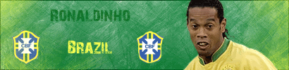
I made a few changes to the Ronaldinho sig and this is how it looks now.

Wed Jul 12, 2006 7:28 pm
What did you change ?
Wed Jul 12, 2006 7:32 pm
The lighting a little bit. Can't you tell at the top?
Wed Jul 12, 2006 7:35 pm
Ah, ok. Didn't really notice it.
Thu Jul 13, 2006 6:20 pm

Heres a new Dirk sig that I beleive is my best so far.
Thu Jul 13, 2006 6:39 pm
you're getting better every time
Thu Jul 13, 2006 8:06 pm
Your background looks abit plain, and also maybe add more effects to the Dirk pic, but other than that, it is your best.
Thu Jul 13, 2006 10:13 pm
Its nice, you are getting gooder and gooder, but the border always goes in front
of every because it looks weird that dirk is covered at the bottom and not at the top.
Try using my tut but just to make a background...and it should look "fresh" lol g/l
of every because it looks weird that dirk is covered at the bottom and not at the top.
Try using my tut but just to make a background...and it should look "fresh" lol g/l
Fri Jul 14, 2006 5:45 am
well kig u need to get some brushes..like grunge/abstract ones..they will spice up your sig bg...and also like jae said duplicate the render layer and set the top duplicate to multiply/overlay and experiment with layer effects..dont just get a plain background and put a render on it...and also try to duplicate the render layer, make the top overlay, and blur the overlay layer. it iwll give a good effect. oh and also go check dee's thread. there is a image-tutorial there that teachers you how to make the sigs he made...its pretty neat
Fri Jul 14, 2006 1:28 pm
You're getting better, but:
1) Add more to the background like others have said. They all look similar. Try different brushes from places like DeviantART.
2) Text is always hard, so just check out dafont.com for every sig and look for a fitting one.
3) On the Nowitzki sig, I don't like the stroke on him along with the background.
Good luck.
Sat Jul 15, 2006 1:17 am
and read lots of tuts to get used to ps..
good-tutorials.com
..
..
..
pixel2life.com i think thats what its called
good-tutorials.com
..
..
..
pixel2life.com i think thats what its called
Wed Jul 19, 2006 8:51 am

Im a little rusty, I think its an ok sig though.