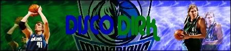
CG's Photoshoppe | 06.06.10 - A little tinkering, and voilà!
Sat Sep 10, 2005 6:30 am
Wallpapers:


Avatars:

Houston Rockets
Signatures:
If you want to use any of these, all you need to do is ask.


 w/
w/ 


 w/
w/ 


 w/
w/ 


 w/
w/ 


_______________________________________________________
Original post:
This is the technically the second sig I've made (the first being the one I use), but it's the first I put effort into. I'm open for any comments, I've got a feeling it's not great.
^^ chris paul v.1


Avatars:
Houston Rockets
Signatures:
If you want to use any of these, all you need to do is ask.
w/
w/
w/
w/
_______________________________________________________
Original post:
This is the technically the second sig I've made (the first being the one I use), but it's the first I put effort into. I'm open for any comments, I've got a feeling it's not great.
^^ chris paul v.1
Last edited by Cable on Mon Oct 09, 2006 1:26 pm, edited 98 times in total.
Sat Sep 10, 2005 6:34 am
yeh its not great the colours on the background scare me lol im not ps pro so wat can i say
Sat Sep 10, 2005 6:36 am
try brushing in white and then changing hue and saturation, and using the polygonal lasso tool to cut out your images
Sat Sep 10, 2005 6:38 am
or better still use PSDs there already cut out for u
Sat Sep 10, 2005 6:46 am
nbalive744 wrote:try brushing in white and then changing hue and saturation, and using the polygonal lasso tool to cut out your images
LOL @ you saying to use the Polygonal Lasso Tool
I think he used it, the only thing is that the picture he used (the centre one) was a bad pic, 'cos actually Chris had his arm "cut off" in that pic
cvele wrote:or better still use PSDs there already cut out for u
That's a good idea, but there's a small quantity of websites that let you download them
Sat Sep 10, 2005 6:55 am
Da King23 wrote:nbalive744 wrote:try brushing in white and then changing hue and saturation, and using the polygonal lasso tool to cut out your images
LOL @ you saying to use the Polygonal Lasso Tool
i have no idea why you said lol???
Sat Sep 10, 2005 6:57 am
Da King23 wrote:nbalive744 wrote:try brushing in white and then changing hue and saturation, and using the polygonal lasso tool to cut out your images
LOL @ you saying to use the Polygonal Lasso Tool
i have no idea why you said lol???
Sat Sep 10, 2005 7:09 am
I meant you're not the right person to say to use the Polygonal Lasso Tool, 'cos if I don't remember bad, you're cutting was horrible before someone said you to use the Polygonal Lasso Tool 
Now I say you another thing about double posting: You know that you could get kicked out of here if you do this often?
Now on topic: Cable Guy, that sig is not bad at all, you should work on the background, and you should pick better pics, maybe take a look at GOAT's tutorial... It's way better than my first
Sat Sep 10, 2005 7:34 am
fuck!! my comp messed up on the double post!
i cant delete it!
i cant delete it!
Sat Sep 10, 2005 7:53 am
cable guy learn 1st how to spell photoshop in the title
Sat Sep 10, 2005 7:54 am
i think he spelled it that way on purpose
Sat Sep 10, 2005 7:55 am
Yeah, I know that actually this post is probably spam
Sat Sep 10, 2005 9:05 am
Thanks for the tips. I read GOAT's tutorial after I made this, so I'm going to fix it up. And yes, Photoshop is spelled wrong on purpose.
Sat Sep 10, 2005 9:06 am
hahah cvele i told you thats how it was spelled
so when is your next sig coming out?
so when is your next sig coming out?
Last edited by nbalive744 on Sat Sep 10, 2005 9:13 am, edited 2 times in total.
Sat Sep 10, 2005 9:07 am
1. Da King23 didn't say it was spelled wrong, cvele did.
EDIT: so you understand, he put Da King instead of cvele. He's now edited it
2. Stop spamming
EDIT: so you understand, he put Da King instead of cvele. He's now edited it
2. Stop spamming
Last edited by Cable on Sat Sep 10, 2005 11:05 am, edited 1 time in total.
Sat Sep 10, 2005 11:04 am
Chris Paul sig v2

I looked through some tutorials and downloaded some new brushes, and this time I brushed in white and added a multiply colour layer over it. I think I'm getting the hang of it.
I looked through some tutorials and downloaded some new brushes, and this time I brushed in white and added a multiply colour layer over it. I think I'm getting the hang of it.
Last edited by Cable on Wed Sep 14, 2005 9:28 am, edited 2 times in total.
Sat Sep 10, 2005 11:15 am
It's better than the first, if you still have the PSD, you should change the blending options for the player's pics: Set it as normal, then duplicate the layer and set the duplicated layer as overlay, I think it'll be better 
Sat Sep 10, 2005 11:20 am
Thanks for the tip. I actually didn't use PSD, I did it myself. Btw, what does PSD stand for?
Sat Sep 10, 2005 11:22 am
It's the Photoshop format file, it's very useful when you have to change something from the sig, because it doesn't save the file as a copy but as layers...
Sat Sep 10, 2005 11:25 am
Oh shit. My bad, I thought the PSD was the pre-cut pics . I know what a PSD is. I need to pay more attention to what I'm reading. Yeah, I still have the PSD. Were you confused by my post?
I have question, probably one that seems silly, but how do you merge or group layers? I do my jerseys with Paint Shop Pro, so I'm not that familiar with Photoshop. I have Elements 2.0.
Here's the sig with the multiply layers over the pics. Personally, I like the first one I made.

I have question, probably one that seems silly, but how do you merge or group layers? I do my jerseys with Paint Shop Pro, so I'm not that familiar with Photoshop. I have Elements 2.0.
Here's the sig with the multiply layers over the pics. Personally, I like the first one I made.
Last edited by Cable on Wed Sep 14, 2005 9:29 am, edited 4 times in total.
Sat Sep 10, 2005 11:53 am
To merge layers, just select the layers you want to merge and go to Layer>Merge Linked. If you want to merge all the layer then you just go to Layer>Merge Visible.
Also, you should try to duplicate the layers and then change the blending options of the duplicated layer, because right now the pics are too blended into the background.
Now off-topic: you were wondering how to change the color of a jersey: having Elements 2.0 you should have the Colorizer (or Color Variations) button, just hit it and select the color you want. It will give you the shiny effect my jerseys have
Sat Sep 10, 2005 12:01 pm
use the square box tool thingy and put a square over some picture then press delete on your keyboard, it will mask with the background, and it looks amazing!!!
Sat Sep 10, 2005 12:19 pm
The square box tool thingy is called 'select tool'.
Thanks for the merging stuff, I guess I missed that. The pics are blended into the background because I lowered the opacity on them. You think I should un-blend them?
Thanks for the colour variations thing. I couldn't find it because I was looking for Colorizer. Damn those name changes ...
This is my latest sig.

What do you think? The only thing I'm stuck on is having the pic of Nash and the text somewhere, anything else I'm open to suggestions.
Thanks for the merging stuff, I guess I missed that. The pics are blended into the background because I lowered the opacity on them. You think I should un-blend them?
Thanks for the colour variations thing. I couldn't find it because I was looking for Colorizer. Damn those name changes ...
This is my latest sig.
What do you think? The only thing I'm stuck on is having the pic of Nash and the text somewhere, anything else I'm open to suggestions.
Last edited by Cable on Wed Sep 14, 2005 9:30 am, edited 1 time in total.
Sat Sep 10, 2005 12:24 pm
your pic is 400 by 100, you can make it 450 by 100 to make it more convinient
i really like the text effect, but i can see that you didnt have much room to make the sig better, like putting nash in the wrong spot or something
the background is a little boring, may i ask what brushes you were using, but it was your thord sig, so it was very good for a starter
if you want to make yourself feel better, look at my sigs numbers like 1-5
Sat Sep 10, 2005 12:32 pm
The text is actually the Molson Canadian logo, and the effect is just lowing the opacity, like I said in your thread.
I used a brush that made maple leafs, under Special Effects brushes. The background is just red with the leaves on top.
I used a brush that made maple leafs, under Special Effects brushes. The background is just red with the leaves on top.