Ruff Ryder's Crap-hix thread [DWade|Wade+Shaq|Sig League ]
Fri Jul 01, 2005 7:36 am
I don't like my first wall, so I'm not gonna post it, but here's my second. I know Colin the gfx and hip hop guru will have something to say though. 
(crappy)Walls:


Avatars:


Sigs:
Newest


Dirk
Baron Davis
Pops Mensah-Bonsu
LeBron James
Kanye West
TMac
Another TMac sig
Ginobili
Ciara
Allen Iverson
Josh Smith
Dwyane Wade
Jordan XIV
Jordan XIII
Melo
Julius Jones
Gerald Wallace
Lamar Odom
Nate Robinson
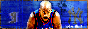
Marbury
(I think I want something in the bg but I'm not sure what)
Marbury v2
Mafia's other grizzlies sig:
Mafia's other Grizz sig
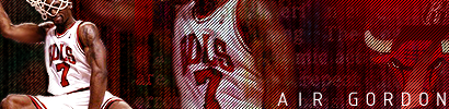
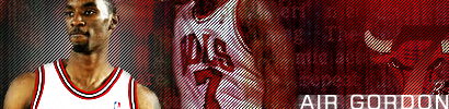
Ben Gordon
V1: V2
LeBron James
1
2
Dwyane Wade
Regular
Animated
Andre Iguodala
Jadakiss
Gilbert Arenas
Simple UNC sig I had a couple days before they one
Vince Carter Sig I use for a sim league
Tony Allen sig
Random Stuff

(crappy)Walls:


Avatars:
Sigs:
Newest
Dirk
Baron Davis
Pops Mensah-Bonsu
LeBron James
Kanye West
TMac
Another TMac sig
Ginobili
Ciara
Allen Iverson
Josh Smith
Dwyane Wade
Jordan XIV
Jordan XIII
Melo
Julius Jones
Gerald Wallace
Lamar Odom
Nate Robinson
Marbury
(I think I want something in the bg but I'm not sure what)
Marbury v2
Mafia's other grizzlies sig:
Mafia's other Grizz sig
Ben Gordon
V1: V2
LeBron James
1
2
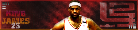
Dwyane Wade
Regular
Animated
Andre Iguodala
Jadakiss
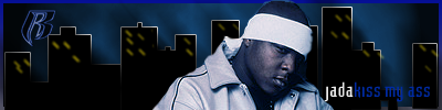
Gilbert Arenas
Simple UNC sig I had a couple days before they one
Vince Carter Sig I use for a sim league
Tony Allen sig
Random Stuff
Last edited by Ruff Ryder on Wed May 31, 2006 9:34 am, edited 21 times in total.
Fri Jul 01, 2005 7:57 am
How'd you know. 
A good effect forbackgrounds is to make them fade to black. Put a layer of pure black over the BG and use a layer mask and the gradient set to radial to do that. Move the Iguodala text up a bit so it doesn't get cut off by the taskbar when it's actually used. I like it except for the Andre text, which is just awful. But that BG looks very good for your 2nd wall. It seems a lot of people don't put effects on their player photos. A quick tutorial could help everyone.
A good effect forbackgrounds is to make them fade to black. Put a layer of pure black over the BG and use a layer mask and the gradient set to radial to do that. Move the Iguodala text up a bit so it doesn't get cut off by the taskbar when it's actually used. I like it except for the Andre text, which is just awful. But that BG looks very good for your 2nd wall. It seems a lot of people don't put effects on their player photos. A quick tutorial could help everyone.
Fri Jul 01, 2005 8:52 am
Agreed, player effects are really simple but some beginners don't know about them. That's a pretty nice wall for your second. Once you develop your brushing (easy) all the stuff you do will get better, just practice with it.
Fri Jul 01, 2005 1:55 pm
Colin wrote:How'd you know.
A good effect forbackgrounds is to make them fade to black. Put a layer of pure black over the BG and use a layer mask and the gradient set to radial to do that. Move the Iguodala text up a bit so it doesn't get cut off by the taskbar when it's actually used. I like it except for the Andre text, which is just awful. But that BG looks very good for your 2nd wall. It seems a lot of people don't put effects on their player photos. A quick tutorial could help everyone.
I know, I know. I do know some effects but I was kinda debating whether or not to put them on, but I don't know as many as you. I'm guessing alot are learned from just messing around. I read your tut by the way.
@ Fender Bender, I'm not a brushing genious like you.

I also took out the text that said Andre, I didn't have it in there originally though. Should I take out those red bar things? I may try some new brushes, I was looking for some kinda dark, grungy/gothic, flower type brushes. Anybody have suggestions? Kinda like what Hubbakuk (?) used on that Paul Pierce saint/sinner wall.
Fri Jul 01, 2005 2:59 pm
I would suggest you take the red bar lines out even though I don't know jackshit about PS  Just a suggestion though, I like the wallpaper though
Fri Jul 01, 2005 10:00 pm
lol. Thanks for the compliment, but I think once you get the hang of it you'll say "why the hell couldn't I do this before?"  It's basically randomly clicking around with different brushes and layers and messing around with opacities and blending modes until you get something that looks cool. I'm interested in making a simple video tutorial, I want to try one.
Sun Jul 03, 2005 5:00 am
I added some sigs up there, now I have a real thread...kinda.
Sun Jul 03, 2005 9:28 pm
Those Ben "Jordan" & Bron sigs are excellent.
Sun Jul 03, 2005 11:23 pm
I like your style man and you almost can't go wrong when you make sigs of Knicks players anyway.
btw. I kind of noticed that there are only blue and red sigs up there.
btw. I kind of noticed that there are only blue and red sigs up there.
Sun Jul 03, 2005 11:46 pm
ceekay wrote:btw. I kind of noticed that there are only blue and red sigs up there.
True, true, I never noticed myself. I'll have to stop that
Mon Jul 04, 2005 12:21 am
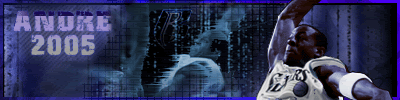
I like the effect on the Andre in the background you did in the Iguodala sig, nice.
Fri Jul 08, 2005 4:13 am
New Gerald Wallace sig..

Fri Jul 08, 2005 4:25 am
I like it, the overall style of it, but some parts are a little pixelated and I'd try some other shape than a rectangle (I mean you can throw in some invisible parts, like cut the corners off for a little more techy style). That last thing is not really necessary though. 
Not trying to be a nitpick or anything, just trying to give some usefull comments.
Not trying to be a nitpick or anything, just trying to give some usefull comments.
Fri Jul 08, 2005 4:27 am
ceekay wrote:I like it, the overall style of it, but some parts are a little pixelated and I'd try some other shape than a rectangle (I mean you can throw in some invisible parts, like cut the corners off for a little more techy style). That last thing is not really necessary though.
Not trying to be a nitpick or anything, just trying to give some usefull comments.
I have another idea too about the shape. It just came a little late, I'll get it next time.
Fri Jul 08, 2005 12:33 pm
Agreed that is just looks too pixely in places, otherwise it's good. But did you do the stroke (on the text) yourself or something? It looks like there are some errors on it.
Sat Jul 09, 2005 12:36 am
FendeR` wrote:Agreed that is just looks too pixely in places, otherwise it's good. But did you do the stroke (on the text) yourself or something? It looks like there are some errors on it.
Actually no, I didn't put stroke on the text, I probably should have changed it. And I'm not sure why it looks pixelated, I'm guessing cuz I used the number from Live 05.
Sat Jul 09, 2005 5:16 am
Can i use the G-DUB sig? cos i wanna change my sig until i someone makes my trailblazers one
Sat Jul 09, 2005 5:57 am
magadag25 wrote:Can i use the G-DUB sig? cos i wanna change my sig until i someone makes my trailblazers one
Yeah, even though it looks like shit.
Sat Jul 09, 2005 10:08 am
not as bad as my rhmyes 
Sun Jul 10, 2005 3:10 am
magadag25 wrote:not as bad as my rhmyes
Sun Jul 10, 2005 4:45 am
That's a compliment :p
Tue Jul 12, 2005 7:48 am
Ok, this is what I'm up to now...

It's not done though, any c&c is welcome.
It's not done though, any c&c is welcome.
Tue Jul 12, 2005 8:38 am
that lamar odom sign is great
Tue Jul 12, 2005 11:40 am
Ok, i switched it up a little bit cuz it wasn't quite what I wanted so I got this:

Also some G-Unot avatars, see first post. If you hate G-Unit, or just are disgusted by their stupid love songs, then sport one.  Me and Mafia so far
  .
.
Also some G-Unot avatars, see first post.
Tue Jul 12, 2005 3:23 pm
Make it three.
Normally I don't like all these bandwagon stuff like Cosby and those superheroes, but this is just to support the cause eh.
Normally I don't like all these bandwagon stuff like Cosby and those superheroes, but this is just to support the cause eh.