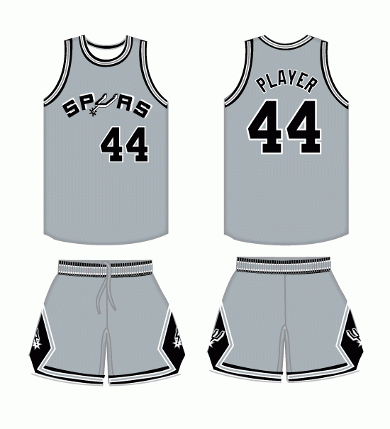
New Hideous Spurs Alternate Uni
Thu Sep 20, 2012 9:10 am
Re: New Hideous Spurs Alternate Uni
Thu Sep 20, 2012 9:15 am
A grey version of their current jersey would be nice, but this is just bad. I'd give this jersey a season at max.
Re: New Hideous Spurs Alternate Uni
Thu Sep 20, 2012 10:18 am
JaoSming wrote:Thought it was a practice uni....
Spot on.
Folks can say what they will about some of the outlandish jerseys from the 90s that some teams will be rocking this season, but at least they were creative. Those alternates are offensively plain.
Re: New Hideous Spurs Alternate Uni
Thu Sep 20, 2012 10:27 am
Looks like a uniform for a created team in nba 2K12
Re: New Hideous Spurs Alternate Uni
Thu Sep 20, 2012 10:32 am
lel
Re: New Hideous Spurs Alternate Uni
Thu Sep 20, 2012 12:09 pm
Wow. Just WOW. I think they're paying their designers cheap.
Re: New Hideous Spurs Alternate Uni
Thu Sep 20, 2012 1:48 pm
ugly as shit.
Re: New Hideous Spurs Alternate Uni
Thu Sep 20, 2012 5:32 pm
Who stole the S, P, R & S? That jersey looks unfinished or something. Just plain awful!
Re: New Hideous Spurs Alternate Uni
Thu Sep 20, 2012 8:37 pm
Should have sticked with the design of the home and away jersey and put this color. Logos on front of jerseys just suck.
Re: New Hideous Spurs Alternate Uni
Thu Sep 20, 2012 9:22 pm
Looks like a D-League jersey or worse.
Re: New Hideous Spurs Alternate Uni
Fri Sep 21, 2012 9:41 am
Badshotter wrote:Should have sticked with the design of the home and away jersey and put this color. Logos on front of jerseys just suck.
Agreed. That could've been a nice throwback to one of their old designs, much the same way the Rockets' current alternate is a throwback to the championship years in the mid 90s.
Re: New Hideous Spurs Alternate Uni
Fri Sep 21, 2012 11:04 am
^ This is way better.
Re: New Hideous Spurs Alternate Uni
Fri Sep 21, 2012 12:23 pm
As a life-long supporter for my home team I am glad they have a new alternative jersey.With that said,I hate this design.I was hoping they would bring back the George Gervin era jerseys.
Re: New Hideous Spurs Alternate Uni
Fri Sep 21, 2012 2:52 pm
They were fucked from the beginning when they chose grey as one of their colors. It is hard to come up with something that looks good when youve got grey in front of people's face to induce vomit.
Re: New Hideous Spurs Alternate Uni
Fri Sep 21, 2012 3:32 pm
I think they had the retro design posted earlier in 2K11, I think they should of stuck with that because that OP pic looks pretty bad...
Re: New Hideous Spurs Alternate Uni
Fri Sep 21, 2012 4:34 pm
I like how simple it is, ordinary color and design. I'd probably look better in this than most other team jerseys out there.
But perhaps too simple for a professional team.
But perhaps too simple for a professional team.
Re: New Hideous Spurs Alternate Uni
Fri Sep 21, 2012 5:07 pm
I have read and watched reports about it here in town and people are saying that the Spurs logo on front is the best thing because once you see the symbol,people will know who they are.I say bullshit.
Actually it is officially silver.But yeah...vomit.
bowdown wrote:They were fucked from the beginning when they chose grey as one of their colors.
Actually it is officially silver.But yeah...vomit.
Re: New Hideous Spurs Alternate Uni
Sat Sep 22, 2012 4:36 am
bowdown wrote:It is hard to come up with something that looks good when youve got grey in front of people's face to induce vomit.
LIES

Re: New Hideous Spurs Alternate Uni
Sat Sep 22, 2012 5:33 am
smh... Terrible. In ten years it's going to be on some top ten worst NBA jerseys list. It's too simplistic.
Re: New Hideous Spurs Alternate Uni
Sat Sep 22, 2012 5:55 am
Qballer wrote:bowdown wrote:It is hard to come up with something that looks good when youve got grey in front of people's face to induce vomit.
LIES
I don't know if that jersey really looks good or 'toine is just making it look good.
Re: New Hideous Spurs Alternate Uni
Sat Sep 22, 2012 8:05 am
Dc311 wrote:I have read and watched reports about it here in town and people are saying that the Spurs logo on front is the best thing because once you see the symbol,people will know who they are.
As opposed to having "Spurs" written across the front of the jersey? That's not exactly ambiguous.
As a practice jersey, summer league jersey or even fan apparel, they wouldn't be so bad. As an official alternate jersey though? Should've gone with something similar to the old design that I previously posted.
Re: New Hideous Spurs Alternate Uni
Sat Sep 22, 2012 8:37 am
Qballer wrote:bowdown wrote:It is hard to come up with something that looks good when youve got grey in front of people's face to induce vomit.
LIES
they are cheating. They added a glossy shine on their jerseys which makes almost anything look better.
Re: New Hideous Spurs Alternate Uni
Sat Sep 22, 2012 2:11 pm

I was eating when I saw this and I didn't vomit.
Re: New Hideous Spurs Alternate Uni
Sat Sep 22, 2012 2:30 pm
Alright that one is pretty good. Spurs just need some creative designers
Re: New Hideous Spurs Alternate Uni
Sun Sep 23, 2012 12:22 am

Just in case you missed it on the first post.