
all new shader.
preview
2k14 skin lighting preview
5 posts
• Page 1 of 1
2k14 skin lighting preview
![]() by michaelvlutz49 on Tue Mar 24, 2020 3:19 am
by michaelvlutz49 on Tue Mar 24, 2020 3:19 am
Last edited by michaelvlutz49 on Fri Mar 27, 2020 11:53 am, edited 1 time in total.
-
michaelvlutz49 - Posts: 302
- Joined: Wed Nov 24, 2010 3:26 pm
- Location: Cleveland,OH
Re: NEED HELP with this 2k14 lighting
![]() by Dee4Three on Tue Mar 24, 2020 3:47 am
by Dee4Three on Tue Mar 24, 2020 3:47 am
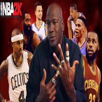
I think the problem with calling a lot of these "2K14 lighting" is that they really don't look like 2K14. The reason is, the players on these 2K14 lighting mods look glossy as opposed to just having the appropriate increase lighting, and shine in the right places.
Looking at this screen, this doesn't look like 2K14 to me. This looks like an oversaturated image with glossy players/floor.
Another key factor: The court colors needs to be right, and that Bulls court looks dark and blah. One thing that stands out with 2K14 is that the courts truly stand out and are bright and awesome. This is so important because of how much the courts look adds to the overall experience.
And this isnt a knock on your mods, either. You have made a lot of people happy over the years with your lighting mods for the various basketball games, I used your mods for 2K19 (turning off volumetric lighting in game gave me the result I wanted).
But I think if you are going for the 2K14 look, the most important items would be:
1. Better crowd lighting
2. Floor reflections that stand out
3. Lighting on players increased yet not with a glossy look, not completely overdone.
4. Making the textures look more SOLID as opposed to washed out
DEIBYS did a good job overall on his Pelicans stadium achieving better lighting for the crowd, players, and on the court, without making the game look overly glossy and saturated. Does it look like 2K14? Not exactly. But it does partly give us what we loved about 2K14, which is better lighting on the floor/players/crowd.
Below is the gameplay video I uploaded with that lighting. Better crowd/floor/player lighting, but not overdone.
Just some thoughts on this!
-

Dee4Three - NLSC Team Member

- Posts: 9982
- Joined: Sun Mar 30, 2014 12:34 pm
- Location: New Hampshire, USA
Re: NEED HELP with this 2k14 lighting
![]() by Simonn-Lee on Tue Mar 24, 2020 1:31 pm
by Simonn-Lee on Tue Mar 24, 2020 1:31 pm
As for me, I'm thinking the same thing as D43
We all love what u have done in these courts, they look great, but still don't feel like 2K14 . As we can compare with some screenshots:


The video that D43 drop above, does give me a bit of 2K14's feel, especially the lights on the players -- that special feeling in 2K14
BTW I have seen some comments on your 2k14 courts mod are like: "Wow this graphic is great! Wait...does it look 2K14 lighting?.." "The players are like sculptures, feel like plastic without the sweat"..etc. Maybe the problem is it's oversaturated.
Imo actually your another courts mod gives me a bit 2K14's feeling: https://forums.nba-live.com/viewtopic.php?f=258&t=108125


The lights, the reflections on skin. And this mod is relatively simple, no need to change too many files
The floor reflection is already good in default 2K20, perhaps it needs a little bit of fog and lights on players to get the 2K14 feels
But to me, nothing feels more 2K14 than the actual 2K14 game, even with true 2K14 graphic mods, the gameplay and the atmosphere are still 2K20. If I really wanna get some 2K14 feeling, I prefer to launch my PS4 console
Just some thoughts!
We all love what u have done in these courts, they look great, but still don't feel like 2K14
The video that D43 drop above, does give me a bit of 2K14's feel, especially the lights on the players -- that special feeling in 2K14
BTW I have seen some comments on your 2k14 courts mod are like: "Wow this graphic is great! Wait...does it look 2K14 lighting?.." "The players are like sculptures, feel like plastic without the sweat"..etc. Maybe the problem is it's oversaturated.
Imo actually your another courts mod gives me a bit 2K14's feeling: https://forums.nba-live.com/viewtopic.php?f=258&t=108125
The lights, the reflections on skin. And this mod is relatively simple, no need to change too many files
The floor reflection is already good in default 2K20, perhaps it needs a little bit of fog and lights on players to get the 2K14 feels
But to me, nothing feels more 2K14 than the actual 2K14 game, even with true 2K14 graphic mods, the gameplay and the atmosphere are still 2K20. If I really wanna get some 2K14 feeling, I prefer to launch my PS4 console
Just some thoughts!
-

Simonn-Lee - Posts: 221
- Joined: Fri Dec 06, 2019 3:19 am
Re: NEED HELP with this 2k14 lighting
![]() by martoluthor on Wed Mar 25, 2020 2:55 am
by martoluthor on Wed Mar 25, 2020 2:55 am
This is the closest i get using reshade
https://www.youtube.com/watch?v=5KQNcIFdC-s
https://www.youtube.com/watch?v=5KQNcIFdC-s

-
martoluthor - Posts: 232
- Joined: Wed Dec 25, 2019 12:05 am
- Location: Argentina
Re: 2k14 skin lighting preview
![]() by DEIBYS2KMOD on Wed Apr 22, 2020 3:14 am
by DEIBYS2KMOD on Wed Apr 22, 2020 3:14 am
I think that if the lighting can be achieved, I have noticed that the lighting of the nba 2k14 the lighting of the players are independent, the players are controlled from another point of the engine, also I believe that the effect of the tone is achieved with the edition of the PostEffect. FxTweakables
michaelvlutz49 I have a PostEffect. FxTweakables which can be added a little mist would look very similar to the nba 2k14 and then apply a complement to the lighting of the players to try to darken the skin. If you can help me, I'll send you the PostEffect. FxTweakables brother go through my thread or contact me privately to work together on this if you want

michaelvlutz49 I have a PostEffect. FxTweakables which can be added a little mist would look very similar to the nba 2k14 and then apply a complement to the lighting of the players to try to darken the skin. If you can help me, I'll send you the PostEffect. FxTweakables brother go through my thread or contact me privately to work together on this if you want
-

DEIBYS2KMOD - Posts: 754
- Joined: Wed Jul 17, 2019 9:42 am
5 posts
• Page 1 of 1
Who is online
Users browsing this forum: No registered users and 6 guests