
I get confused with the names LMAO!
Yeah Hardly read it but readiable lol thanks for the feed.
*~>| Dee Showroom | Impossible is 0 |<~*
![]() by BIG GREEN on Sun Jul 09, 2006 3:50 pm
by BIG GREEN on Sun Jul 09, 2006 3:50 pm
Thanks for the sig but i was wondering if you could fix the yohance part and add the words "big green" instead of anger management...right in the same style. Great work though and I trust i have your permission to use it in either case? 

A big fan of the emerald hue and much higher state of being/
Yohance "thug" Bailey on the scene...now known as Big Green/
-

BIG GREEN - Posts: 4413
- Joined: Thu Sep 19, 2002 1:18 pm
- Location: Bronx, New york


![]() by .Dee. on Sun Jul 09, 2006 4:38 pm
by .Dee. on Sun Jul 09, 2006 4:38 pm
Thanks, yeah like i used in the jessica alba sideways lol...but arial gets boring...
Yb no problem done in about 10 mins.
Edit
I did a few more changes put the tex brighter and put a border...

Yb no problem
Edit
I did a few more changes put the tex brighter and put a border...
-

.Dee. - Posts: 636
- Joined: Sun Jun 04, 2006 12:16 pm
- Location: Madison Square Garden!

![]() by BIG GREEN on Mon Jul 10, 2006 3:47 am
by BIG GREEN on Mon Jul 10, 2006 3:47 am
Thanks again for the sig. It looks superb 
BTW...if you smooth out the pixelated edges of the ryu sprite it would make it look better.
BTW...if you smooth out the pixelated edges of the ryu sprite it would make it look better.
A big fan of the emerald hue and much higher state of being/
Yohance "thug" Bailey on the scene...now known as Big Green/
-
BIG GREEN - Posts: 4413
- Joined: Thu Sep 19, 2002 1:18 pm
- Location: Bronx, New york


![]() by Scorer--20 on Tue Jul 11, 2006 12:07 pm
by Scorer--20 on Tue Jul 11, 2006 12:07 pm
wow !! very nice sigs
mmm Jessica Alba

plz make a Manu sig / wallpapper plz
plz
mmm Jessica Alba
plz make a Manu sig / wallpapper

-

Scorer--20 - Posts: 1332
- Joined: Fri Apr 21, 2006 4:48 am
- Location: Buenos Aires,Argentina

![]() by .Dee. on Tue Jul 11, 2006 1:25 pm
by .Dee. on Tue Jul 11, 2006 1:25 pm
hanks for the feed and comments Jalba is hot aint she LOL
Ill try to do the Manu sig, just be patient please.
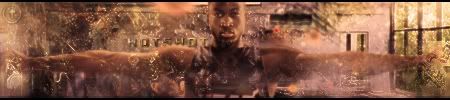
As for the G Arenas sig, the text, i didnt want to use the same one i keep on using so i used something different.
Ill try to do the Manu sig, just be patient please.
As for the G Arenas sig, the text, i didnt want to use the same one i keep on using so i used something different.
-
.Dee. - Posts: 636
- Joined: Sun Jun 04, 2006 12:16 pm
- Location: Madison Square Garden!


![]() by Cornerthree on Tue Jul 11, 2006 5:13 pm
by Cornerthree on Tue Jul 11, 2006 5:13 pm
Yeah this ones nice...
I understood the text just from the 2nd time
Somehow my monitor is blured
I understood the text just from the 2nd time
Somehow my monitor is blured
- Cornerthree
- Posts: 1787
- Joined: Sat Mar 25, 2006 9:46 pm


Who is online
Users browsing this forum: No registered users and 30 guests