

Sac-1's Photoshop Thread [New Webber Sig]
123 posts
• Page 3 of 5 • 1, 2, 3, 4, 5
![]() by Cable on Mon May 29, 2006 10:09 am
by Cable on Mon May 29, 2006 10:09 am
All of it. Check ouy some other walls to see where good places to have text are. Usually it's anchored on something, whether it's the side of the wall, or some kind of stripe through the sig.

And I'm going to see them in Toronto!
-

Cable - Posts: 5078
- Joined: Fri Jul 22, 2005 3:31 am
- Location: Burlington, Ontario


![]() by Sac-1 on Wed Jun 28, 2006 4:11 am
by Sac-1 on Wed Jun 28, 2006 4:11 am
Four new things.
Web Banner for a banner exchange with NLSC:

Sim League banner:

Iran World Cup:

And a random thing I made when I was trying out new things with Photoshop:

Don't you think the last one is too busy?
Web Banner for a banner exchange with NLSC:
Sim League banner:
Iran World Cup:
And a random thing I made when I was trying out new things with Photoshop:
Don't you think the last one is too busy?
-

Sac-1 - Posts: 2467
- Joined: Sun Feb 13, 2005 8:16 am
- Location: London, Ontario


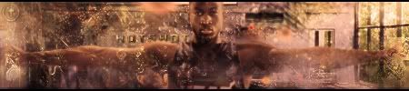
![]() by Jing on Fri Jun 30, 2006 12:53 am
by Jing on Fri Jun 30, 2006 12:53 am
i dont really like the cut on webber, and the quality of teh picture.. the text is really hard to see as well
it seemed you really have dropped in skills or something since that skip to my lou wallpaper
it seemed you really have dropped in skills or something since that skip to my lou wallpaper
-

Jing - Posts: 9791
- Joined: Sat Sep 06, 2003 9:29 am
- Location: College
![]() by Sac-1 on Fri Jun 30, 2006 12:58 am
by Sac-1 on Fri Jun 30, 2006 12:58 am
I haven't dropped it's just i've been trying out different player effect. I'll post a second version for you with the things you mentioned fixed. All I have to change is the brightness and contrast.
BTW, what do you think of the Marbury sig?
BTW, what do you think of the Marbury sig?
-
Sac-1 - Posts: 2467
- Joined: Sun Feb 13, 2005 8:16 am
- Location: London, Ontario
![]() by Jing on Fri Jun 30, 2006 1:04 am
by Jing on Fri Jun 30, 2006 1:04 am
again the quality of the photo is  and the cutty seems shady. the effects are decent in the background... dark. as for the font you used... NO. and the concept for the text is interesting but i dont think it works
-
Jing - Posts: 9791
- Joined: Sat Sep 06, 2003 9:29 am
- Location: College


![]() by Sac-1 on Tue Jul 18, 2006 12:58 am
by Sac-1 on Tue Jul 18, 2006 12:58 am
Thanks for the comments. Ok, here is the sig made by the guy i'm competing against. Remember people, the theme is NBA Finals.

This isn't even related to the finals and guess what? He is winning in votes. Aghhh!
This isn't even related to the finals and guess what? He is winning in votes. Aghhh!
-
Sac-1 - Posts: 2467
- Joined: Sun Feb 13, 2005 8:16 am
- Location: London, Ontario


123 posts
• Page 3 of 5 • 1, 2, 3, 4, 5
Who is online
Users browsing this forum: No registered users and 21 guests