Wed Aug 30, 2006 3:58 pm
uhhh wat is it?
Wed Aug 30, 2006 4:14 pm
....Are you serious? Its a siggy of Halle berry but i obviously used the concept "In My BathRoom" The original pic is a bathroom... 

Wed Aug 30, 2006 4:16 pm
i must be either incredibly stupid or im missing something really big here, u just stuck halle berry on to a pic of ur bathroom, added brushing, and wrote in my bathroom? can u explain im confused
Wed Aug 30, 2006 4:48 pm
Are you slow lmfao Its just basically a bg of a bathroom with a halle berry render in it with photoshop effects...It added an manip to the Bg and splatter, C4D's, pen tool, lighting, text, outlining and a border...now was that so hard...LOL!
Wed Aug 30, 2006 10:04 pm
Sorry but eh.. the concept doesn't make any sense really.. you can't even recognize the bathroom in the final sig anymore. Looks like you pulled it out of your toilet "in your bathroom" lol..
Nice tutorial, I like the other outcomes. Guess you had some blank space left too..
Nice tutorial, I like the other outcomes. Guess you had some blank space left too..
Thu Aug 31, 2006 5:49 am
lol sorry .Dee., i like alot of ur work but that bathroom thing is sorta confusing. not how u did it but why u did it lol... i think im still missing something.
Thu Aug 31, 2006 8:01 am
You guys are missing the point, Its just like a regular sig...
And with the creativty made a girl in a bathroom
and put it as if "THIS IS MY BATHROOM" with a hot girl in it..
Get it now?.? Thanks for the feed.
And with the creativty made a girl in a bathroom
and put it as if "THIS IS MY BATHROOM" with a hot girl in it..
Get it now?.? Thanks for the feed.
Fri Sep 01, 2006 5:49 pm

Best

2nd Best

Sun Sep 10, 2006 9:51 am


Sun Sep 10, 2006 2:13 pm

Sun Sep 10, 2006 2:52 pm
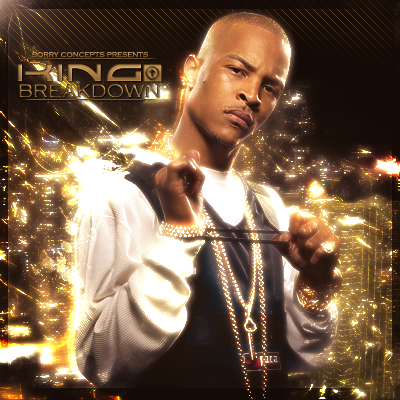
Nice, my favorites are the Juelz and Nas sigs 
Sun Sep 10, 2006 6:36 pm
Nas one is the nicest but good job on them.
Mon Sep 11, 2006 2:54 am
Thanks, but i think its time for a change...

-Look at how Nlsc only apoves side 400x100, and this sig is 400x180 lmao.
-Look at how Nlsc only apoves side 400x100, and this sig is 400x180 lmao.
Sat Sep 16, 2006 10:35 am


XClusive New Yorkknicks Upcomming dynasty

Sat Sep 16, 2006 1:23 pm
the shakira one is hot I think if you got a better pic of beyonce and made her stand out more it would be better. but shakira
Sat Sep 16, 2006 7:53 pm
They're good but the Rihanna one still > all of these.
Sun Sep 17, 2006 12:26 am
Those are pretty good. On the Knicks dynasty one, you should take out the black part of the gradient because it makes the text hard to read.
Sun Sep 17, 2006 11:37 am
every one of those are sick great job!
Sat Sep 23, 2006 12:32 pm
Thanks for the feedback fellaz.


Werd. Lol.
Werd. Lol.
Sun Sep 24, 2006 11:44 am
Sun Sep 24, 2006 5:37 pm
I'm liking the ludacris one, not really feeling the checkered background on the omarion one. Keep it up.
Mon Sep 25, 2006 3:00 am
Thanks.
New Vince Carter Wall XCluzive Shyt.
[Wall] http://i79.photobucket.com/albums/j131/Abo...eCarterWall.png
[Image]
[Ori Image(I Cut Myself)]
New Vince Carter Wall XCluzive Shyt.
[Wall] http://i79.photobucket.com/albums/j131/Abo...eCarterWall.png
[Image]
[Ori Image(I Cut Myself)]
Mon Sep 25, 2006 3:32 am
Really, really nice, but very small, isn't it?
Mon Sep 25, 2006 3:45 am
Thanks, The Wallpaper link is the real image, the [IMG] Under it is just to show people what it is...(Cuz i hate when the forum exceeds width size)
Mon Sep 25, 2006 4:27 am
nice nice, but i think d'wade is saying that the actual wallpaper it self is small.. i think hes rite... and also his face is a bit blurry..
but that is the real shyte
but that is the real shyte