Mon Jun 20, 2005 12:18 pm
Whats the font you used Colin for the Marbury text?
Its used for my avy but I dont know what it is?
Its used for my avy but I dont know what it is?
Mon Jun 20, 2005 12:26 pm
Awesome thanks for that man....now I can put some text on my sig(s).
Now all I gotta do is learn how to make good ones
EDIT: Hey Colin i noticed this in ya sig C#, what does that mean or stand for or watever?
Now all I gotta do is learn how to make good ones
EDIT: Hey Colin i noticed this in ya sig C#, what does that mean or stand for or watever?
Mon Jun 20, 2005 12:39 pm
Colin - what did you do with the avatar? Looks amazing, a bit on insight perhaps? (this is why a seperate Photoshop-forum would rock.)
Mon Jun 20, 2005 12:40 pm
I will post all after the game.
Mon Jun 20, 2005 12:43 pm
I wish I was at home watching the game 
So Colin whats with the C# <---Just incase you didnt see above i'll ask again!
So Colin whats with the C# <---Just incase you didnt see above i'll ask again!
Mon Jun 20, 2005 2:21 pm
Anyone want to make me a Rockets avatar ?
Maybe the rockets logo in the background with nice colour effects over it...
Maybe the rockets logo in the background with nice colour effects over it...
Mon Jun 20, 2005 2:49 pm
Here you go Skip.

edit: And the C#. In music C# means C-Sharp, and my last name is Sharp. So...
I'm getting a few screenshots ready for this quick little av tutorial.
edit: And the C#. In music C# means C-Sharp, and my last name is Sharp. So...
I'm getting a few screenshots ready for this quick little av tutorial.
Mon Jun 20, 2005 3:22 pm
The first step in 95% of backgrounds is to render-clouds. That looks like this. You can press ctrl-F again and again to get clouds you like. If you want them to be a very distinct pattern you can use the burn (to darken) and dodge (to lighten) tools. This isn't usually neccessary for a small avatar.

Next take some brushes. A good place to get them is at Deviant Art. I generally start the bottom off with grunge brushes as they are hidden for the most part. Switch between brushing black and white on different layers. After I set the bottom two to overlay and the top to hard light. Play around between the settings there to get the look you want.

After this I put my Phoenix logo in there and set it to overlay.

Many people stop there and colourize their image. But it provides a better effect if you do brushing overtop of everything else. I wanted to emphazize the orange to purple colour theme, so I used brushes with fairly sharp edges. I wanted lighter orange, so I used white on the left and black on the right. I left the blend modes at normal because the brushes didn't mask my background too much.

Next to get colour I added two colour balance layers. You can get them by pressing on the button I have highlighted in red at the bottom of the next screenshot. Don't move the bars to far to either side of 0 because you will usually get an oversaturated look. To get orange I set midtones to 48, 0, -43; highlights to 26, 0, -37; and shadows to 55, 0, -35. For purple I used midtones at 47, 0, 51; highlights at 39, 0, 33, and shadows at 33, 0, 44. After that I used the gradient tool on the layer mask that automatically pops up and used it in opposite directions on the two masks to blend the colours (if you have questions on layer masks post.) I now have this.

Kind of bland, right? You can solve that with a curves layer. It's located in the same place colour balance layers are. Your curve should usually look like this. Now make a new layer on top of everything and hit ctrl-a (select canvas). Go to edit-->stroke and set it to 1 px, white or black (depending on where you plan to use it and the avatar you have), and inside. You now have a complete avatar that looks like below.

Hope this helps you. I use an expanded method of that to make sigs.
Next take some brushes. A good place to get them is at Deviant Art. I generally start the bottom off with grunge brushes as they are hidden for the most part. Switch between brushing black and white on different layers. After I set the bottom two to overlay and the top to hard light. Play around between the settings there to get the look you want.
After this I put my Phoenix logo in there and set it to overlay.
Many people stop there and colourize their image. But it provides a better effect if you do brushing overtop of everything else. I wanted to emphazize the orange to purple colour theme, so I used brushes with fairly sharp edges. I wanted lighter orange, so I used white on the left and black on the right. I left the blend modes at normal because the brushes didn't mask my background too much.
Next to get colour I added two colour balance layers. You can get them by pressing on the button I have highlighted in red at the bottom of the next screenshot. Don't move the bars to far to either side of 0 because you will usually get an oversaturated look. To get orange I set midtones to 48, 0, -43; highlights to 26, 0, -37; and shadows to 55, 0, -35. For purple I used midtones at 47, 0, 51; highlights at 39, 0, 33, and shadows at 33, 0, 44. After that I used the gradient tool on the layer mask that automatically pops up and used it in opposite directions on the two masks to blend the colours (if you have questions on layer masks post.) I now have this.
Kind of bland, right? You can solve that with a curves layer. It's located in the same place colour balance layers are. Your curve should usually look like this. Now make a new layer on top of everything and hit ctrl-a (select canvas). Go to edit-->stroke and set it to 1 px, white or black (depending on where you plan to use it and the avatar you have), and inside. You now have a complete avatar that looks like below.
Hope this helps you. I use an expanded method of that to make sigs.
Mon Jun 20, 2005 3:40 pm
Thanks for the avy Colin
Mon Jun 20, 2005 6:41 pm
I made a cavs avy using Colins TUT.
It doesnt look like it should but i think its ok.

It doesnt look like it should but i think its ok.
Mon Jun 20, 2005 7:09 pm
Colin, I'm glad you didn't take my comment as an offense, your new sig and avatar are great!
Can you tell me which brushes you use from deviantart? I've never really used custom brushes before (:oops:) in photoshop and the default ones suck...
EDIT: for anyone that wants to give THE MAILMAN's request a try:
http://img111.echo.cx/img111/3937/lebronjazz0fb.png
Can you tell me which brushes you use from deviantart? I've never really used custom brushes before (:oops:) in photoshop and the default ones suck...
EDIT: for anyone that wants to give THE MAILMAN's request a try:
http://img111.echo.cx/img111/3937/lebronjazz0fb.png
Mon Jun 20, 2005 11:45 pm
What does everybody think of thsi signature I made for here-

Tue Jun 21, 2005 4:14 am
ceekay wrote:Colin, I'm glad you didn't take my comment as an offense, your new sig and avatar are great!
Can you tell me which brushes you use from deviantart? I've never really used custom brushes before (:oops:) in photoshop and the default ones suck...
I don't know where to start. Go to the deviantart link I posted and in the viewing options change 'newest' to 'top favourites' that should give you good ones.
Tue Jun 21, 2005 6:34 am
got bored and made a new graphic today, it kinda reflects my mood these days and ive been feeling that song for months now.
here it is:

here it is:
Tue Jun 21, 2005 6:39 am
Mazzlowcchi™ wrote:What does everybody think of thsi signature I made for here-
Add some more fancy background there. Please.
Tue Jun 21, 2005 7:42 am
Ok, thanks Colin, will try that.
btw. why has no one replied to my jersey switch, I thought it was pretty cool...
maybe I shouldn't have posted [url] tags but [img] ones

original: http://www.kenston.k12.oh.us/khs/lebron ... ripped.jpg
btw. why has no one replied to my jersey switch, I thought it was pretty cool...
maybe I shouldn't have posted [url] tags but [img] ones
original: http://www.kenston.k12.oh.us/khs/lebron ... ripped.jpg
Tue Jun 21, 2005 7:46 am
nice work 

and K-dogg....the only thing i don`t like about your sig is that common pic...doesn`t fit together with the text, but still a hot sig
and K-dogg....the only thing i don`t like about your sig is that common pic...doesn`t fit together with the text, but still a hot sig
Tue Jun 21, 2005 8:16 am
Could someone incorporate that pic of lebron for my jazz sig?Please 
Tue Jun 21, 2005 9:53 am
Yeak cyriel, that's a great job.
For that Common sig, make another layer of black brushing and put it over the pic of Common to blend it into teh background and add a little 1 px border. Looks good. Did you just cut the font from the album cover, or did you find it somewhere?
For that Common sig, make another layer of black brushing and put it over the pic of Common to blend it into teh background and add a little 1 px border. Looks good. Did you just cut the font from the album cover, or did you find it somewhere?
Tue Jun 21, 2005 3:27 pm
i just used the logo in this sig, i dont think there is such a font. and it already has a border, its in light green so its hard to see on these boards but this sig is made for another forum with a dark color sheme.
at first i tried blending the pic of common into the background but i just didnt like it so ima go with this version.
at first i tried blending the pic of common into the background but i just didnt like it so ima go with this version.
Tue Jun 21, 2005 6:41 pm
Damn I'm liking that Common sig, you mind if I use it on another board ?
Wed Jun 22, 2005 6:19 am
no, i dont.
Wed Jun 22, 2005 11:18 am
Skip, I think you need a new sig too.
Made myself another sig:
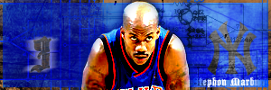
C&C? I think it needs a tad more work though.
Made myself another sig:
C&C? I think it needs a tad more work though.
Wed Jun 22, 2005 11:22 am
Putting Stephon underneath your colour balance/hue layers would probably give it a nice effect. And maybe more of the brushing or 'blueprint images' that go overtop of Steph would be good. Not sure about the border either. But it looks really good right now.