2012-13 Brooklyn Nets logos [prepare for awful]
Sat Apr 28, 2012 6:13 am
Via leaks here and there, here are the new Nets logos:
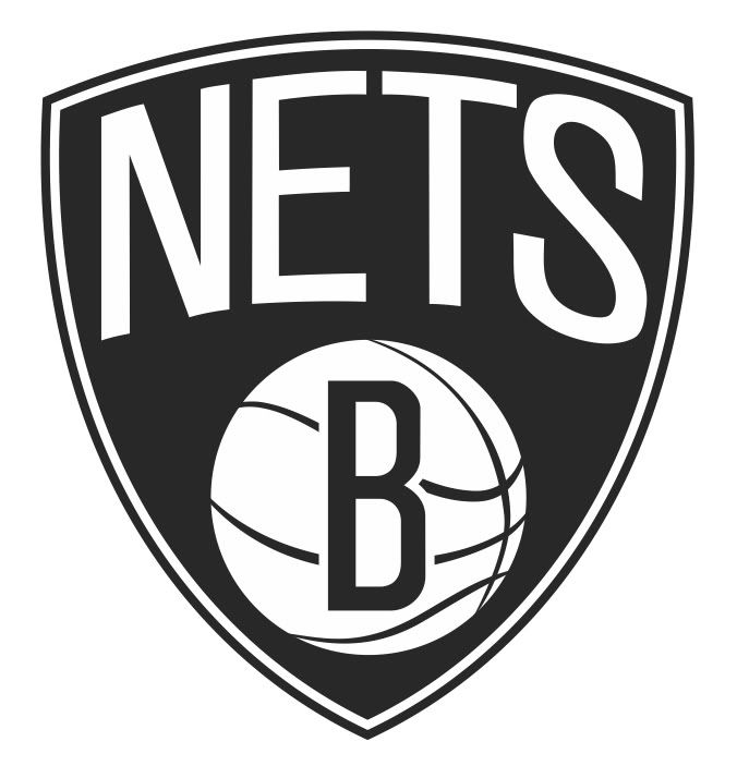

SO DAMN UNCREATIVE AND UNINSPIRING.
SO DAMN UNCREATIVE AND UNINSPIRING.
Re: 2012-13 Brooklyn Nets logos [prepare for awful]
Sat Apr 28, 2012 6:25 am

Re: 2012-13 Brooklyn Nets logos [prepare for awful]
Sat Apr 28, 2012 6:32 am
Looks like an NBA 2K created team.
Re: 2012-13 Brooklyn Nets logos [prepare for awful]
Sat Apr 28, 2012 7:21 am
I like how simple it is though.
Re: 2012-13 Brooklyn Nets logos [prepare for awful]
Sat Apr 28, 2012 7:59 am
Can you get anymore generic I wonder.
Re: 2012-13 Brooklyn Nets logos [prepare for awful]
Sat Apr 28, 2012 9:22 am
Wew what the heck are the Net's Management thinking!!
Re: 2012-13 Brooklyn Nets logos [prepare for awful]
Sat Apr 28, 2012 9:52 am
B is for Boring. Even Nas doesn't say B when he reps Brooklyn 
Re: 2012-13 Brooklyn Nets logos [prepare for awful]
Sat Apr 28, 2012 10:36 am
Lamrock wrote:Looks like an NBA 2K created team.
This, come on Jay Z, you can do better.
Re: 2012-13 Brooklyn Nets logos [prepare for awful]
Sat Apr 28, 2012 11:01 am
It's too simple/generic. Getting started on a new team, this would not help on trying to establish a new identity.
*new city, i mean.
*new city, i mean.
Last edited by jenz on Sat Apr 28, 2012 11:18 am, edited 1 time in total.
Re: 2012-13 Brooklyn Nets logos [prepare for awful]
Sat Apr 28, 2012 11:16 am
Is the logo two tone colored? Black & White? Or there more?
Re: 2012-13 Brooklyn Nets logos [prepare for awful]
Sat Apr 28, 2012 12:12 pm
It's two toned only man
Re: 2012-13 Brooklyn Nets logos [prepare for awful]
Sat Apr 28, 2012 3:09 pm
I don't mind it. Nothing wrong with simple. I'll reserve judgement until i see the official logos and jerseys though.
Re: 2012-13 Brooklyn Nets logos [prepare for awful]
Sat Apr 28, 2012 5:32 pm
This looks like a friggin baseball gear!! Where's the creativity Nets??? Just make an open contest for the logo,it would be better....
Re: 2012-13 Brooklyn Nets logos [prepare for awful]
Sat Apr 28, 2012 7:40 pm
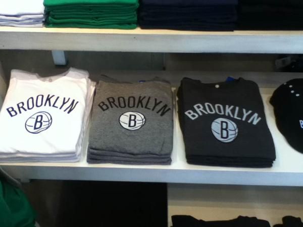
I think we need to see the Jerseys, cause idk the logo is pretty bad, but I don't mind that Brooklyn fitted cap.
Re: 2012-13 Brooklyn Nets logos [prepare for awful]
Sat Apr 28, 2012 9:02 pm
Is this black? It looks a bit like a dark gray. It's not very creative, but nevertheless I think it's cool.
Re: 2012-13 Brooklyn Nets logos [prepare for awful]
Sat Apr 28, 2012 9:32 pm
NovU wrote:I like how simple it is though.
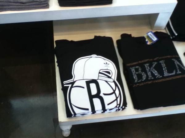
I'm digging the "Brooklyn" wordmark, but the B in the basketball is terrible. then they put an adidas backwards hat on it.
SO DAMN UNCREATIVE AND UNINSPIRING.
and yet still somehow better than the OKC garbage
Re: 2012-13 Brooklyn Nets logos [prepare for awful]
Sat Apr 28, 2012 9:33 pm
What's the source on this? I remember a ton of Thunder logos before the real one on a basketball in some box showed up.
Re: 2012-13 Brooklyn Nets logos [prepare for awful]
Sat Apr 28, 2012 9:34 pm
The dickhead of the design is the one with the hat.
Re: 2012-13 Brooklyn Nets logos [prepare for awful]
Sun Apr 29, 2012 8:55 am
I think the letter "B" is for Beyonce.
Re: 2012-13 Brooklyn Nets logos [prepare for awful]
Sun Apr 29, 2012 10:48 am
Considering their most recent logo didn't contain any references to New Jersey, there's no reason they couldn't have kept that one a little while longer.
It's a clean enough design and similar to the most recent one, but as you guys have already said, it's pretty generic.
It's a clean enough design and similar to the most recent one, but as you guys have already said, it's pretty generic.
Re: 2012-13 Brooklyn Nets logos [prepare for awful]
Mon Apr 30, 2012 2:22 am
If i may, my solution to sprucing this Nets logo up:
 more distinctive "B"
nod to crenelation of the Bridge
include full city name
add a third color
some cooler alternate logos
Done.
Done.
Re: 2012-13 Brooklyn Nets logos [prepare for awful]
Mon Apr 30, 2012 7:47 am
The leaks of the Brooklyn Nets logo is true look at the nets Hello Brooklyn

Re: 2012-13 Brooklyn Nets logos [prepare for awful]
Mon Apr 30, 2012 8:09 am
Are they allowed to have the same colors as San Antonio? Because that is what it looks like.
Re: 2012-13 Brooklyn Nets logos [prepare for awful]
Mon Apr 30, 2012 8:11 am
I guess so because if they didn't allowed them why will be the logo like this
Re: 2012-13 Brooklyn Nets logos [prepare for awful]
Mon Apr 30, 2012 4:13 pm
looks like they kept the shield shape & ball from the last logo but i like conrad's idea for the top looking like a bridge
it still doesn't explain the Anaheim Amigos-like ball with a hat on it.
it still doesn't explain the Anaheim Amigos-like ball with a hat on it.