Re: 76ers With a new ''old'' look !
Sat Jun 27, 2009 9:37 am
this is actually the new primary logo, with the ball logo by itself being the "partial logo":

god awful, if you ask me.
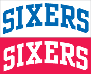
also, here's a prelim look at the uni wordmarks (the designs won't come out for a couple of weeks):
god awful, if you ask me.
also, here's a prelim look at the uni wordmarks (the designs won't come out for a couple of weeks):
Last edited by c0nr4d on Sat Jun 27, 2009 11:16 am, edited 1 time in total.
Re: 76ers With a new ''old'' look !
Sat Jun 27, 2009 9:43 am
I had the feeling it was going to be bad when I read the description of the primary logo in the Sixers site. It's indeed awful.
Re: 76ers With a new ''old'' look !
Sat Jun 27, 2009 11:11 am
Looks like all the links on sportslogos.net are now broken, but there's a tiny version of it on NBA.com:

EDIT: I tell a lie. After a refresh, it's showing up for me here.
EDIT: I tell a lie. After a refresh, it's showing up for me here.
Re: 76ers With a new ''old'' look !
Sat Jun 27, 2009 11:18 am
fixed it again, but if it goes out again, this one won't:

again, still rectangular feces.
again, still rectangular feces.
Re: 76ers With a new ''old'' look !
Sat Jun 27, 2009 11:36 am
Yes, the rectangle seems a bit unnecessary.
Re: 76ers With a new ''old'' look !
Sat Jun 27, 2009 12:10 pm
Andrew wrote:Looks like all the links on sportslogos.net are now broken, but there's a tiny version of it on NBA.com:
EDIT: I tell a lie. After a refresh, it's showing up for me here.
sportlogos.net doesn't allow linking images that's why it's broken here, I think.
Re: 76ers With a new ''old'' look !
Sat Jun 27, 2009 9:09 pm
Could be, though it was showing up to begin with. In any case, we certainly have means of seeing the new logo in all its glory. After a couple of hours updating the logo patches for 2005-08, I'm still not a big fan of the rectangle. The update to the old primary logo would've been sufficient for the new primary.
Re: 76ers With a new ''old'' look !
Sun Jun 28, 2009 12:08 pm
you'd think when all the other teams are going for sleeker, changed-up appearances (think hawks and bucks) that more teams would follow suit. this doesn't suit the age at all. it goes too much with the simpler, single-color uniforms from the 80s and early 90s.
...might as well break out a team picture of iguodala and brand in short-shorts now.
...might as well break out a team picture of iguodala and brand in short-shorts now.
Re: 76ers With a new ''old'' look !
Sun Jun 28, 2009 1:32 pm
I think the partial logo with the subtle updates would have been passable. With the rectangle, not so much.
Re: 76ers With a new ''old'' look !
Tue Jun 30, 2009 4:00 am
Looks like the jersey is exactly the same as the old ones
http://sportslogos.net/logo.php?id=x4zb ... lkefsgt0in

http://www.nba.com/multimedia/photo_gal ... nt.10.html
http://sportslogos.net/logo.php?id=x4zb ... lkefsgt0in
http://www.nba.com/multimedia/photo_gal ... nt.10.html
Re: 76ers With a new ''old'' look !
Tue Jun 30, 2009 4:22 am
I like this jersey than the other.
Let's give the other jersey to the Thunder
Let's give the other jersey to the Thunder
Re: 76ers With a new ''old'' look !
Tue Jun 30, 2009 12:32 pm
I believe that one is already in NBA Live. That'll be convenient for the roster updates.
As for the real Sixers, not too bad. It's a classic look that hasn't been tampered with. I still like the logo and jerseys the Sixers had from 1997 through 2009 but the return to the old jersey isn't too bad. Still not a fan of that rectangle around the logo though.
As for the real Sixers, not too bad. It's a classic look that hasn't been tampered with. I still like the logo and jerseys the Sixers had from 1997 through 2009 but the return to the old jersey isn't too bad. Still not a fan of that rectangle around the logo though.
Re: 76ers With a new ''old'' look !
Thu Jul 02, 2009 1:42 am
Andrew wrote:Still not a fan of that rectangle around the logo though.
heh, any design beats the Thunder's logo
Re: 76ers With a new ''old'' look !
Thu Jul 02, 2009 1:52 am
Can't get over the rectangle fence 'drew?
I find the change fresh, old fresh. It's paying homage to the great Sixer team that carried that logo.
I find the change fresh, old fresh.
Re: 76ers With a new ''old'' look !
Thu Jul 02, 2009 9:18 am
Valor wrote:Andrew wrote:Still not a fan of that rectangle around the logo though.
heh, any design beats the Thunder's logo
I don't know...Oklahoma City's logo is modern enough. The partial logo (ie the simple update on the old logo) would have been fine as the primary though but the recentangle is a bit too old school.
Re: 76ers With a new ''old'' look !
Thu Jul 02, 2009 9:26 pm
if you're hyperventilating after seeing these jerseys, now check out the boise state football uniforms. those were just recently updated too and that is a prime example of thunder colors gone fucked up huge.
Re: 76ers With a new ''old'' look !
Thu Jul 02, 2009 9:32 pm
Andrew wrote:Valor wrote:Andrew wrote:Still not a fan of that rectangle around the logo though.
heh, any design beats the Thunder's logo
I don't know...Oklahoma City's logo is modern enough. The partial logo (ie the simple update on the old logo) would have been fine as the primary though but the recentangle is a bit too old school.
It's just ok. If they use the logo with the rectangle thing on their jerseys, then start hating the team.
Re: 76ers With a new ''old'' look !
Fri Jul 03, 2009 3:22 pm
I'll live with it. Unless the Bulls change their logo to include a picture of John Paxson's face, I can get used to new NBA logos.
Re: 76ers With a new ''old'' look !
Sat Jul 04, 2009 5:32 am
Andrew wrote:Unless the Bulls change their logo to include a picture of John Paxson's face, I can get used to new NBA logos
He broke your heart, didn't he?
Re: 76ers With a new ''old'' look !
Sat Jul 04, 2009 10:44 am
Let's not go nuts and throw around a term like that too easily.  Suffice to say I've grown increasingly frustrated and disappointed with his decisions over the years, as much as he's made a few good ones too.