Mon Jun 23, 2008 1:57 pm
Raptors logo is too red.
Mon Jun 23, 2008 2:17 pm
Damn... Raptors were trying to keep us from remembering the T-Mac-VC age.
The removed the purple completely, but what did they replace it with? Black and white?
The logo could have been a bit more colorful - add like yellow or something like that. Now it's really a bit too plain.
By the way, I love what you did to the T'wolves.
The removed the purple completely, but what did they replace it with? Black and white?
The logo could have been a bit more colorful - add like yellow or something like that. Now it's really a bit too plain.
By the way, I love what you did to the T'wolves.
Mon Jun 23, 2008 3:57 pm
There's too much red on that Raptors new/recolored logo. There's no more contrast/depth in the logo. IMO, I think it would be better to have the red inner circle to be black or something in a darker shade. 
The T'Wolves on the other hand is freakin good! I like it better than the old one. Nice work Con
The T'Wolves on the other hand is freakin good! I like it better than the old one. Nice work Con
Mon Jun 23, 2008 5:29 pm
That Wolves logo should be used, they can still maintain the green as you did.
While the Raps, err, I got seizure.
While the Raps, err, I got seizure.
Mon Jun 23, 2008 6:20 pm
the Raptors logo would be easier on the eyes if the center circle behind the raptor wasn't red also. and they could also do without the red semi circle border.
Tue Jun 24, 2008 4:09 am
Qballer wrote:the Raptors logo would be easier on the eyes if the center circle behind the raptor wasn't red also. and they could also do without the red semi circle border.
i totally agree.
HERE is the place i found the new recolor btw.
Tue Jun 24, 2008 4:19 am
lol at TJ standing on the one side and Calderon on the other side.
The logo doesn't look too bad on wallpaper now, still overall too much red on it.
The logo doesn't look too bad on wallpaper now, still overall too much red on it.
Tue Jun 24, 2008 6:00 am
Yah... somehow it doesn't look too bad. Maybe because there are also other colors in the wall.
Hope the Raps play well this year - I might support my home team once again.
Hope the Raps play well this year - I might support my home team once again.
Tue Jun 24, 2008 7:43 am
Raptors will continue to go overboard with the red.
"Red Army"
lol.
"Red Army"
lol.
Tue Jun 24, 2008 5:42 pm
the new twolves uniform would be great. if we would base it on the new font.
Wed Jun 25, 2008 12:46 am
MAMANIP, i think the jerseys will be revealed tmw at the Draft, so hopefully we'll see 'em then
Wed Jun 25, 2008 12:49 am
the draft is tomorow? i thought it was not until thursday? cool!
Wed Jun 25, 2008 1:29 am
You're right, it's not until Thursday (the 26th).
Wed Jun 25, 2008 12:49 pm
Andrew wrote:You're right, it's not until Thursday (the 26th).
ya, my bad frAn, sorry for any unjust excitement
Wed Jun 25, 2008 4:32 pm
the raps will also have a new all black alternate jersey.
Wed Jun 25, 2008 4:33 pm
no worries! the 26th (rather, 27th here in the phils) is just a few days away.
anyways, i was browsing around the raptors website and i saw another variation of the raptors logo. i took a screen shot since i cannot link it directly to where i found it because it was placed on an ad. here
anyways, i was browsing around the raptors website and i saw another variation of the raptors logo. i took a screen shot since i cannot link it directly to where i found it because it was placed on an ad. here
Wed Jun 25, 2008 4:48 pm
frAn wrote:no worries! the 26th (rather, 27th here in the phils) is just a few days away.
anyways, i was browsing around the raptors website and i saw another variation of the raptors logo. i took a screen shot since i cannot link it directly to where i found it because it was placed on an ad. here
it's better.
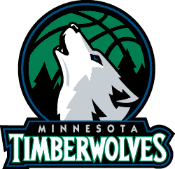
Fri Jun 27, 2008 2:59 am
the official one's from timberwolves website:


im glad the green is back in the primary there, but i dont like that they made it brighter...also, im still not a fan of the white splotch on the wolf-head.
also to note, the uni's will be shown in August sometime not 2nite at the draft.
im glad the green is back in the primary there, but i dont like that they made it brighter...also, im still not a fan of the white splotch on the wolf-head.
also to note, the uni's will be shown in August sometime
Fri Jun 27, 2008 3:40 am
im still not a fan of the white splotch on the wolf-head.
Ever seen a real timber wolf?

I'm glad that the alternate one is actually round and not the first one you posted.
Anyone notice that the green in the trees of the main logo is brighter?
Fri Jun 27, 2008 4:03 am
Yea I'm feelin the new main logo.
Acutually the alt logo c0n posted first was also round. It was a part of the draft cap they gonna use, which was just tilted to the side.
Acutually the alt logo c0n posted first was also round. It was a part of the draft cap they gonna use, which was just tilted to the side.
Fri Jun 27, 2008 4:20 am
Some reason the new logo looks so much cleaner and simpler
Fri Jun 27, 2008 7:38 am
I still prefer this logo that c0nr4d made:
Fri Jun 27, 2008 7:59 am
Secondary logo reminds me too much of the Mavericks.
Fri Jun 27, 2008 9:14 am
Looks really really shiny..