Fri Jul 25, 2008 3:19 am
Here are the logos for that concept, looks pretty nice.
I hope the NBA makes something similar like this.

I hope the NBA makes something similar like this.
Fri Jul 25, 2008 3:24 am
I love the black jersey
I want one xD
I want one xD
Fri Jul 25, 2008 4:02 am
That looks pretty sick, though the NBA have probably already decided on a crappy jersey design and logo already.
Fri Jul 25, 2008 5:21 am
I think they should be White/Black/Silver/Dark Blue
Fri Jul 25, 2008 5:27 am
looks like the hawks old jerseys
Fri Jul 25, 2008 6:35 am
looks good
Fri Jul 25, 2008 10:43 am
Something along those lines would be pretty cool in my opinion.
Sat Jul 26, 2008 2:04 am
New logo by AAO (the guy who made the jerseys)
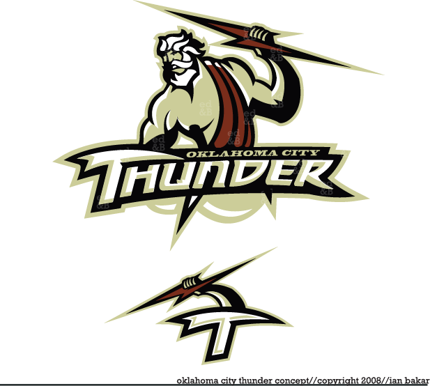
Zeus god of thunder
So NBA guys what's your proposal
Zeus god of thunder
So NBA guys what's your proposal
Sat Jul 26, 2008 10:33 am
The NBA has filed for trademark rights to six nicknames for the league's new Oklahoma City franchise: Barons, Bison, Energy, Marshalls, Thunder and Wind.
An attorney for the league made the filing Monday with the U.S. Patent and Trademark Office.
Marshal is usually spelled with one l. It's not clear why the league used a variant spelling.
Source
Sat Jul 26, 2008 2:50 pm
Barons and Thunder sound good. The rest suck, who the hell would call their team Oklahoma City Energy??? Sounds like a WNBA team.
Sat Jul 26, 2008 4:41 pm
Why are they filing for the trademarks now? Though they had already decided.
Sat Jul 26, 2008 5:17 pm
ok i seriously hate the color. reminds me of the brownish farms and Dried up cow shit
Sat Jul 26, 2008 5:33 pm
frenchy wrote:New logo by AAO (the guy who made the jerseys)
Zeus god of thunder
So NBA guys what's your proposal
I'm now excited to see the proposed mascot.
EDIT:
How about the logo for the nicknames..
Barons, Bison, Energy, Marshalls and Wind.
Sat Jul 26, 2008 8:45 pm
bowdown wrote:ok i seriously hate the color. reminds me of the brownish farms and Dried up cow shit
A change in colour wouldn't hurt, black and gold would be better in my opinion. Great designs though.
Sat Jul 26, 2008 8:46 pm
i dunno why the guy making these has a hard on for that nasty doo doo color.
and maybe Donyell Marshall is making a comeback
I have my money on Barons. that's the most traditional team name left. Isn't there an Iowa Energy team already?
and maybe Donyell Marshall is making a comeback
I have my money on Barons. that's the most traditional team name left. Isn't there an Iowa Energy team already?
Sun Jul 27, 2008 7:53 pm
They should have locked Cycones too !!!
Credit to steven little
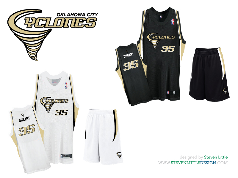
Colors are great on this one !
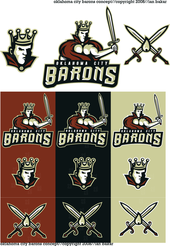
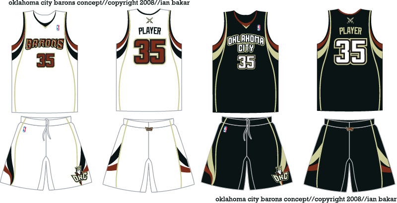
BTW, here is Ian bakar's project for the barons
Credit to steven little
Colors are great on this one !
BTW, here is Ian bakar's project for the barons
Sun Jul 27, 2008 8:00 pm
Not bad either, though a different colour scheme wouldn't go astray.
Sun Jul 27, 2008 10:52 pm
Different color scheme is a good idea. I'm always reminded of Cleveland when I see those designs.
Mon Jul 28, 2008 12:17 am
Me too, it's just a little too close to the Cavs' wine and gold.
Mon Jul 28, 2008 12:26 am
thunder really sucks,i would go to marshalls or barons,thunder is to childiss.
Mon Jul 28, 2008 1:57 am
pau gasol wrote:marshalls
Are you sure? According to Wikipedia, Marshalls is the name of a department store.
Mon Jul 28, 2008 2:49 pm
Sick concepts there...
I hope they stay with the black/gold colorway and stay away from the blue...There are just too many teams with blue colors already...
I hope they stay with the black/gold colorway and stay away from the blue...There are just too many teams with blue colors already...
Thu Jul 31, 2008 5:31 pm
I don't like the font used in the conceptualized Barons.
Thu Jul 31, 2008 8:14 pm
cyanide wrote:pau gasol wrote:marshalls
Are you sure? According to Wikipedia, Marshalls is the name of a department store.
yeah it's a store not too many people are proud of to shop at being a discount store.
Thu Jul 31, 2008 8:25 pm
Quit being embarassed when you shop there Q.