Sun Aug 03, 2008 1:31 pm
When do we get to see the Hornets new jerseys?
Tue Aug 05, 2008 4:31 pm
Crimson Penguin wrote:When do we get to see the Hornets new jerseys?
conr4d already got it..and i believe pepis21 already posted it in a jersey thread for 08..and wow..the alternate jersey of NOLA is oh so great!..wow!..the home jersey of the twolves looks better than the away..wait..there's more..the magic are introducing a new version of pinstripes..
Tue Aug 05, 2008 4:44 pm
looks like they ripped off the colors of the Denver Nuggets
http://i67.photobucket.com/albums/h296/ ... _home2.png
http://i67.photobucket.com/albums/h296/ ... _away2.png
http://i67.photobucket.com/albums/h296/ ... oh_alt.png
:
http://i67.photobucket.com/albums/h296/ ... _home2.png
http://i67.photobucket.com/albums/h296/ ... _away2.png
http://i67.photobucket.com/albums/h296/ ... oh_alt.png
:
Tue Aug 05, 2008 4:52 pm

Source:c0nr4d
Wed Aug 06, 2008 1:28 am
those Hornets jerseys i posted are just ideas based on stuff that has been leaked...they aren't official by any standards. also, that alternate hornets jersey i made it just a concept, they can't have an alternate jersey until the 2010-11 season.
none of the stuff I have been posting is official (yet ), its all just ideas I have based on the leaked parts of jerseys we've seen that ARE official.
none of the stuff I have been posting is official (yet
Wed Aug 06, 2008 1:40 am
c0nr4d wrote:they can't have an alternate jersey until the 2010-11 season.
Why's that?
Wed Aug 06, 2008 9:10 am
dramacydal wrote:c0nr4d wrote:they can't have an alternate jersey until the 2010-11 season.
Why's that?
its a league rule that whenever a team changes logos and/or jerseys, they have to wait 2 seasons before they can add a 3rd jersey. the rule is there to fully establish the 2 jerseys as the new identity for the team.
Wed Aug 06, 2008 9:10 am
That's when Brangelina give birth to a whole New Orleans starting 4. (Chris Paul still starts.)
Sun Aug 17, 2008 12:40 pm

A screenshot from the other company's game shows a preview of the new Hornets home jersey. o_o
Sun Aug 17, 2008 2:16 pm
I still like the throwback aspect of the pinstripes. It's not a huge change but I like the result.
Sun Aug 17, 2008 11:02 pm
yea... i think that jersey on the screenshot sure is prettier...
Mon Aug 18, 2008 3:41 am
I think this new jersey is better than the old one, although I don't like Hornets' new logo. It's terrible 
Tue Aug 19, 2008 12:46 am
The jersey reminds me of B-Diddy and Monster Mash days in Charlotte.
Tue Aug 19, 2008 7:11 am
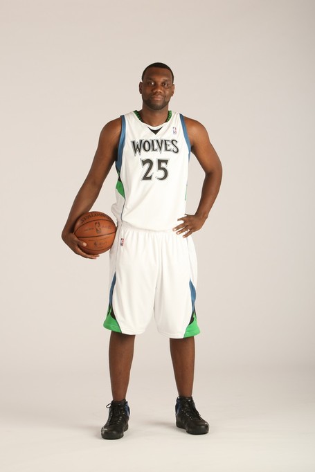
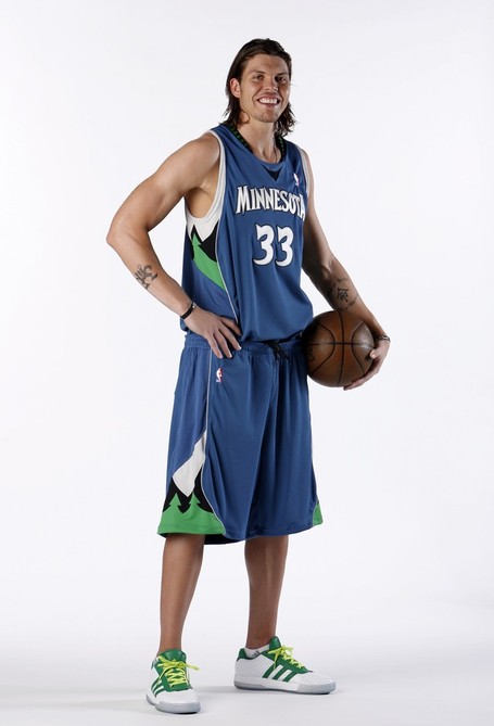
New pictures of the new t'wolves jersey.
Looks horrible, imo. Like something a WNBA team would wear.
Tue Aug 19, 2008 7:35 am
good find
Doesn't look that bad as it did in the first one with Love, but it'll take some time getting used to it. My only big complain of the jersey is still the collar. At the side of the neck is still the design of the old jerseys, which is weird. If they want a new jersey design, then stick with it. That part of the old collar is just inappropriate.
Doesn't look that bad as it did in the first one with Love, but it'll take some time getting used to it. My only big complain of the jersey is still the collar. At the side of the neck is still the design of the old jerseys, which is weird. If they want a new jersey design, then stick with it. That part of the old collar is just inappropriate.
Tue Aug 19, 2008 7:48 am
I kinda like it.
Tue Aug 19, 2008 8:08 am
Same, it looks actually alright. The team names seem bigger, and the away jersey seems a lot better than the home one.
Tue Aug 19, 2008 9:10 am
Better then the other picture, but still hate the collar.
Tue Aug 19, 2008 9:08 pm
Agreed, it looks a bit better than the first picture but it could just be that I've seen it before and am a little used to it. Still looks a bit awkward to me.
Tue Aug 19, 2008 10:47 pm
based on this design, the sportslogos.net released these designs:
HOME:

AWAY:

i think it is nice but it will really take some time for us to get used to it.
the design is a combination of dallas and hawks + the trees.
what do you think guys?
Wed Aug 20, 2008 12:52 am
Looks better than the pic with Love, the fonts look better with those new pics. And I agree that the trees in the collar should be [cheesyjoke] "cut down" [/cheesyjoke]. They could've made it in solid color. Like black.
Wed Aug 20, 2008 2:36 am
Al Jefferson looks like a bench player lol
Wed Aug 20, 2008 12:12 pm
Looks like a high school jersey.
Wed Aug 20, 2008 4:12 pm
Better than the first preview posted here, the one with Love, where the "Minnesota" wordmark is too small and centered. But the logo at the back looks abnormal.
Interestingly, they wear black shoes at home jerseys and white shoes for the away one. Or is't only in the pictorial?
For the hornets, i like c0nr4d's concept more..the hornets just put pinstripes at their old jersey and added a new design for the side panel.
Interestingly, they wear black shoes at home jerseys and white shoes for the away one. Or is't only in the pictorial?
For the hornets, i like c0nr4d's concept more..the hornets just put pinstripes at their old jersey and added a new design for the side panel.
Last edited by Billie on Thu Aug 21, 2008 11:46 am, edited 1 time in total.
Thu Aug 21, 2008 2:30 am
I'm happy they made "Wolves" bigger.
So it seems anyways.
So it seems anyways.