Clippers Court Revealed
Sat Jul 18, 2015 3:22 pm

That red/blue combination looks like shit
Re: Clippers Court Revealed
Sat Jul 18, 2015 6:28 pm
Dear Lord...
Re: Clippers Court Revealed
Sat Jul 18, 2015 7:21 pm
Nautical......roots.
Re: Clippers Court Revealed
Sat Jul 18, 2015 7:51 pm
Well, the origin of the Clippers moniker is nautical, but yeah, it's kind of a weird way of putting it.
Re: Clippers Court Revealed
Sat Jul 18, 2015 8:17 pm
It kind of looks like what you would get if you merged the Clippers and the Nets together.
Re: Clippers Court Revealed
Sat Jul 18, 2015 8:26 pm
I guess we shouldn't be surprised. It feels like everyone's going for similar logos these days.
Re: Clippers Court Revealed
Sat Jul 18, 2015 10:05 pm
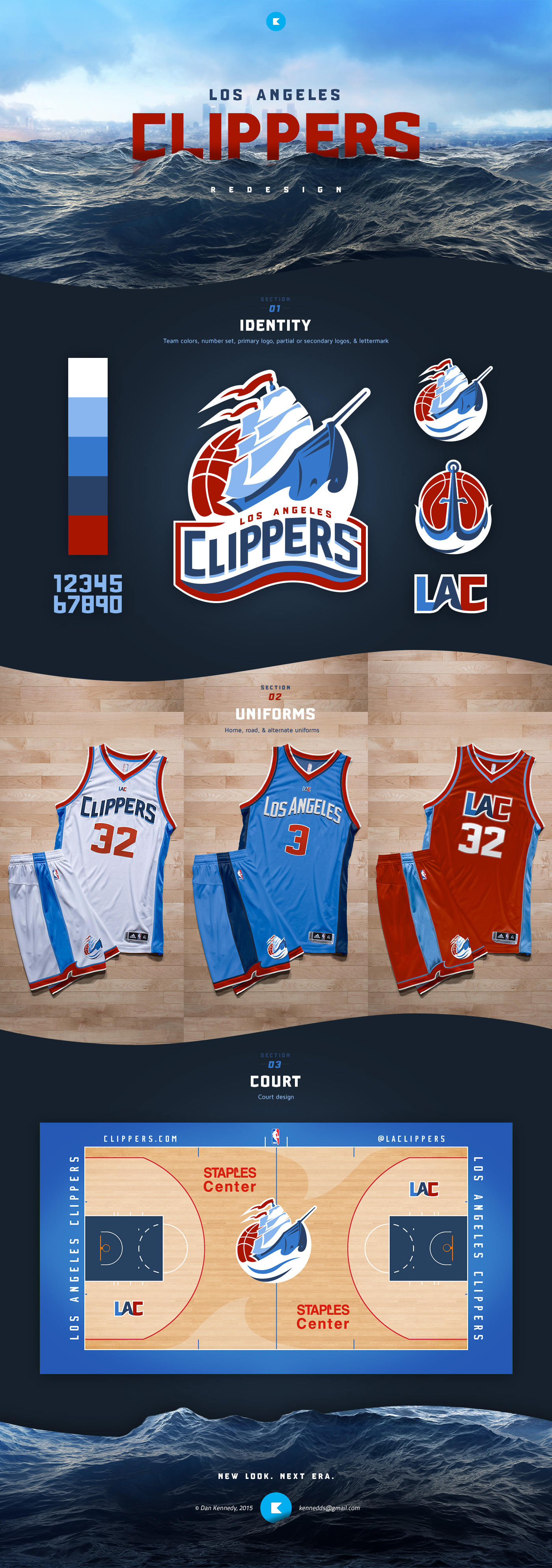
Saw this on ESPN's Uni Watch. Looks a lot better imo.
Re: Clippers Court Revealed
Sat Jul 18, 2015 10:56 pm
^^ That guy did an amazing job. It's heaps better than the minimalist junk they call their actual "rebranding".
Re: Clippers Court Revealed
Sun Jul 19, 2015 2:23 am
Pdub wrote:Nautical......roots.
Looks less like nautical roots, more like Microsoft/clip art roots
Re: Clippers Court Revealed
Sun Jul 19, 2015 9:25 am
I miss Sterling.
Re: Clippers Court Revealed
Sun Jul 19, 2015 9:33 am
I'm not sure about the ship logo at centre court, but apart from that, those designs are way better and more creative than what they've gone with.