
Nice.
Look at the "Current roster" - very nice GUI addition.
Overall it looks clean and functional. Well done.
BTW Timmy is 90? That's third after all.
Some screenshots +team selected screen & spurs ratings screen
47 posts
• Page 2 of 2 • 1, 2
Re: Some screenshots +team selected screen & spurs ratings screen
![]() by ThePointForward on Wed Sep 10, 2014 5:21 pm
by ThePointForward on Wed Sep 10, 2014 5:21 pm
-

ThePointForward - Formerly Dommy73
- Posts: 2117
- Joined: Mon Jun 11, 2012 12:00 am
Re: Some screenshots +team selected screen & spurs ratings screen
![]() by Retroswald13 on Wed Sep 10, 2014 5:26 pm
by Retroswald13 on Wed Sep 10, 2014 5:26 pm
Quite reflects the Metro trend.
-
Retroswald13 - Oswald. Legend Mods Creator. 256 Project Starter. Real Cheerleaders. Kawaii Leonard.
- Posts: 554
- Joined: Sat May 28, 2011 2:15 pm
- Location: Philippines
Re: Some screenshots +team selected screen & spurs ratings screen
![]() by ThePointForward on Wed Sep 10, 2014 5:38 pm
by ThePointForward on Wed Sep 10, 2014 5:38 pm
Nah, wouldn't say it's metrolike from these screens.
-
ThePointForward - Formerly Dommy73
- Posts: 2117
- Joined: Mon Jun 11, 2012 12:00 am
Re: Some screenshots +team selected screen & spurs ratings screen
![]() by TBM on Wed Sep 10, 2014 5:43 pm
by TBM on Wed Sep 10, 2014 5:43 pm
Damn that's pretty.

-

TBM - Contributor

- Posts: 3653
- Joined: Mon Dec 16, 2013 7:33 am
Re: Some screenshots +team selected screen & spurs ratings screen
![]() by Retroswald13 on Wed Sep 10, 2014 5:44 pm
by Retroswald13 on Wed Sep 10, 2014 5:44 pm
Dommy73 wrote:Nah, wouldn't say it's metrolike from these screens.
Or just flat?
-
Retroswald13 - Oswald. Legend Mods Creator. 256 Project Starter. Real Cheerleaders. Kawaii Leonard.
- Posts: 554
- Joined: Sat May 28, 2011 2:15 pm
- Location: Philippines
Re: Some screenshots +team selected screen & spurs ratings screen
![]() by ThePointForward on Wed Sep 10, 2014 6:11 pm
by ThePointForward on Wed Sep 10, 2014 6:11 pm
Retroswald13 wrote:Dommy73 wrote:Nah, wouldn't say it's metrolike from these screens.
Or just flat?
Well it kinda reminds me of some older designs - nice, clean, neat, functional. I like it wqy more than jay-z's bullshit stuff all over the screen.
-
ThePointForward - Formerly Dommy73
- Posts: 2117
- Joined: Mon Jun 11, 2012 12:00 am
Re: Some screenshots +team selected screen & spurs ratings screen
![]() by Retroswald13 on Wed Sep 10, 2014 6:38 pm
by Retroswald13 on Wed Sep 10, 2014 6:38 pm
Dommy73 wrote:Retroswald13 wrote:Dommy73 wrote:Nah, wouldn't say it's metrolike from these screens.
Or just flat?
Well it kinda reminds me of some older designs - nice, clean, neat, functional. I like it wqy more than jay-z's bullshit stuff all over the screen.
Yeah. I think u're referring to 2K12.
-
Retroswald13 - Oswald. Legend Mods Creator. 256 Project Starter. Real Cheerleaders. Kawaii Leonard.
- Posts: 554
- Joined: Sat May 28, 2011 2:15 pm
- Location: Philippines
Re: Some screenshots +team selected screen & spurs ratings screen
![]() by skoadam on Wed Sep 10, 2014 7:51 pm
by skoadam on Wed Sep 10, 2014 7:51 pm
i dont like design of 2k12 and 2k14 but i like this very much. 


2011/2012 2010/2011 2009/2010 2008/2009 2007/2008 2006/2007 2005/2006 2004/2005 2003/2004 2002/2003
2001/2002 2000/2001 1999/2000 1998/1999 1997/1998 1996/1997 1995/1996 1994/1995 1993/1994 1992/1993
1991/1992 1990/1991 1989/1990 1988/1989 1987/1988 1986/1987 1985/1986 1984/1985 1969/1970 1961/1962
-

skoadam - U R Basketball - Where Sim Happens
- Posts: 8360
- Joined: Sat Nov 12, 2005 12:52 am
- Location: PL
Re: Some screenshots +team selected screen & spurs ratings screen
![]() by Andrew on Wed Sep 10, 2014 7:54 pm
by Andrew on Wed Sep 10, 2014 7:54 pm
Prefer it to the menus from last year's PS4/X1 version.
Contact: Email | X | Bluesky
Modding Topics: NBA 2K10 | NBA Live 08 | NBA Live 07 | NBA Live 06 | NBA 2K6 | NBA Live 2005 | NBA Live 2004 | NBA Live 96
Story Topics: NBA Live 16 | NBA 2K14 | NBA 2K13 | NBA Live 06 (Part 2) | NBA Live 06 (HOF) | NBA Live 2004 (HOF)
NLSC: Podcast | The Friday Five | Monday Tip-Off | Wayback Wednesday | Facebook | X | YouTube | Instagram | Bluesky
Donations/Support: Patreon | PayPal
-

Andrew - Retro Basketball Gamer

- Posts: 115438
- Joined: Thu Aug 22, 2002 8:51 pm
- Location: Australia
Re: Some screenshots +team selected screen & spurs ratings screen
![]() by Kevin on Wed Sep 10, 2014 8:56 pm
by Kevin on Wed Sep 10, 2014 8:56 pm
Looks cool and simple. 
Rest In Peace Kobe
-

Kevin - Fuck the Celtics
- Posts: 8038
- Joined: Sat Nov 16, 2013 9:47 pm
- Location: Staples
Re: Three new screenshots
![]() by Ballyoop on Wed Sep 10, 2014 10:11 pm
by Ballyoop on Wed Sep 10, 2014 10:11 pm
Vlad2010 wrote:Team selected screen (via operationsports)
[ Image ]
sweet! nice to see that they also improved in designing their interface and presentation.
sooo.. timmy is the 3rd player joining bron and kd with 90+ rating.

is this it, that's what it's all about, manny?
-

Ballyoop - collywobbles
- Posts: 1356
- Joined: Fri Aug 15, 2008 2:41 pm
- Location: Auckland
Re: Some screenshots +team selected screen & spurs ratings screen
![]() by ColumbusBobby23 on Wed Sep 10, 2014 10:54 pm
by ColumbusBobby23 on Wed Sep 10, 2014 10:54 pm
I like how it shows an actual image of each teams best player. I wonder how that's going to work with custom rosters?
-
ColumbusBobby23 - Posts: 431
- Joined: Mon Dec 10, 2012 3:57 pm
Re: Some screenshots +team selected screen & spurs ratings screen
![]() by ThePointForward on Wed Sep 10, 2014 11:36 pm
by ThePointForward on Wed Sep 10, 2014 11:36 pm
Retroswald13 wrote:Dommy73 wrote:Retroswald13 wrote:Dommy73 wrote:Nah, wouldn't say it's metrolike from these screens.
Or just flat?
Well it kinda reminds me of some older designs - nice, clean, neat, functional. I like it wqy more than jay-z's bullshit stuff all over the screen.
Yeah. I think u're referring to 2K12.
No I meant older designs in general. But that's just my taste with everything:
- nice, solid, elegant pc case like define r4
- ordinary, yet beautiful girl without stupid stuff like having half of her head shaven
... You get the idea
-
ThePointForward - Formerly Dommy73
- Posts: 2117
- Joined: Mon Jun 11, 2012 12:00 am
Re: Some screenshots +team selected screen & spurs ratings screen
![]() by TBM on Thu Sep 11, 2014 1:32 am
by TBM on Thu Sep 11, 2014 1:32 am
columbusbobby23 wrote:I like how it shows an actual image of each teams best player. I wonder how that's going to work with custom rosters?
Probably the highest ranked player? Only issue there is, does the game really have an action shot like that for everyone?
-
TBM - Contributor
- Posts: 3653
- Joined: Mon Dec 16, 2013 7:33 am
Re: Some screenshots +team selected screen & spurs ratings screen
![]() by chicagoRAW on Thu Sep 11, 2014 2:02 am
by chicagoRAW on Thu Sep 11, 2014 2:02 am
Looks like a play off TNT themes from the past couple years. Very nice. It actually looks professional. Only took about 15 years.

-

chicagoRAW - Posts: 2289
- Joined: Mon Dec 20, 2010 8:04 am
- Location: Chi Town
Re: Some screenshots +team selected screen & spurs ratings screen
![]() by TBM on Thu Sep 11, 2014 3:19 am
by TBM on Thu Sep 11, 2014 3:19 am
Tim Duncan is one of the four 90s? Yeah, I'm changing that.
-
TBM - Contributor
- Posts: 3653
- Joined: Mon Dec 16, 2013 7:33 am
Re: Some screenshots +team selected screen & spurs ratings screen
![]() by bowdown on Thu Sep 11, 2014 4:02 am
by bowdown on Thu Sep 11, 2014 4:02 am
They said player rating systems are now changed. Duncan is quite good both defensively and offensively. That might have factored in him being 90. It makes sense too. If a player is only good on offense like Harden gets rated in the 90s it doesn't really depict how many points he gives up on the other end.
-

bowdown - Posts: 2010
- Joined: Wed Jun 18, 2008 6:30 am
Re: Some screenshots +team selected screen & spurs ratings screen
![]() by xerion on Thu Sep 11, 2014 4:40 am
by xerion on Thu Sep 11, 2014 4:40 am
-

xerion - Posts: 439
- Joined: Fri Jul 31, 2009 10:34 pm
- Location: Czech Republic
Re: Some screenshots +team selected screen & spurs ratings screen
![]() by TBM on Thu Sep 11, 2014 4:52 am
by TBM on Thu Sep 11, 2014 4:52 am
bowdown wrote:They said player rating systems are now changed. Duncan is quite good both defensively and offensively. That might have factored in him being 90. It makes sense too. If a player is only good on offense like Harden gets rated in the 90s it doesn't really depict how many points he gives up on the other end.
TIm Duncan is not a 90 in 2014, though. Not that James Harden is, either.
-
TBM - Contributor
- Posts: 3653
- Joined: Mon Dec 16, 2013 7:33 am
Re: Some screenshots +team selected screen & spurs ratings screen
![]() by bowdown on Thu Sep 11, 2014 5:37 am
by bowdown on Thu Sep 11, 2014 5:37 am
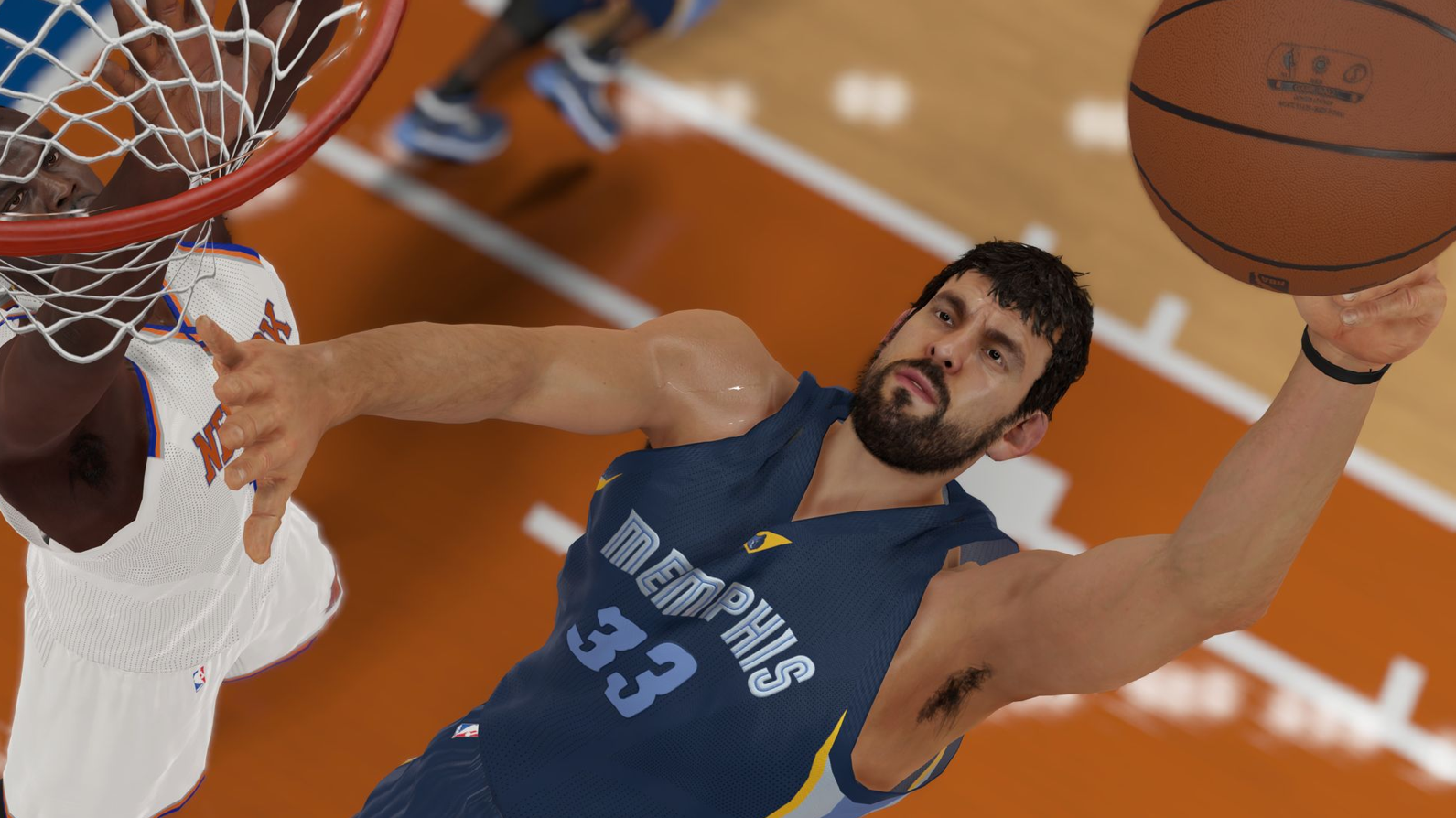
Is that armpit hair really in game? Have my prayers finally been answered?
-
bowdown - Posts: 2010
- Joined: Wed Jun 18, 2008 6:30 am
Re: Some screenshots +team selected screen & spurs ratings screen
![]() by Hiteshom on Thu Sep 11, 2014 7:41 am
by Hiteshom on Thu Sep 11, 2014 7:41 am
One other observation on the team select screen: on the bulls it says ready, signifying that one cannot start a game without the other being ready like last year. Haleighlujah!!!

-

Hiteshom - Posts: 499
- Joined: Mon Jun 25, 2012 9:47 am
- Location: Salt Lake City, Utah
Re: Some screenshots +team selected screen & spurs ratings screen
![]() by JBulls on Thu Sep 11, 2014 12:49 pm
by JBulls on Thu Sep 11, 2014 12:49 pm
chicagoRAW wrote:Very nice. It actually looks professional. Only took about 15 years.
Haha isn't that the truth.
-

JBulls - Posts: 685
- Joined: Tue Oct 09, 2012 2:59 pm
- Location: Durham, N.C.
47 posts
• Page 2 of 2 • 1, 2
Who is online
Users browsing this forum: No registered users and 3 guests