bigh0rt's Little Patch Thread
Sun Oct 29, 2006 11:58 am
RELEASES:
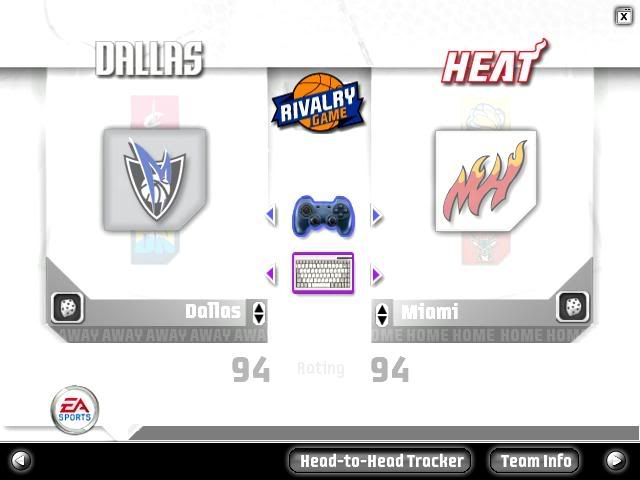
ESPN Styled Team Select Logos :: Preview
New Player Icon/FSS Indicators
ESPN Styled Team Select Logos :: Preview
New Player Icon/FSS Indicators
Last edited by bigh0rt on Sun Nov 12, 2006 10:41 am, edited 1 time in total.
Sun Oct 29, 2006 12:00 pm
Smooth.
Sun Oct 29, 2006 12:03 pm
very very smooth

Sun Oct 29, 2006 12:08 pm
Where should I put the files? 
Sun Oct 29, 2006 12:09 pm
sgsm -- sorry
Sun Oct 29, 2006 12:15 pm
Cool beans.
*we need a cool bean smiley just for me...I'm tired of the thumbs up."
*we need a cool bean smiley just for me...I'm tired of the thumbs up."
Sun Oct 29, 2006 12:20 pm
Looks cool 
Sun Oct 29, 2006 12:24 pm
looks nice bigh0rt... though I think if the logos had a stronger color it would be much beter
Sun Oct 29, 2006 12:43 pm
Nice Job 
Sun Oct 29, 2006 12:44 pm
courtney wrote:Nice Job
Get your ass on MSN. Been waitin for you.
Sun Oct 29, 2006 1:50 pm
Wow! Nice man!
In my game!
In my game!
Sun Oct 29, 2006 2:37 pm
I love it.
Sun Oct 29, 2006 2:39 pm
The Miami Heat one is ... hot. 
Sun Oct 29, 2006 2:57 pm
super smooth..i love it!! keep it up 
Sun Oct 29, 2006 3:40 pm
Jing wrote:looks nice bigh0rt... though I think if the logos had a stronger color it would be much beter
yea i agree...the ones above and below the main one should be faded like that, but the main focused logo should be really vibrant with color...also, is it me, or does the Heat one not have a bevel?
Sun Oct 29, 2006 5:13 pm
Very nice bigh0rt, I think the more you can do to make it seem like an ESPN style presentation TV broadcast the better.
Sun Oct 29, 2006 5:18 pm
very nice
Sun Oct 29, 2006 5:18 pm
nice!
Sun Oct 29, 2006 5:25 pm
C0nr4d, the Heat one does have a bevel. There is an effect on that screen where the logo pulses between normal and bright. The screenshot was taken was during a pulse of brightness, which washed out the bevel.
Sun Oct 29, 2006 6:36 pm
Well Done bighOrt
Mon Oct 30, 2006 4:26 am
Marcus Williams has gotten 5 separate tatoos since being drafted; when he had zero. Here I'll show you the 3 I could get a good preview of. I couldn't get a good shot of the words that go down the front of each of his biceps...
Preview:

So?
Preview:
So?
Mon Oct 30, 2006 4:36 am
They look great. Very realistic (except for that shine)
Hope that you can get a hold of the rest..
Hope that you can get a hold of the rest..
Mon Oct 30, 2006 4:40 am
Pdub wrote:C0nr4d, the Heat one does have a bevel. There is an effect on that screen where the logo pulses between normal and bright. The screenshot was taken was during a pulse of brightness, which washed out the bevel.
aight thx
Mon Oct 30, 2006 4:41 am
Nice tats. I agree with Conr4d on the logos, they do look washed out. I'm hoping thats a result of taking the screen while the "pulse" appeared, because the Atlanta and Boston logos you showed in the other thread looked stunning.
Mon Oct 30, 2006 4:47 am
Flite_23 wrote:Nice tats. I agree with Conr4d on the logos, they do look washed out. I'm hoping thats a result of taking the screen while the "pulse" appeared, because the Atlanta and Boston logos you showed in the other thread looked stunning.
The logos were done in idential fashion to the Atlanta and Boston preview I showed in the SUM Headquarters thread, so I assume it must be the pulse of light that PDub's referring to. Download 'em and check it out for yourself.
Andreas: I've already put all the tats on -- I just couldn't get a good shot for a preview of the other 2.