Mon Oct 31, 2005 12:13 am
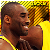
Ok I tried to fix it a bit :

Do you think it's any better ?
Do you think it's any better ?
Mon Oct 31, 2005 4:19 am
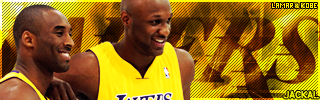
Love the Amare one  Nice work! I don't really like the KG one though, the type doesn't really match the background and picture.
Mon Oct 31, 2005 6:46 am
New one's much better.
And I was just joking, don't take it seriously
And I was just joking, don't take it seriously
Fri Nov 11, 2005 6:07 am
Here's my newest set . Maybe it looks a bit plain but I just wanted to do something easy and nice 
Tell me what do you think.


Tell me what do you think.
Fri Nov 11, 2005 8:01 am
Plain? Great job
Fri Nov 11, 2005 8:03 am
Yeah, Nice job on that sig, could you please upload the pattern?
Fri Nov 11, 2005 1:02 pm
i think it´s very nice
Fri Nov 11, 2005 1:41 pm
Da King23 wrote:Yeah, Nice job on that sig, could you please upload the pattern?
That pattern looks like it's just a mesh texture for jerseys, I'm sure you have that.
Sat Nov 12, 2005 1:46 am
Da King23 wrote:Yeah, Nice job on that sig, could you please upload the pattern?
Here ya go :
http://img.photobucket.com/albums/v212/ ... attern.png
Sat Nov 12, 2005 4:07 am
Hellow, nice stuff you've got here.
Do you take requests? If so, can I ask for a sig/avatar?
Could you make something out of one of the following two:

http://psdresource.com/psds.php?action= ... rts&page=1
or

http://psdresource.com/psds.php?action= ... rts&page=3
I'd prefer if you could do the Lakers one.
Thanks if you can, no biggie if you can't.
Do you take requests? If so, can I ask for a sig/avatar?
Could you make something out of one of the following two:
http://psdresource.com/psds.php?action= ... rts&page=1
or
http://psdresource.com/psds.php?action= ... rts&page=3
I'd prefer if you could do the Lakers one.
Thanks if you can, no biggie if you can't.
Sat Nov 12, 2005 5:34 am
Jackal wrote:Hellow, nice stuff you've got here.
Do you take requests? If so, can I ask for a sig/avatar?
Actually I don't have enough time for doing request but today is friday so I took your request
I tried my best . It doesn't look superb but better than nothing
Sat Nov 12, 2005 6:53 am
Thanks, it's much appreciated you decided to do it regardless of the fact you usually don't take requests.
I like it. The avatar is kind of off, but as you said, it's better than nothing.
 XOXOXOX
Edit: The size in KB's of the signature is too much + the size of the avatar isn't 90 x 90.
Can anyone resize it? I don't have PS on this PC.
I like it. The avatar is kind of off, but as you said, it's better than nothing.
Edit: The size in KB's of the signature is too much + the size of the avatar isn't 90 x 90.
Can anyone resize it? I don't have PS on this PC.
Sat Nov 12, 2005 7:02 am

Sat Nov 12, 2005 7:05 am
Gratzi nbalive. (Go back to that.)
Sat Nov 12, 2005 11:43 am
Can you get me a request?
Wed Dec 14, 2005 6:13 am
New A.Iverson set :


Comments & suggestions are much appreciated
Comments & suggestions are much appreciated
Wed Dec 14, 2005 6:42 am
nice 10/10 also could u make a set for me but with chris bosh??? thanks
Wed Dec 14, 2005 6:54 am
Sorry but as I said i'm not taking requests maybe some day.. 
btw thanks fot the comment
btw thanks fot the comment
Wed Dec 14, 2005 6:56 am
Wow, that's ONE of my fav sig.
Wed Dec 14, 2005 3:58 pm
I don't like the 'panco' text in the sig, and the effect on AI doesn't work too well (the eyes are too dark). Other than that it's nice man.
Thu Dec 15, 2005 7:54 am
Colin wrote:I don't like the 'panco' text in the sig, and the effect on AI doesn't work too well (the eyes are too dark). Other than that it's nice man.
Thanks
btw : it's off-topic but i love your Marion sig , especially the background
Thu Dec 15, 2005 9:43 am
Here's a suggestion: Try duplicating the AI layer, then filter-->other-->high pass (I think it's under other) at 6-8 pixels. Then set that layer to soft light or overlay. You'll get some nice shadow and contrast without messing up his eyes. If his eyes still get too dark use the dodge tool set to 60% and shadows with a soft brush and brush around the eyes on the duplicated layer.
Fri Dec 16, 2005 1:19 am
Colin wrote:Here's a suggestion: Try duplicating the AI layer, then filter-->other-->high pass (I think it's under other) at 6-8 pixels. Then set that layer to soft light or overlay. You'll get some nice shadow and contrast without messing up his eyes. If his eyes still get too dark use the dodge tool set to 60% and shadows with a soft brush and brush around the eyes on the duplicated layer.
thanks for the suggestion
Thu Dec 22, 2005 5:28 am
I made two versions of t-mac sig and I would like to hear your opinion about the sig and which version is better
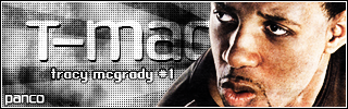

Thu Dec 22, 2005 6:03 am
I thik it needs some colour, but the white part of it looks more pink than red right now. And the BG is a little undersaturated.