Pontiac's Warriors jerseys
Sat Oct 22, 2005 12:51 am
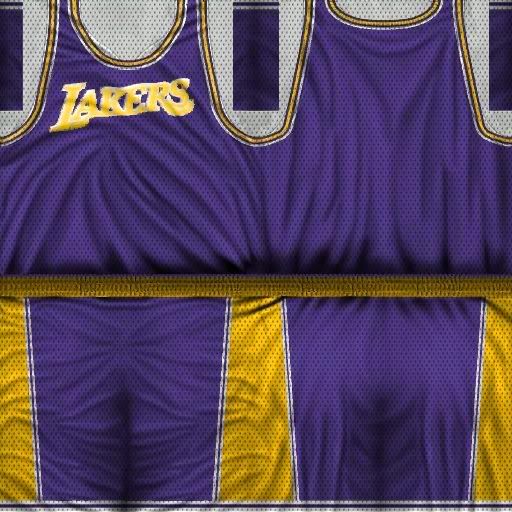
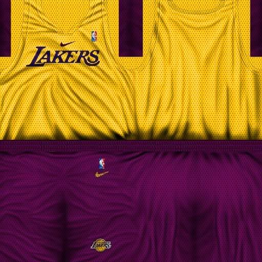
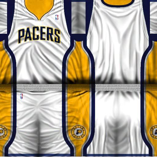
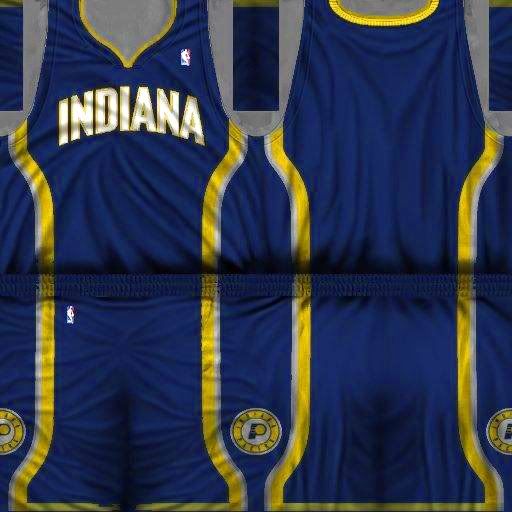
Some lakers and pacers jerseys
Texture By Andyg
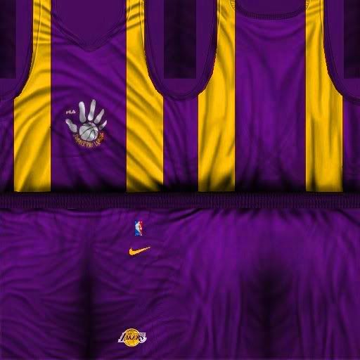
summer league 2003
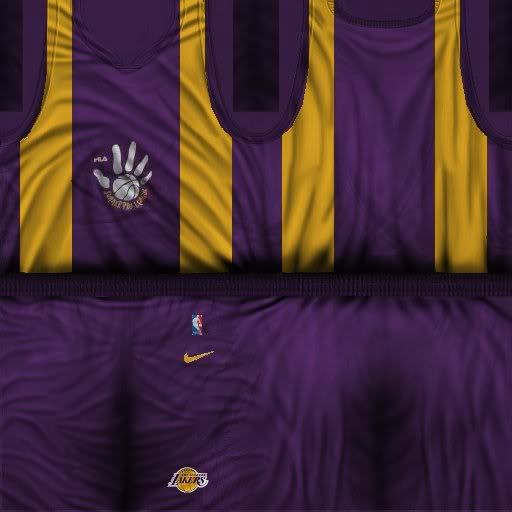
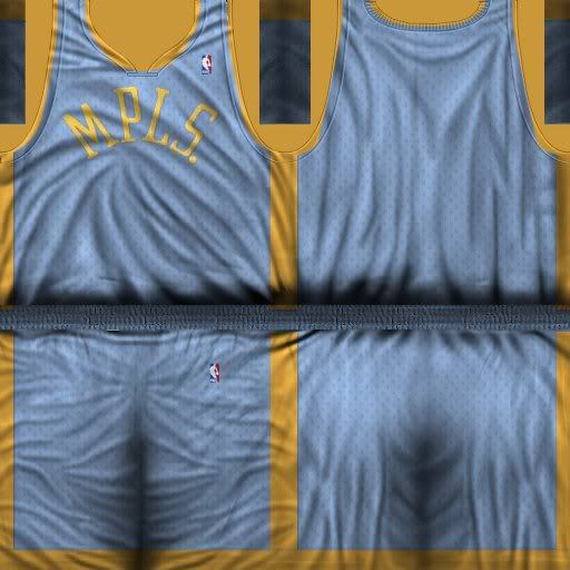
lakers serd
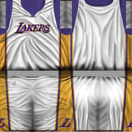
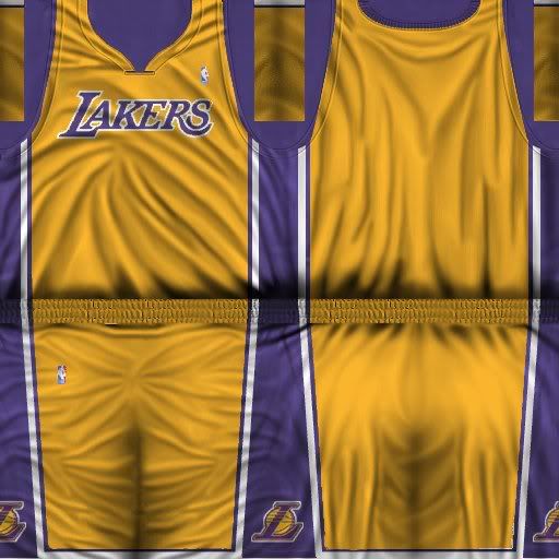
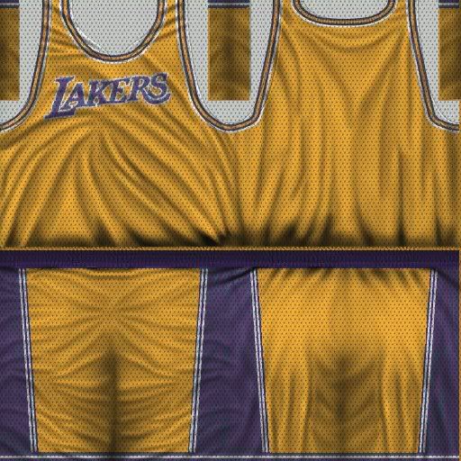
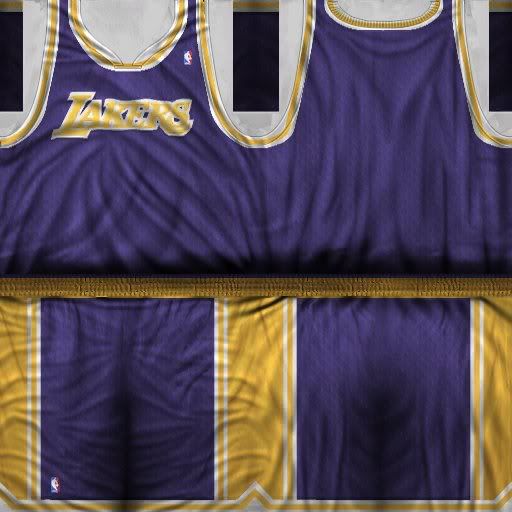
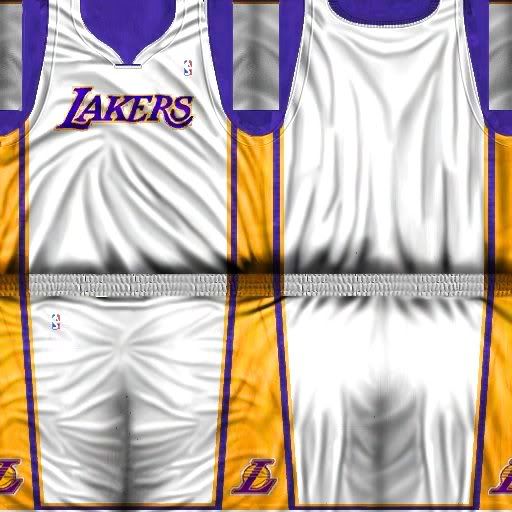
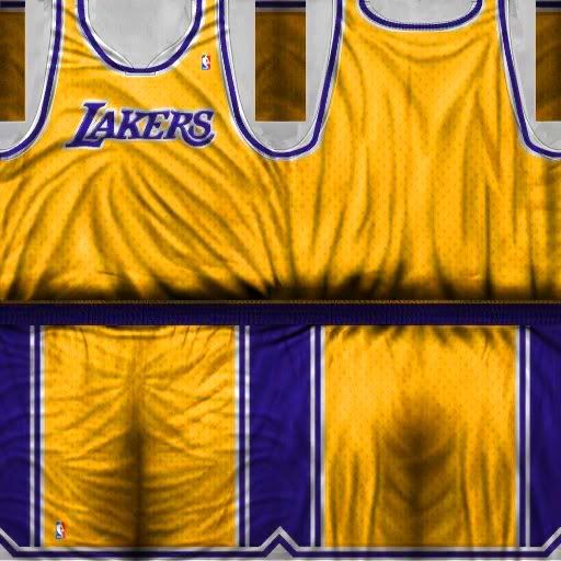
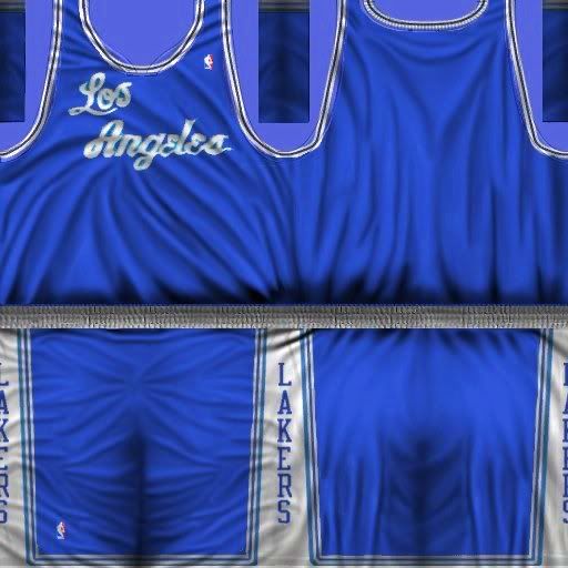
lakers home
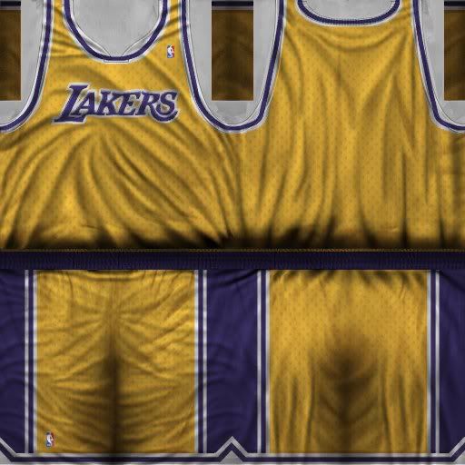
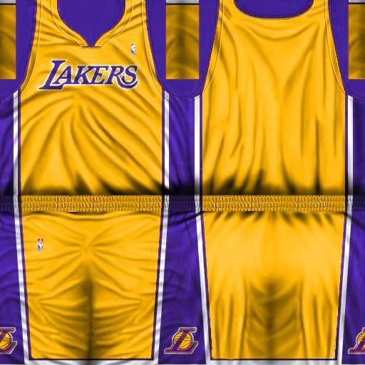
lakers home 86
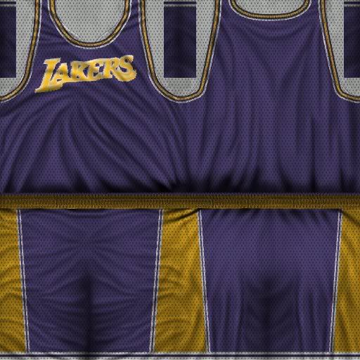
lakers home71
lakers home 61
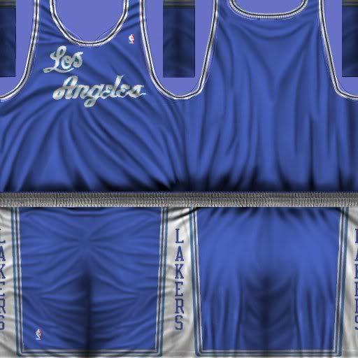
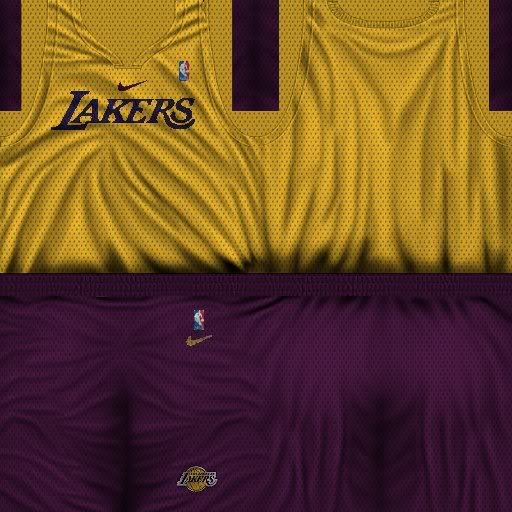
lakers away61
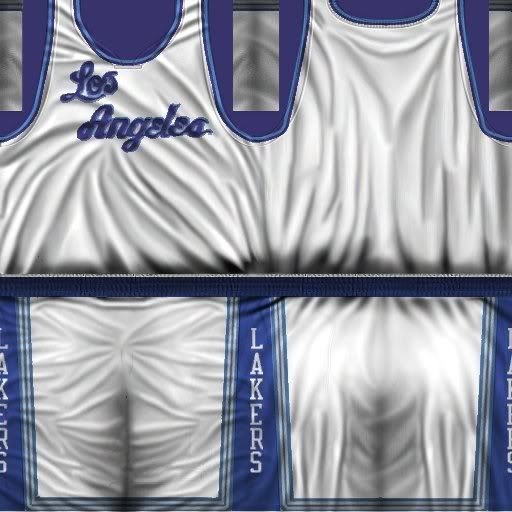
lakers away
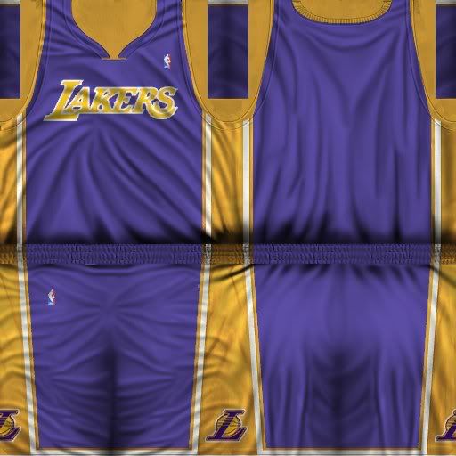
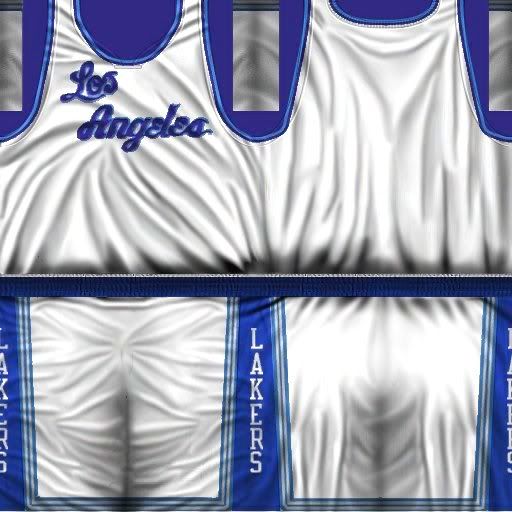
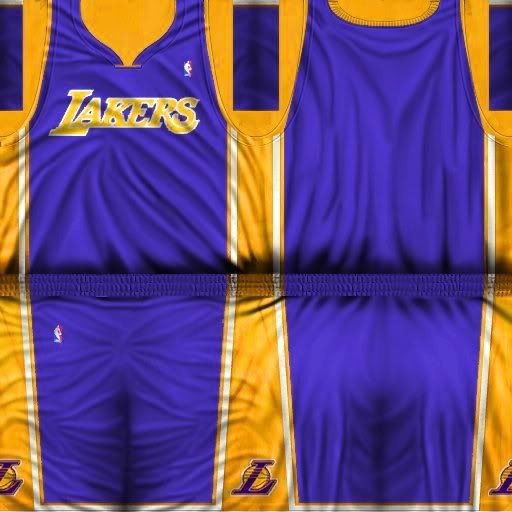
lakers 49 away
lakers 86away
lakers 71 away
lakers sumer league 2004 home
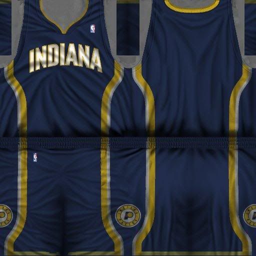
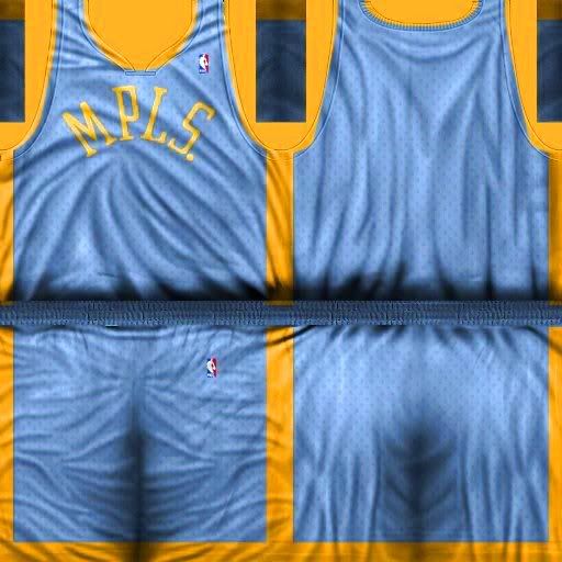
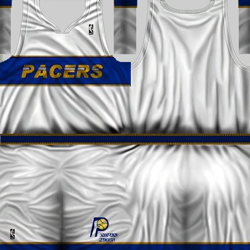
indiana away
Texture By Andyg
summer league 2003
lakers serd
lakers home
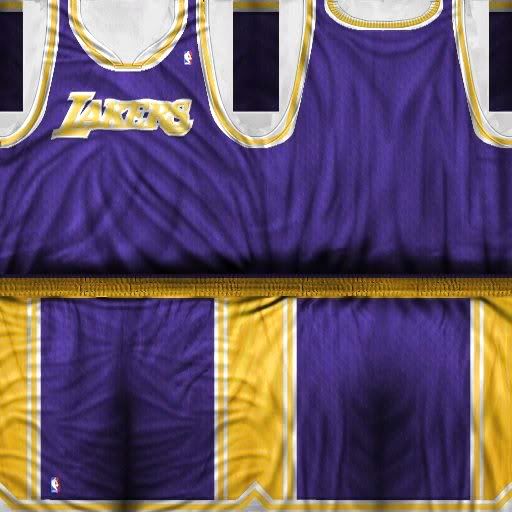
lakers home 86
lakers home71
lakers home 61
lakers away61
lakers away
lakers 49 away
lakers 86away
lakers 71 away
lakers sumer league 2004 home
indiana away
Last edited by pontiacsilverdome on Tue Nov 08, 2005 2:32 am, edited 7 times in total.
Sat Oct 22, 2005 1:06 am
[rant] the colors dont seem saturated enuff to me...and some of the wordmarks look a bit jagged...and the wordmarks shouldnt be "multiplied" with the texture, b/c in real life they are sewn-on patches of material that dont fold and bend like the material of the jersey [/rant]
sry, but i had to get that out...
sry, but i had to get that out...
Sat Oct 22, 2005 1:11 am
looking good for me
Sat Oct 22, 2005 1:20 am
looks good
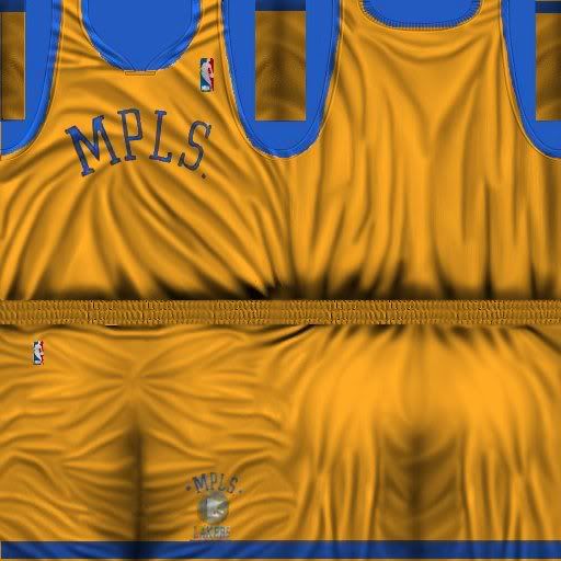
if i install this, will the MLPS jersey overwrite the baby blue Minneapolis Lakers jersey update that i installed? (the jersey that just says "LAKERS" with the stars)
if i install this, will the MLPS jersey overwrite the baby blue Minneapolis Lakers jersey update that i installed? (the jersey that just says "LAKERS" with the stars)
Sat Oct 22, 2005 1:40 am
i love them all, will you make more jerseys 
Sat Oct 22, 2005 1:44 am
Isiah: Probably yes
um, the colours are too faded and like conrad said, the letters shouldnt be "multiplied"
um, the colours are too faded
Sat Oct 22, 2005 6:48 am
Very good for me! Release!!
Sat Oct 22, 2005 9:02 am
Thanks for the comments
i've tried to correct the saturation and make two new jerseys
lakers home 49 and indiana home 88
it's a release use the jersey raptor to change the default jersey
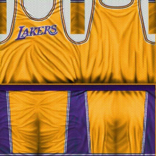
i've tried to correct the saturation and make two new jerseys
lakers home 49 and indiana home 88
Lagoa wrote:Very good for me! Release!!
it's a release use the jersey raptor to change the default jersey
Last edited by pontiacsilverdome on Sat Oct 22, 2005 9:07 am, edited 2 times in total.
Sat Oct 22, 2005 9:04 am
It's better, but now the colours are off. And you still haven't changed the logos, they go above the texture layer.
Sat Oct 22, 2005 9:13 am
i´m too lazy to change the logos 
but i will try to correct this
thanks
but i will try to correct this
thanks
Sat Oct 22, 2005 9:22 am
i think those are some wrong jersey textures
Sat Oct 22, 2005 9:27 am
wrong ? 
Sat Oct 22, 2005 10:08 am
Ignore him, most of what he posts is incomprehensible.
Sat Oct 22, 2005 10:22 am
what im saying is that the old lakers jersey doesnt have the thing at the neck like the new one. and sry i meant to say template or w/e.
Sat Oct 22, 2005 10:31 am
old colors lookin better to me but yeah
Maybe the newones what you did is just too over contrasted.
but nice job anyway.
Maybe the newones what you did is just too over contrasted.
but nice job anyway.
Sat Oct 22, 2005 10:34 am
Imo they look a little to wrinkled. If you just fix that a bit then they would be awesome....better then the EA current ones
Sat Oct 22, 2005 11:03 am
Yeh you've over saturated them..
Alot of your retro jerseys don't match. Trim wise.. not every team\jersey uses the same collar style..
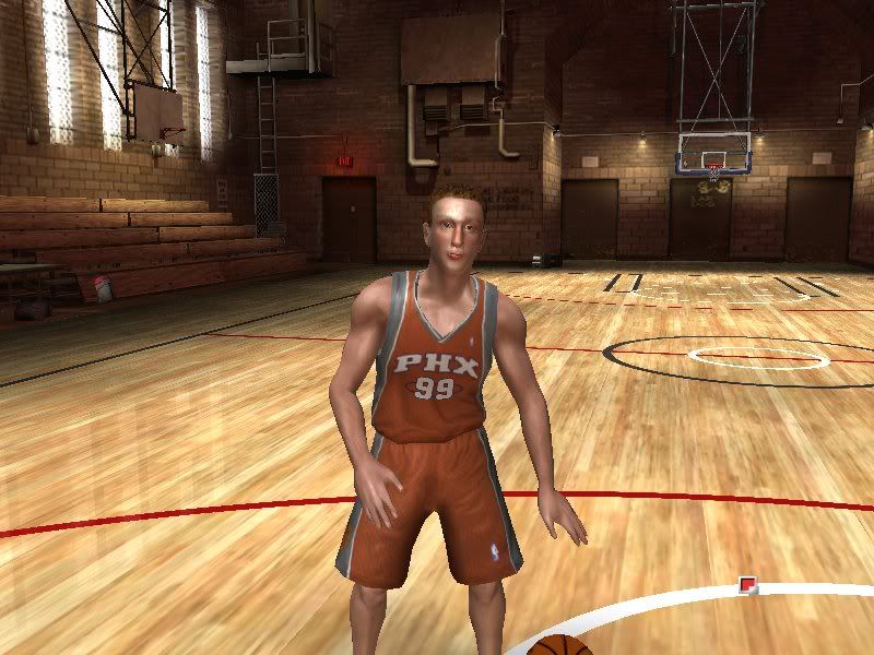
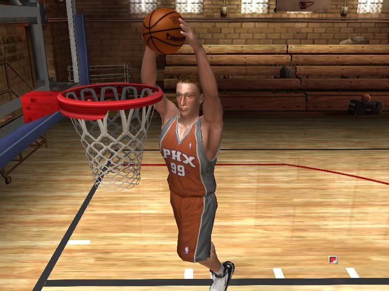
You should test your jerseys in game before u release anything, heck maybe even provide some screenshots.
Jersey patchers these days seem to be very sloppy.. its basic fundamentals of patching.
Alot of your retro jerseys don't match. Trim wise.. not every team\jersey uses the same collar style..
You should test your jerseys in game before u release anything, heck maybe even provide some screenshots.
Jersey patchers these days seem to be very sloppy.. its basic fundamentals of patching.
Sat Oct 22, 2005 11:07 am
Jowe wrote:Jersey patchers these days seem to be very sloppy.. its basic fundamentals of patching.
Take it from the Master, nah mean.
Sat Oct 22, 2005 11:07 am
Jowe wrote:Yeh you've over saturated them..
Alot of your retro jerseys don't match. Trim wise.. not every team\jersey uses the same collar style..
You should test your jerseys in game before u release anything, heck maybe even provide some screenshots.
Jersey patchers these days seem to be very sloppy.. its basic fundamentals of patching.
Yeah thats what I mean, the collars
Sun Oct 23, 2005 5:18 am
Another thing that I've seen lately are classic jerseys with mesh holes. If you are trying to create a 1949 Away jersey you should not use the mesh texture. Also the only neck shape for most classic jerseys should be round. If you are trying to create a modern "retro" jersey then you can do what you like. I like the colors of your second versions. Jerseys from the 70's and 80's did not have the shiny texture that many teams use now.
Tue Oct 25, 2005 3:47 am
the colors and the collars of old jerseys are ea default
the colors are too satured, i know ,but i like it
the colors are too satured, i know ,but i like it
Wed Oct 26, 2005 7:27 am
Lucas tischer preview :
in Game
cyberface:

Portrait:

in Game
cyberface:
Portrait:
Wed Oct 26, 2005 7:49 am
Great, release!!
Wed Oct 26, 2005 8:40 am
Nice to see some missing players getting created. Nice Tischer.
Wed Oct 26, 2005 8:42 am
That's great man. I know people been waiting for this. Maybe try a different head shape.