Re: Lean's Photoshop Gallery: Eyes Failing?
Sun Aug 16, 2009 3:21 am
Thanks for pointing those things out. Though I must admit that these photos take the shit out of me since I can't see all details.
My senses tell me that I should request for a better resource picture next time.
My senses tell me that I should request for a better resource picture next time.
Re: Lean's Photoshop Gallery: Eyes Failing?
Sun Aug 16, 2009 3:47 pm
I'll go with revision, Lean. The outcome really does looks weird when opposed to the source pic, but I'd blame it on the quality of the source pic and the lighting it has. I would recommend you to revise just the facial area as the remaining areas are well above OK. (the hair rules)
It's hard to tell why it's not looking right, but personally I think it's all about the shadows and lightings on her face. Her facial elements looks fine already, but the shadows/lightings on her face can really make a difference in terms of the "impression" you get from looking at the face.
It's hard to tell why it's not looking right, but personally I think it's all about the shadows and lightings on her face. Her facial elements looks fine already, but the shadows/lightings on her face can really make a difference in terms of the "impression" you get from looking at the face.
Re: Lean's Photoshop Gallery: Eyes Failing?
Sun Aug 16, 2009 4:07 pm
I made some adjustments for now and I should put some layers to create that bridge in the girl's nose.
Re: Lean's Photoshop Gallery: Eyes Failing?
Mon Aug 17, 2009 1:08 am
Did a few adjustments and...
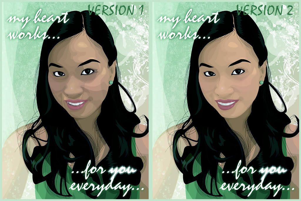
The girl became fairer since I "reduced" the cut-away layers and "did my own style" (as my client puts it) by decreasing the shade layers opacity to 5%. I felt that the portrait lost detail, but I guess it's better than the first one. I added a nose bridge, had the eyes smaller, tweaked the left cheek and added player accessories.
Currently working on the nose to make it look pointier and not squashed.
Commentz plz.
The girl became fairer since I "reduced" the cut-away layers
Currently working on the nose to make it look pointier and not squashed.
Commentz plz.
Re: Lean's Photoshop Gallery: Eyes Failing?
Mon Aug 17, 2009 1:48 am
The final, renowned version.

-Fixed skintone
-Added nose depth
-Added eyebags
-Decreased shadings
-Added custom tattoos and player accessories (must have CustomArt installed)
-Fixed skintone
-Added nose depth
-Added eyebags
-Decreased shadings
-Added custom tattoos and player accessories (must have CustomArt installed)
Re: Lean's Photoshop Gallery: Eyes Failing?
Mon Aug 17, 2009 1:48 am
Hair and nose needs some tweaking . (also maybe the lower lip or the chin?)
- Well, it certainly looks a lot better than before. This time I'd still rather look at the real pic.
- Well, it certainly looks a lot better than before. This time I'd still rather look at the real pic.
Re: Lean's Photoshop Gallery: Eyes Failing?
Mon Aug 17, 2009 2:01 am
I'll probably shoot myself later for saying this, but I agree with MikeMan. The left side of the chin looks a bit off and the hair could do with some more detail. The lower lip also looks a little weird, if you compare to the original the shape of her bottom lip is pretty consistent... whereas on that one it starts off going one way then its almost like another lip is added on top of it. The teeth look better, overall you could probably give it to him as is and he'd be happy. I'm just nitpicking really.
Re: Lean's Photoshop Gallery: Eyes Failing?
Mon Aug 17, 2009 2:23 am
Jae wrote:I'll probably shoot myself later for saying this, but I agree with MikeMan.
Thanks for the pointers, Jae. I personally felt that this one looks more toony, but better in some ways. I showed the file to the client a few minutes ago. And he liked this version as it is. So uhh, next time I'll be demanding for a better resource photo. Or better yet, I'll steal one from my client myself.
Apparently he preferred vectors with less level of shades. I don't know why. The lower lip lacked shades but it's still fine with him.
This first client of mine is a fellow engineering graduate (and also teaches college students), -- whom I teach Photoshop into because he prefers doing still graphics in PowerPoint 2007. I admire the enthusiasm he shows when he does stuff in PowerPoint, and I told him to study something else and I'll be teaching him for free. But he turned it down.

The girl on the left is the girl I just vectored.
and the same girl as she was first depicted by the client in Powerpoint:

One can do the same vector graphics in PowerPoint but I keep on telling him that you cannot go beyond 1024x768 (or your monitor's highest resolution) when doing graphics in PowerPoint.
Well, case closed. I'm really looking forward for payment.
Re: Lean's Photoshop Gallery: Eyes Failing?
Mon Aug 17, 2009 4:19 am
Maybe the reason you had trouble was because you didn't steal the resource photo. It makes you lose your 'edge' or mojo when not stealing.
Re: Lean's Photoshop Gallery: Eyes Failing?
Mon Aug 17, 2009 9:00 am
Nice work nice girl Lean 

Re: Lean's Photoshop Gallery: Eyes Failing?
Mon Aug 17, 2009 3:17 pm
i blame the client... from what i've read, it's a supposed gift for his girlfriend yet the only pic that he could give you is worst than the ones that you have stolen for your earlier vectors (regarding lighting, details, resolution and such) it even looks as if it was the girl who took her own picture for christ's sake (based on her arm position)...
my advice is to view your friend's profile on social networking sites like friendster, multiply, or facebook, find his girlfriend's account and steal a pic of her that is most suitable for vector art... it's a win-win, you get your mojo back (by using stolen material again) and a better base pic to work upon... try to even ask him more money for the "extra research" that you did...
my advice is to view your friend's profile on social networking sites like friendster, multiply, or facebook, find his girlfriend's account and steal a pic of her that is most suitable for vector art... it's a win-win, you get your mojo back (by using stolen material again) and a better base pic to work upon... try to even ask him more money for the "extra research" that you did...
Re: Lean's Photoshop Gallery: Eyes Failing?
Tue Aug 18, 2009 9:59 pm
Glen wrote:my advice is to view your friend's profile on social networking sites like friendster, multiply, or facebook, find his girlfriend's account and steal a pic of her that is most suitable for vector art... it's a win-win, you get your mojo back (by using stolen material again) and a better base pic to work upon... try to even ask him more money for the "extra research" that you did...
You never fail to make me laugh Glen.
Re: Lean's Photoshop Gallery: Eyes Failing?
Wed Aug 19, 2009 9:29 pm
The vectored picture is much more prettier than the original pic  btw i really liked it i hope i could do those things like you ive been practising lately but i cant seem to make it as good as yours
Re: Lean's Photoshop Gallery: Eyes Failing?
Thu Aug 20, 2009 10:11 pm
Kris wrote:The vectored picture is much more prettier than the original pic
No offense to Lean's work but, Kris are you blind?
Re: Lean's Photoshop Gallery: Eyes Failing?
Thu Aug 27, 2009 6:28 pm
what's up guys? Lean told me to post some of my works here in NLSC, and since i don't want to start a new thread for stuff i may probably not update anymore... i decided to hijack his instead (just kidding, Lean also gave me the go signal to post it here)...
below are some of the stuff i did, and contrary to Lean's... the base pic i used were all granted with permission and not just stolen materials...

Layer count: 285
base pic can be seen here: http://www.facebook.com/photo.php?pid=3 ... =605051240

Layer count: 63
base pic can be seen here: http://www.facebook.com/photo.php?pid=3 ... =605051240
i already knew the basics on how to make vector art before, but reading Lean's tutorial and actually applying it to my works sure made them a lot better... it ironically cuts out the "crap" of other tutorials i read even though it's made by a dude who calls himself "Crappystuff"...

obama-inspired "grunge" avatar
for those who wants to make vector art, just read the tutorial, try it personally, and don't get easily discouraged... at 1st it would really seem that the shapes you are making are going nowhere, but as soon as those layers pile up it would only get better... oh, and don't rush it...
below are some of the stuff i did, and contrary to Lean's... the base pic i used were all granted with permission and not just stolen materials...
Layer count: 285
base pic can be seen here: http://www.facebook.com/photo.php?pid=3 ... =605051240
Layer count: 63
base pic can be seen here: http://www.facebook.com/photo.php?pid=3 ... =605051240
i already knew the basics on how to make vector art before, but reading Lean's tutorial and actually applying it to my works sure made them a lot better...
obama-inspired "grunge" avatar
for those who wants to make vector art, just read the tutorial, try it personally, and don't get easily discouraged... at 1st it would really seem that the shapes you are making are going nowhere, but as soon as those layers pile up it would only get better... oh, and don't rush it...
Re: Lean's Photoshop Gallery: Eyes Failing?
Thu Aug 27, 2009 11:24 pm
Nice works there Lean. Keep it up
Re: Lean's Photoshop Gallery: Eyes Failing?
Fri Aug 28, 2009 9:08 am
do you even read, dei?
Glen, the first one is the best.
Glen, the first one is the best.
Re: Lean's Photoshop Gallery: Eyes Failing?
Sat Aug 29, 2009 12:42 am
Where can I find the tutorial?
Re: Lean's Photoshop Gallery: Eyes Failing?
Sat Aug 29, 2009 2:32 pm
Here are the tutorials I wrote so far:
 Vector Art
Comic Book Coloring Tutorial
EDIT: Seen these off-the-hook vector art from Glen on Facebook, I'll say it again man. These are great stuff.
EDIT: Seen these off-the-hook vector art from Glen on Facebook, I'll say it again man. These are great stuff.
Re: Lean's Photoshop Gallery: Eyes Failing?
Sun Aug 30, 2009 5:37 am
Lean wrote:Here are the tutorials I wrote so far:
EDIT: Seen these off-the-hook vector art from Glen on Facebook, I'll say it again man. These are great stuff.
salamat pogi
Re: Lean's Photoshop Gallery: Eyes Failing?
Fri Sep 04, 2009 1:35 am
New pass-time project on the works:

Re: Lean's Photoshop Gallery: Enigma
Sat Sep 05, 2009 2:17 pm
Awesome stuffs there Glen.
Lean, is that Jeff Hardy?
Lean, is that Jeff Hardy?
Re: Lean's Photoshop Gallery: Enigma
Sun Sep 06, 2009 12:15 pm
yeah Lean,is That Jeff Hardy? or the Enigma character on DotA? 
Re: Lean's Photoshop Gallery: Enigma
Sun Sep 06, 2009 5:16 pm
Yes that is Jeff. Though I tend to apply a style I've seen somewhere on that particular art.
Re: Lean's Photoshop Gallery: Enigma
Sat Sep 12, 2009 5:52 am
Lean, i just simply love your work, you are an inspiration for me, especially when it comes to vectors, logos.....love your passion! Keep it up man!