
Crap Cribs: JUMP 07 Mirror Link at FileFront DONE FOR 07


![]() by Scorer--20 on Sun Dec 03, 2006 11:39 am
by Scorer--20 on Sun Dec 03, 2006 11:39 am
Great jerseys , a bit too shiny for me ... but its your style!
Great piece of crap !
Keep it up
Great piece of crap !
Keep it up

-

Scorer--20 - Posts: 1332
- Joined: Fri Apr 21, 2006 4:48 am
- Location: Buenos Aires,Argentina
![]() by el badman on Sun Dec 03, 2006 12:36 pm
by el badman on Sun Dec 03, 2006 12:36 pm
Sexy stuff, thanx man 
El Badmanator VI: AMD Ryzen 9 5900X @3.7GHz, Nvidia GTX 3090 24GB; Acer Predator XB273K 4K 27"Monitor; Samsung NVMe EVO 970 1TB / Samsung EVO Pro 500GS SSD; Gigabyte X570 Aorus Elite; T-Force RAM DDR4-4000 32GB RAM; EVGA G5 850W PSU; Corsair iCUE H100i CPU Liquid Cooler; Razer DeathAdder Chroma wireless gaming mouse; HyperX Cloud Flight S wireless headset; Logitech G560 speakers; Razer Black Widow v3 mechanical keyboard; PS5 Dualsense controller; Rosewill Cullinan V500 gaming case; Windows 10 Pro 64bit
el badman's bandcamp
el badman's bandcamp
-

el badman - Last of the Meheecans
- Posts: 4246
- Joined: Sun Sep 24, 2006 3:42 am
- Location: El Paso, TX


![]() by Lean on Tue Dec 05, 2006 10:47 am
by Lean on Tue Dec 05, 2006 10:47 am
I just noticed that adidas changed the design of the NBA practice jerseys with new fonts and design. Now I'm thinking if I'm going to base on their design for the next batch of jersey patches or stick with the Reebok design (as seen in my practice jerseys).
What do you guys think?

from utopia79's CF thread
The wordmark looks much like the Denmark font.
What do you guys think?
from utopia79's CF thread
The wordmark looks much like the Denmark font.
-

Lean - The Artist Formerly Known as Crappystuff

- Posts: 7775
- Joined: Mon Nov 13, 2006 8:49 pm
- Location: Pilipinas
![]() by nba_baller on Tue Dec 05, 2006 12:01 pm
by nba_baller on Tue Dec 05, 2006 12:01 pm
just test out the new design and see what it looks like first. Both would look amazing.
-

nba_baller - Posts: 541
- Joined: Mon Dec 04, 2006 1:04 pm
- Location: Australia


![]() by Lean on Wed Dec 06, 2006 6:51 am
by Lean on Wed Dec 06, 2006 6:51 am
Here's a comparison of the two practice jersey designs:
PRACTICE JERSEY DESIGN 1
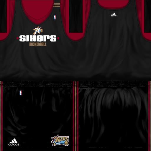
This is the practice jersey template that I use in my previous releases. The wordmarks are from the Reebok practice jerseys series and I only placed the "Stripes" to add the adidas feel.
PRACTICE JERSEY DESIGN 2
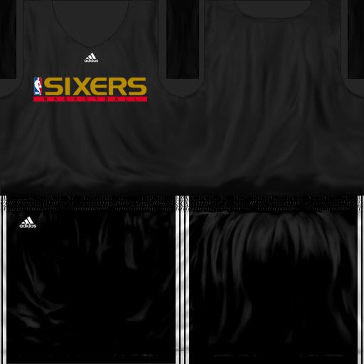
What I'm thinking for the second one is the team colors, plus I'd like to place their alternate logos somewhere on the jersey, so that there would be a distinction on each team.
PRACTICE JERSEY DESIGN 1
This is the practice jersey template that I use in my previous releases. The wordmarks are from the Reebok practice jerseys series and I only placed the "Stripes" to add the adidas feel.
PRACTICE JERSEY DESIGN 2
What I'm thinking for the second one is the team colors, plus I'd like to place their alternate logos somewhere on the jersey, so that there would be a distinction on each team.
-
Lean - The Artist Formerly Known as Crappystuff
- Posts: 7775
- Joined: Mon Nov 13, 2006 8:49 pm
- Location: Pilipinas

![]() by Lean on Wed Dec 06, 2006 7:05 am
by Lean on Wed Dec 06, 2006 7:05 am
Should I go with the second one? Another problem is the updating of the numbers so that they'll be darn transparent. And as of what I know, there are 101 files inside a teamjersey.VIV file to be updated one-by-one. What do you guys think?
-
Lean - The Artist Formerly Known as Crappystuff
- Posts: 7775
- Joined: Mon Nov 13, 2006 8:49 pm
- Location: Pilipinas
![]() by dizzle on Wed Dec 06, 2006 8:02 am
by dizzle on Wed Dec 06, 2006 8:02 am
i like the second jersey sounds like a good idea..but number editing is gonna be a hassle..exporting all the numbers from the viv, then exporting the dds from those..making em transparent..then inserting back into fsh, etc..its gonna take a lot of time if you do that..especially if you do it for all teams..like 6000 numbers to edit..ahy yai yai
formerly jinth0688
- dizzle
- Posts: 635
- Joined: Fri Jul 14, 2006 5:04 am
![]() by Lean on Wed Dec 06, 2006 8:19 am
by Lean on Wed Dec 06, 2006 8:19 am
Yeah, that's what I fear.jinth0688 wrote:i like the second jersey sounds like a good idea..but number editing is gonna be a hassle..exporting all the numbers from the viv, then exporting the dds from those..making em transparent..then inserting back into fsh, etc..its gonna take a lot of time if you do that..especially if you do it for all teams..like 6000 numbers to edit..ahy yai yai
-
Lean - The Artist Formerly Known as Crappystuff
- Posts: 7775
- Joined: Mon Nov 13, 2006 8:49 pm
- Location: Pilipinas
![]() by Scorer--20 on Wed Dec 06, 2006 9:47 am
by Scorer--20 on Wed Dec 06, 2006 9:47 am
Use the second design , but dont forget to add the stripes in the jersey.
And for the numbers , go simple , keep the original ones.
Keep it up
And for the numbers , go simple , keep the original ones.
Keep it up
-
Scorer--20 - Posts: 1332
- Joined: Fri Apr 21, 2006 4:48 am
- Location: Buenos Aires,Argentina

![]() by Lean on Wed Dec 06, 2006 10:18 am
by Lean on Wed Dec 06, 2006 10:18 am
Thanks for the advices, I might take a few more of it.
I also noticed that there are stripes in the side trims of the jerseys, I forgot to put them in the buni preview
I don't know, I have this feeling that this design (the second one) looks plain (or is it just me) and looks like an incarnation of EA's jerseys. I don't know, maybe I'm drugged or so.
Here I changed the color of the wordmarks to white to match the color of the numbers(Practice Away). If I'm going to use the default numbers for the second design, there would be color imbalance. So I'm thinking of the transparent numbers, plus EA f*cked up the way numbers are done this year.
If I use the transparent numbers, it would look like the picture above. Although I'm not sure if these new set of practice jerseys have back numbers. *cough* Jersey Raptor *cough*
Any advice where should I put the teams' secondary/alternate logos?
I'll try the transparent numbers, but I'll stay tuned for your advices. Once I've come up with a decision, I'll use the new design for my upcoming patches and re-release the practice jerseys of my previous patches.
-
Lean - The Artist Formerly Known as Crappystuff
- Posts: 7775
- Joined: Mon Nov 13, 2006 8:49 pm
- Location: Pilipinas


![]() by Lean on Thu Dec 07, 2006 6:45 am
by Lean on Thu Dec 07, 2006 6:45 am
Alright, right now I'm thinking of throwing the first design away and go on with this one. I'm just waiting for the week to be over so that I could start making jerseys again.
-
Lean - The Artist Formerly Known as Crappystuff
- Posts: 7775
- Joined: Mon Nov 13, 2006 8:49 pm
- Location: Pilipinas
Who is online
Users browsing this forum: No registered users and 7 guests