cklitsie's graphics thread [latest: virginia wall]

Other video games, TV shows, movies, general chit-chat...this is an all-purpose off-topic board where you can talk about anything that doesn't have its own dedicated section.

Postby J@3 on Tue Jan 03, 2006 3:22 pm

cklitsie wrote:I used the polygonal lasso and Adobe Illustrator. The tool I used in Illustrator is called 'pen tool' too but it's much easier to use.


Serious? You've given me hope now :lol:
User avatar
J@3
 
Posts: 19815
Joined: Thu Mar 11, 2004 3:25 pm
Location: MLB

Postby shan on Fri Jan 06, 2006 8:42 pm

hey, can u please make me a banner with this pic ?
http://img.photobucket.com/albums/v689/ ... ttack2.jpg

with a red/black/dark red theme..and preferably animated? (if its not, its ok too)
and can it have words saying "shaq attack" :P

(if you want to know the size..it can be about 400x200 pixels)
thanks a lot
Last edited by shan on Fri Jan 06, 2006 9:12 pm, edited 1 time in total.
User avatar
shan
 
Posts: 2
Joined: Fri Jan 06, 2006 8:19 pm

Postby Jugs on Fri Jan 06, 2006 9:02 pm

perfarbly


Yes, we would all perfar you to stay away from these forums.
Jugs
 
Posts: 7442
Joined: Wed Mar 16, 2005 9:32 pm
Location: Geelong, Australia

Postby cklitsie on Sat Jan 07, 2006 12:04 am

No I won't make that, you only have 2 posts here so you're probably just coming in requesting a sig and then leave again.
And I don't like Shaq, animated stuff and too big sigs.

Here's my try at another wall, but I had no inspiration at all so it looks kind of bland, simple. Any ideas on how to make it more appealing?
http://img394.imageshack.us/img394/4130 ... all8ew.jpg
User avatar
cklitsie
 
Posts: 6511
Joined: Sun May 11, 2003 3:02 am

Postby J@3 on Sat Jan 07, 2006 2:51 am

Maybe some action pics faded into the background.
User avatar
J@3
 
Posts: 19815
Joined: Thu Mar 11, 2004 3:25 pm
Location: MLB

Postby Jing on Sat Jan 07, 2006 3:16 am

yeah perhaps more stuff in background, and a lil lighter.
User avatar
Jing
 
Posts: 9791
Joined: Sat Sep 06, 2003 9:29 am
Location: College

Postby stepback3 on Wed Jan 11, 2006 2:15 am

uve got some nice stuff here, complimenti!!! (Y) (Y) (Y)
Image
User avatar
stepback3
 
Posts: 148
Joined: Thu Sep 29, 2005 6:29 pm
Location: Italy

Postby cyanide on Wed Jan 11, 2006 3:35 am

I like how it looks, but you're right, it seems to be lacking something. I'm not overly in agreement to adding complexity, but a single and simple action shot covering the entire background faded, as Jae mentioned, might do the trick. The text looks great (y)
if you were killed tomorrow, i WOULDNT GO 2 UR FUNERAL CUZ ID B N JAIL 4 KILLIN THE MOTHA FUCKER THAT KILLED U!
......|..___________________, ,
....../ `---______----|]
...../==o;;;;;;;;______.:/
.....), ---.(_(__) /
....// (..) ), ----"
...//___//
..//___//
.//___//
WE TRUE HOMIES
WE RIDE TOGETHER
WE DIE TOGETHER
User avatar
cyanide
Dat steatopygous
 
Posts: 9197
Joined: Sat Oct 11, 2003 6:09 am
Location: US's toque

Postby cklitsie on Mon Jan 16, 2006 12:34 am

I'm participating in a wall tournament and I'm up against a crazy good designer in the first round. I'm obviously bound to lose but I'd still like to show up with a solid wall.
So please give me some comments on what I've got so far and what I should do with the 2 red walls (made them red just so you can see the idea).
http://img455.imageshack.us/img455/6892 ... all1fr.jpg
User avatar
cklitsie
 
Posts: 6511
Joined: Sun May 11, 2003 3:02 am

Postby cklitsie on Mon Jan 16, 2006 4:30 pm

Oh come on, anyone?
User avatar
cklitsie
 
Posts: 6511
Joined: Sun May 11, 2003 3:02 am

Postby Colin on Mon Jan 16, 2006 4:32 pm

I have no idea really. 'Posters' of other shots of him?
C#
Image
Pretty Flaco
User avatar
Colin
 
Posts: 5913
Joined: Thu Mar 06, 2003 7:02 am
Location: Van-City

Postby Jing on Mon Jan 16, 2006 4:34 pm

hm.. that looks pretty interesting... its a new simple concept.. dunno what really to comment or suggest on...
User avatar
Jing
 
Posts: 9791
Joined: Sat Sep 06, 2003 9:29 am
Location: College

Postby cklitsie on Mon Jan 16, 2006 4:57 pm

Maybe the temporary red walls makes it look a little stupid and limits the possibilities of things I can do with this start.
Maybe you can give me suggestions after looking at this http://img16.imageshack.us/img16/57/bassywall0ug.jpg ?
User avatar
cklitsie
 
Posts: 6511
Joined: Sun May 11, 2003 3:02 am

Postby J@3 on Mon Jan 16, 2006 5:08 pm

I think I've had too much caffeine. For some reason as soon as I saw that I pictured him being in like a dark hallway with other players chasing him down it. It looked like a scene out of Scary Movie. Weird. I do like where you're going with it.
User avatar
J@3
 
Posts: 19815
Joined: Thu Mar 11, 2004 3:25 pm
Location: MLB

Postby cklitsie on Tue Jan 17, 2006 4:53 am

Damn, why can't I get that from caffeine? :lol:

Anyway, I made some progress:
http://img399.imageshack.us/img399/5871 ... ll22wc.jpg
It's still far too empty and amateur, any suggestions? :oops:
(and yeah - I need to fix the lower part of the hole)
User avatar
cklitsie
 
Posts: 6511
Joined: Sun May 11, 2003 3:02 am

Postby J@3 on Tue Jan 17, 2006 7:17 am

I think your head already has to be somewhat messed up before things like that start happening.

I really really like that background, but I don't think it goes well with the floor... if I had to choose to keep one of the two, I'd definitely keep the background because it could turn into something fantastic. Unfortunately I also have no idea how to expand on it from where it is.
User avatar
J@3
 
Posts: 19815
Joined: Thu Mar 11, 2004 3:25 pm
Location: MLB

Postby Ruff Ryder on Tue Jan 17, 2006 7:20 am

Kinda what I was thinking, but I don't know what you could fill the empty space with unless just some slightly visible brushing.
Image

'Retired'

"You can’t drive a knife into a man’s back nine inches, pull it out six inches, and call it progress."-Malcolm X
User avatar
Ruff Ryder
 
Posts: 5996
Joined: Wed Jun 25, 2003 7:17 am
Location: VA RLY

Postby Jing on Tue Jan 17, 2006 7:52 am

hm. very nice. though i think some parts of the hole doesnt look like its broken through. take a piece of paper and punch through it. .cause some parts of the tear look rounded
User avatar
Jing
 
Posts: 9791
Joined: Sat Sep 06, 2003 9:29 am
Location: College

Postby zmac on Tue Jan 17, 2006 10:49 pm

:shock: :shock: Very nice (Y)

Need some text in there I feel....
ImageImageImageImage
www.myspace.com/zmac24
User avatar
zmac
 
Posts: 2591
Joined: Thu Mar 24, 2005 6:54 pm
Location: Melbourne, Australia

Postby cklitsie on Tue Feb 07, 2006 2:23 am

Thanks for the comments and suggestions, but screw the Bassy thing.. it sucks.

New wallpaper, Mike Jones. I thought the title I cam up with was pretty nice, not creative though. :lol:
Image
User avatar
cklitsie
 
Posts: 6511
Joined: Sun May 11, 2003 3:02 am

Postby KOBE#8 on Tue Feb 07, 2006 4:58 am

Hey man I see you have great work, could you do a sign for me ? please

Make it cool with Kobe and with a sign "The amazing one #8"
User avatar
KOBE#8
 
Posts: 206
Joined: Sat Jan 28, 2006 5:31 am
Location: Lithuania

Postby Ruff Ryder on Tue Feb 07, 2006 8:09 am

Great wall. (Y) When I read the title I got kinda scared that you would do that other fool with more money in his mouth than my family's yearly income.
Image

'Retired'

"You can’t drive a knife into a man’s back nine inches, pull it out six inches, and call it progress."-Malcolm X
User avatar
Ruff Ryder
 
Posts: 5996
Joined: Wed Jun 25, 2003 7:17 am
Location: VA RLY

Postby cyanide on Wed Feb 08, 2006 2:02 am

The Bassy one was starting to become promising with that sweet wall effect, but the player looked a little ridiculous in that kind of setting. Would've been something out of Lemony Snicket's Series of Unfortunate Events :lol:

As for WHO? that is a very sweet wallpaper. I love your choice of fonts, one of the few people who knows how to choose the right ones if I might add. The one thing that I'm not comfortable with is the contrast in the background with the first 2/3rd vs the last 1/3rd seem a little separated. You could experiment a bit with the burn and dodge tools on the players so they appear less cut out, unless you want that effect. Also, was that Nike basketball originally in the photo or was it added?
if you were killed tomorrow, i WOULDNT GO 2 UR FUNERAL CUZ ID B N JAIL 4 KILLIN THE MOTHA FUCKER THAT KILLED U!
......|..___________________, ,
....../ `---______----|]
...../==o;;;;;;;;______.:/
.....), ---.(_(__) /
....// (..) ), ----"
...//___//
..//___//
.//___//
WE TRUE HOMIES
WE RIDE TOGETHER
WE DIE TOGETHER
User avatar
cyanide
Dat steatopygous
 
Posts: 9197
Joined: Sat Oct 11, 2003 6:09 am
Location: US's toque

Postby mark_30_112 on Sun Feb 12, 2006 12:32 am

Can I use your Nas one?
Image
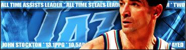
“I'm just honored to play for the Jazz and to play after John Stockton, to wear the same jersey he wore and be on the same floor he was on because he's one of the best players of all-time, one of the best point guards of all-time" Derron Williams - Utah Jazz
User avatar
mark_30_112
 
Posts: 232
Joined: Sat Jan 14, 2006 3:21 pm

Postby cklitsie on Sun Jul 02, 2006 10:53 pm

Alright I finally updated this thing again with some older graphics and sigs and some new stuff as well.
And the reason why I basically dug this thread up again:
Image
User avatar
cklitsie
 
Posts: 6511
Joined: Sun May 11, 2003 3:02 am

PreviousNext

Return to Off-Topic

Who is online

Users browsing this forum: No registered users and 5 guests